瑰麗凝存,珀玉留世。
Freeze the goodness in life.
東方安柏酒店品牌視覺設計 Visual Identity of Orient Amber Hotel
CLIENT : Orient Amber Hotel
PROJECT SERVICE : Visual Branding

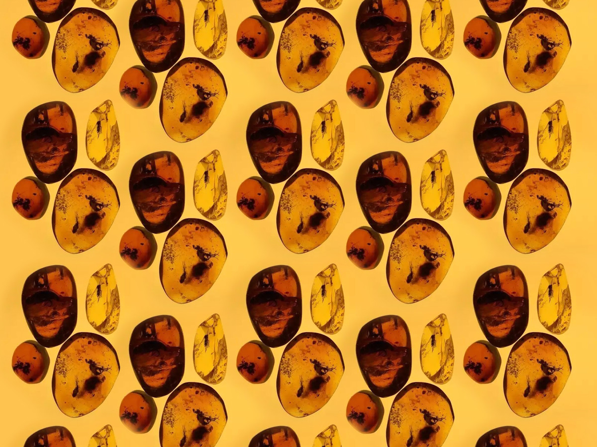
客人以琥珀為核心主旨,希望帶出凝固時間、留傳百世的意象,並要從視覺上體現珍貴、寶物的感覺。
在消化了這些資訊後,便順著突發的詩興,寫下一英、一中兩組字句:
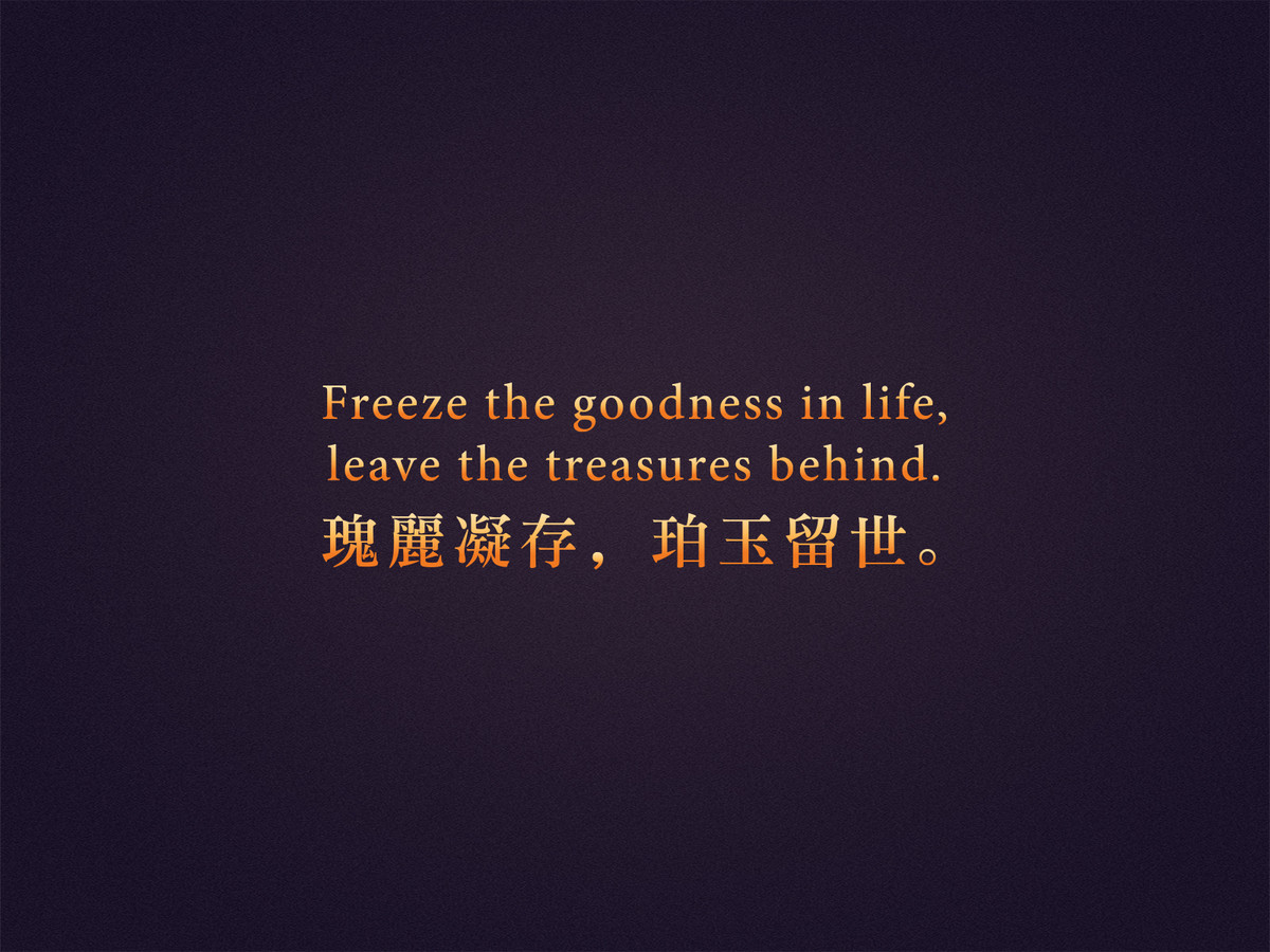
Freeze the goodness in life,
leave the treasures behind.
瑰麗凝存,
珀玉留世。
一瞬華彩,
歲月鎏金。
然後整套設計,就圍繞這兩段字句來展開。
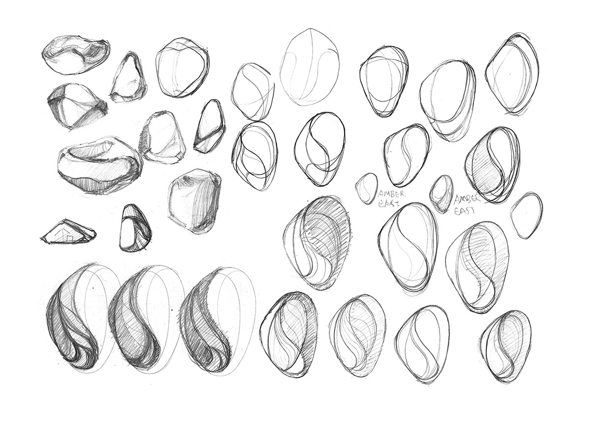
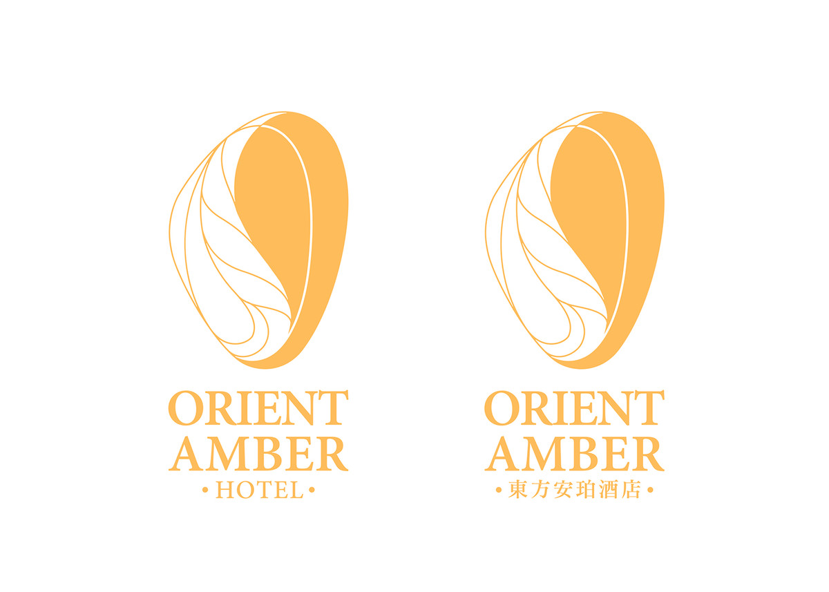
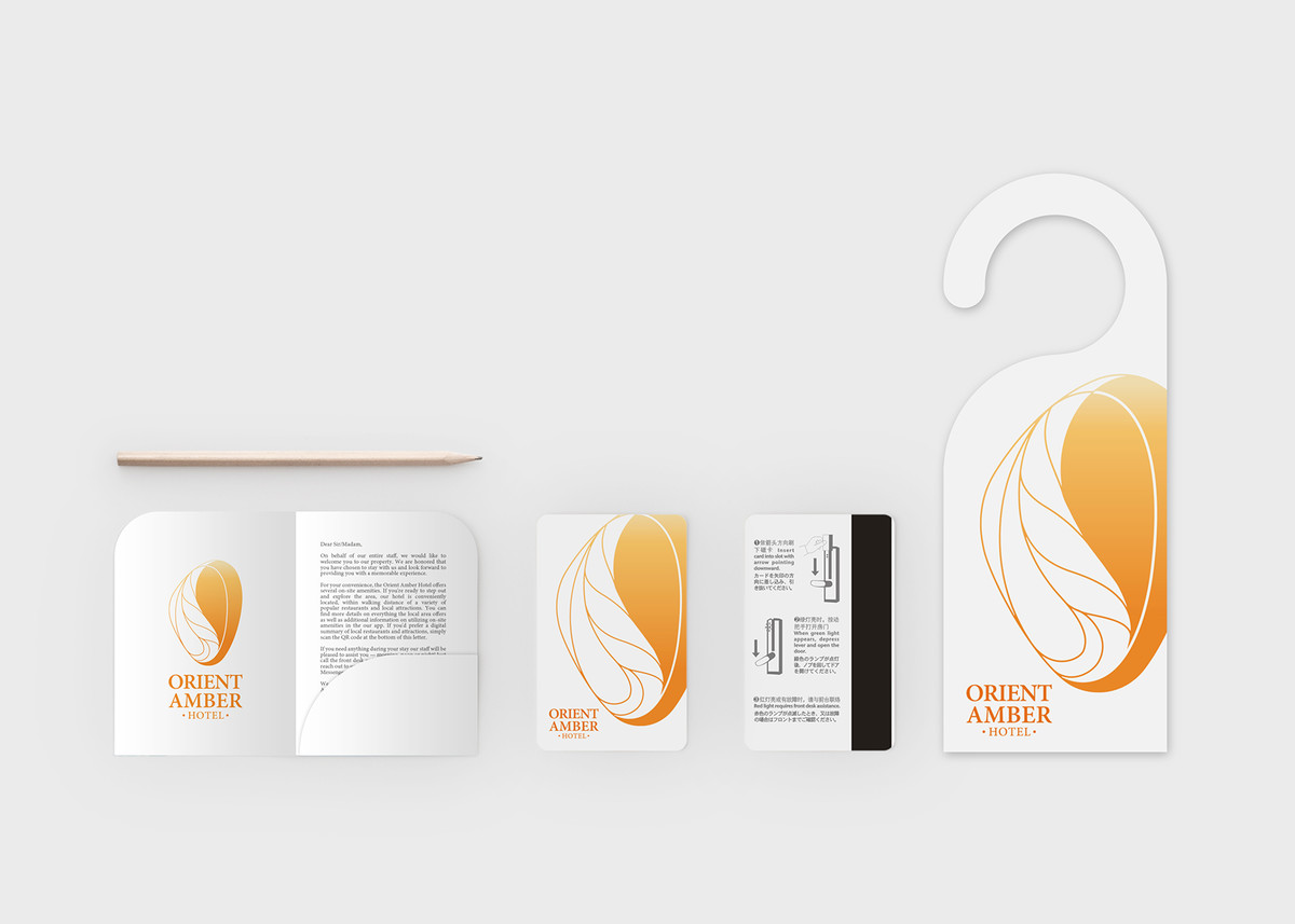
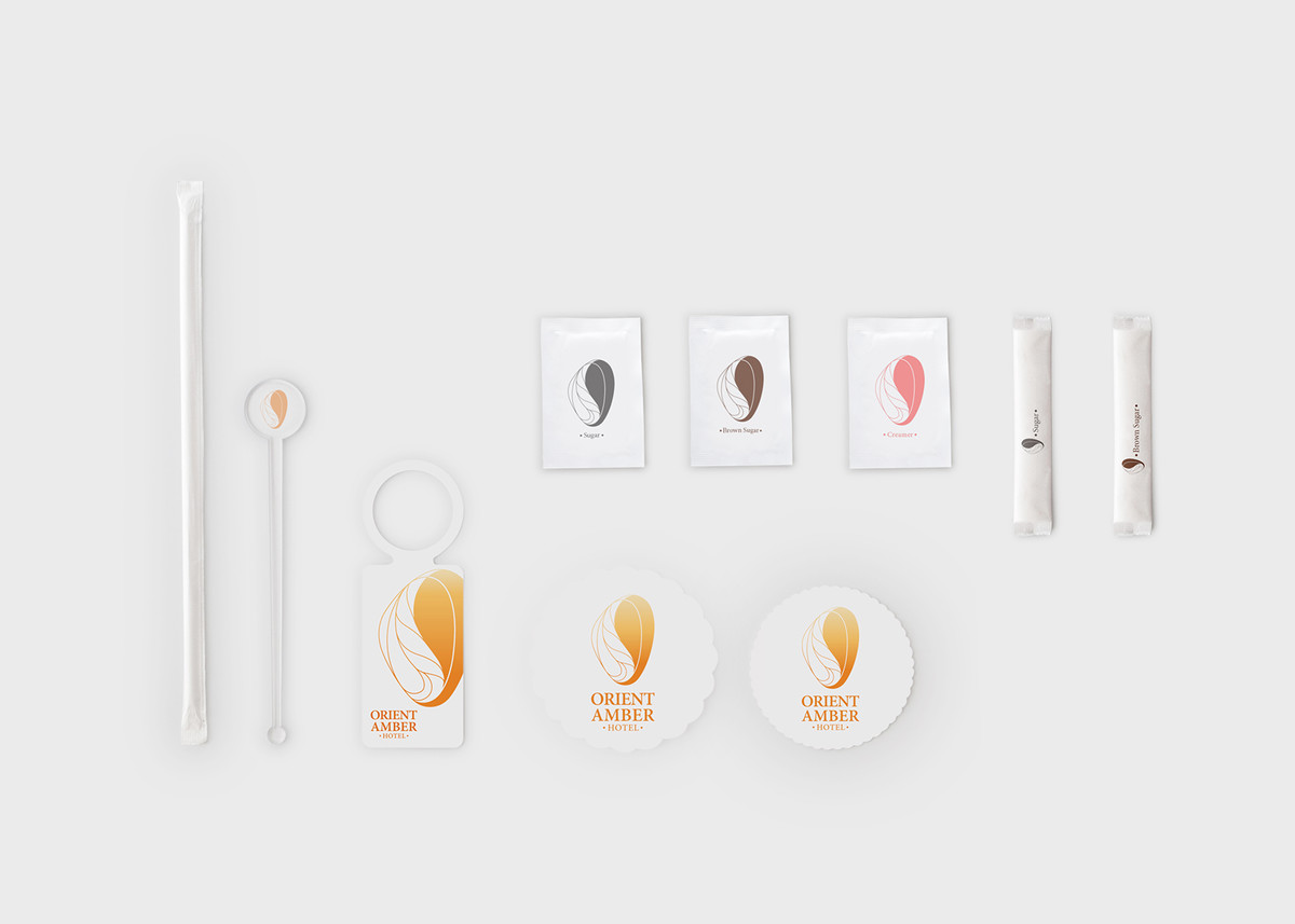
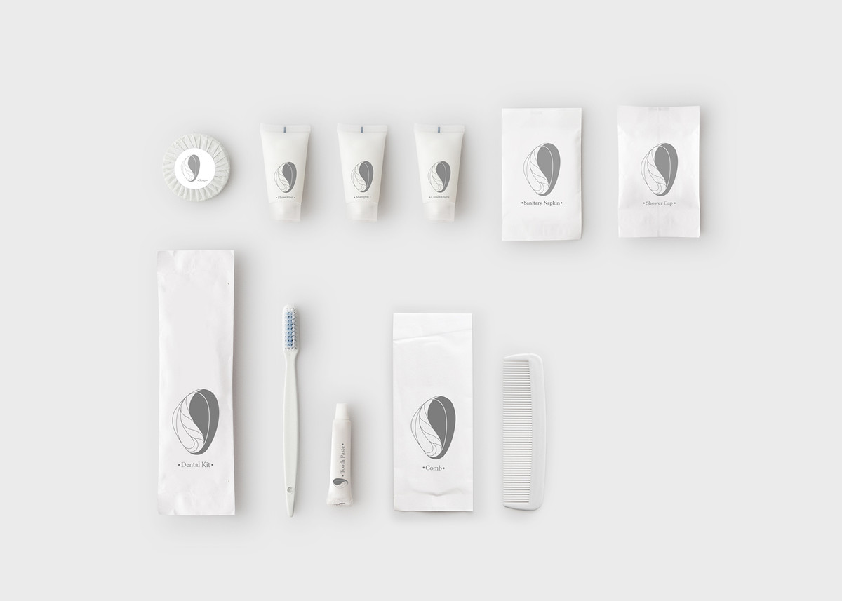
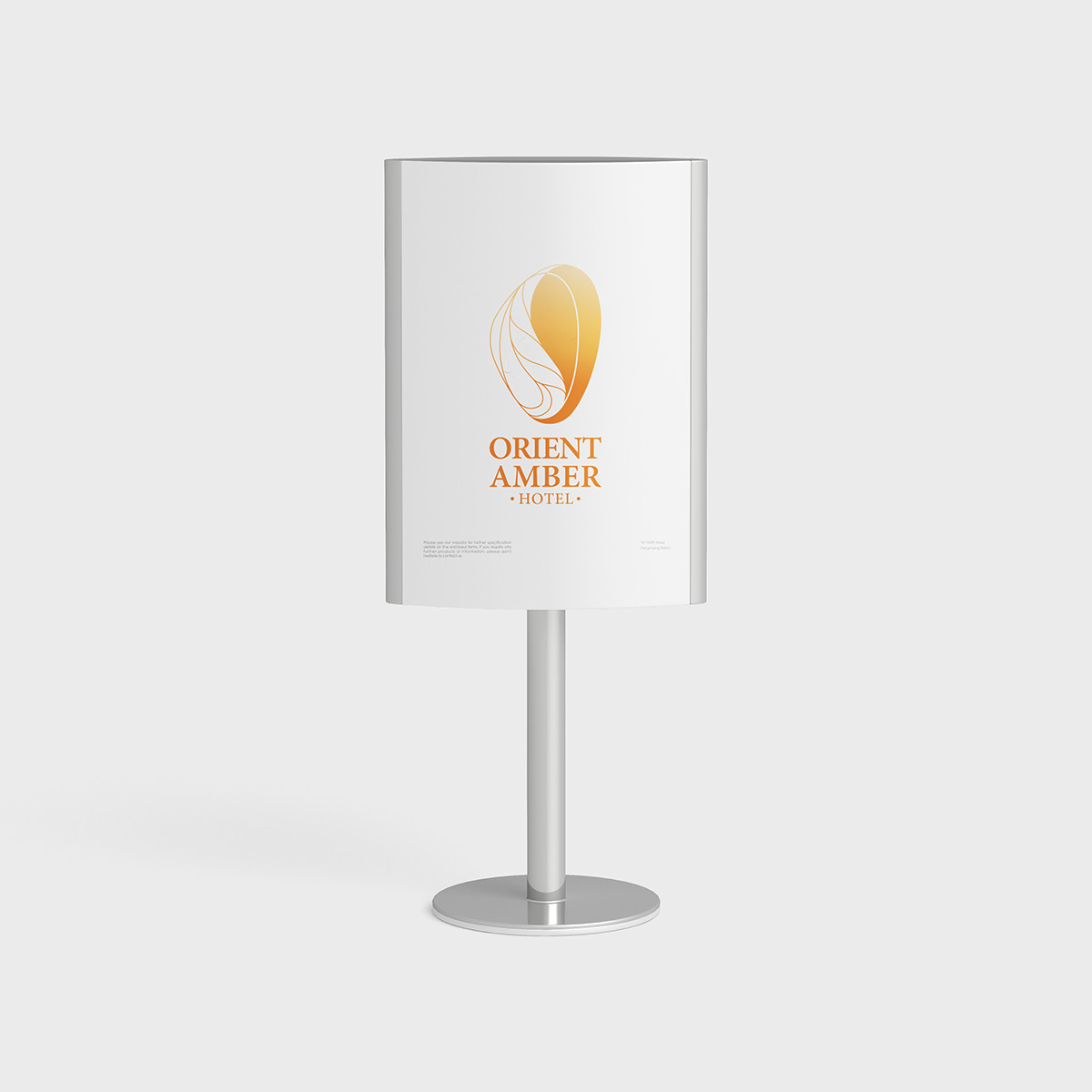
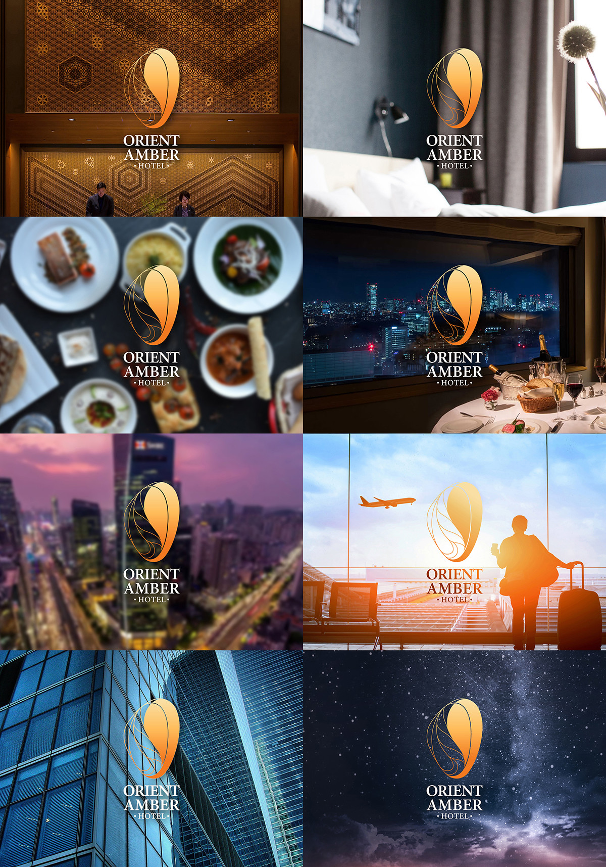
琥珀經歷歲月洗禮,渾然天成,有一種不對稱的自然美感,logo造型保留這種趨勢,減少人為的對稱性。不過作為酒店商標,也必須在不對稱當中做出穩定感,展現本體事業的份量,因此每條主要輪廓都取自正圓弧線,體現規整的秩序。
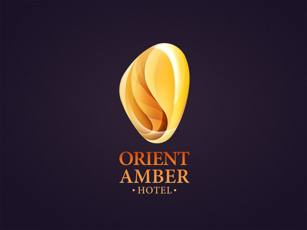
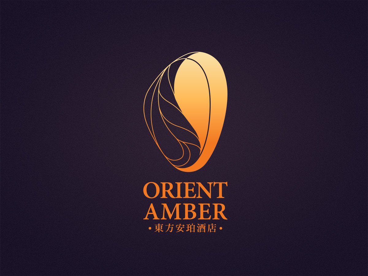
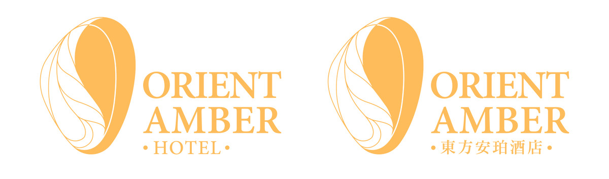
為了完整詮釋品牌文化,logo有一款全彩版本,將琥珀圓潤通透的質感呈現出來。包裹其中的是從遠古留下來的葉脈,象徵一脈相承的源遠流傳。而作為各媒介的應用,則有另一平面化的主logo,對半的通實對比,除了展現空間關係,也務求讓顧客留下鮮明的視覺印象。
The client took amber as the main theme, bringing out the meaning of saving an ancient moment with a preciousness feeling like a treasure. After learning this information, we wrote down two words, both in English and Chinese, to depicted our understanding:
Freeze the goodness in life,
Leave the treasures behind.
瑰麗凝存,
珀玉留世。
一瞬華彩,
歲月鎏金。
And the idea of the design expanded around these two paragraphs.
With the baptism of years, amber is an asymmetrical natural beauty. The logo keeps this characteristic shape and avoids artificial symmetry. However, as a hotel trademark, it is also necessary to make it look stability even in the asymmetrical shape, showing a suitable weight of their business, so each main outline is taken from the circular line with a neat rule.
In order to fully express the brand culture, we made a full-color version logo that presents the sleek and transparent texture of amber. A ancient vein wrapped in it, symbolizes the origin of long story. We have a another flat version deisgn as the main logo for other applications, in addition to showing the spatial feeling, the half and half comparison is to leave the customer a deep impression.