將品牌融入功能。
Integrate the brand into the function.
將品牌融入功能。
Integrate the brand into the function.
富力集團年度筆記簿設計
Design for Annual Notebook of R&F Group
CLIENT : 富力集團 R&F Group / PROJECT SERVICE : Product Design
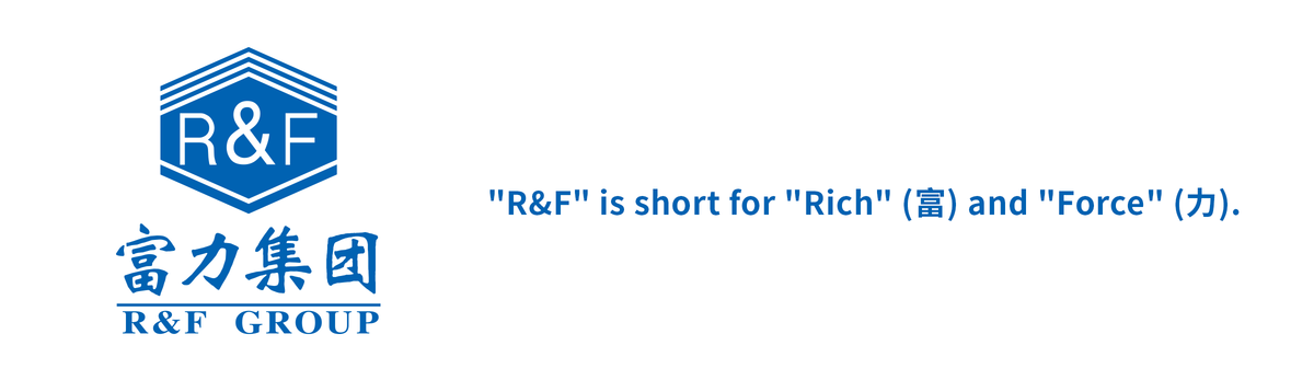
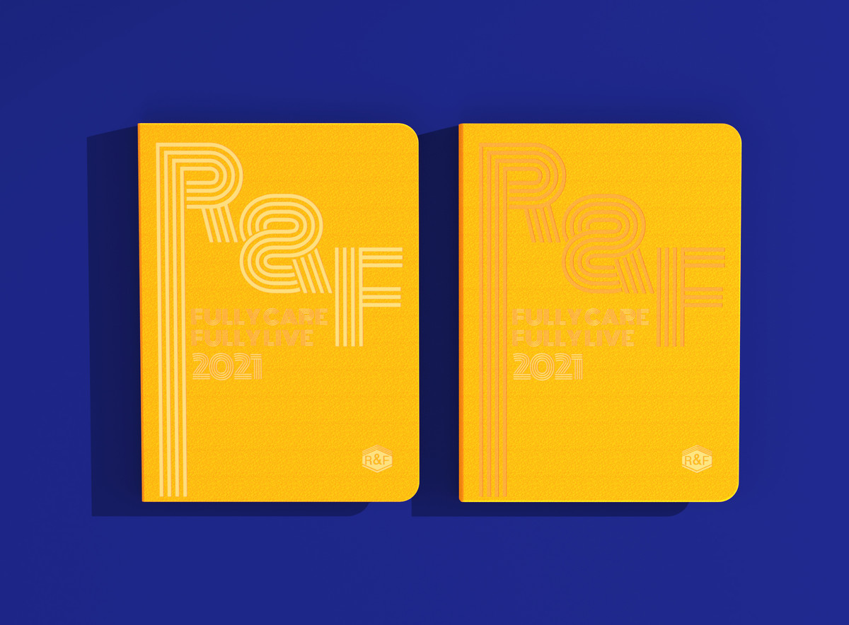
為富力集團設計的年度筆記簿。
這種官方衍生品,主要用作派發集團內部各階層人員使用,以及饋贈予業務往來的夥伴,說得上是另類的企業名片。因此其設計除了要符合品牌格調,更需要呈現企業獨有的特徵或符號。
作為一個擁有綜合業務的大集團,富力涉獵的領域早已不限於地產業。這種規模的品牌很難一概而論,且企業本身亦不想將其多元化事業局限在單一的基調上。經過一番思考,我們發現最能代表富力的,其實就是「富力」。一個已經創立數十年的業界品牌,富力的名聲已無人不知,根本毋須贅述。
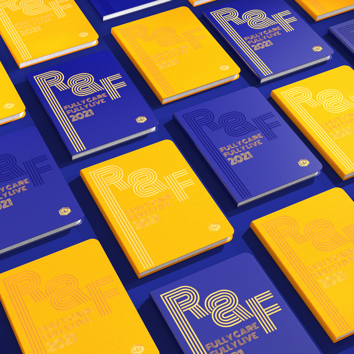
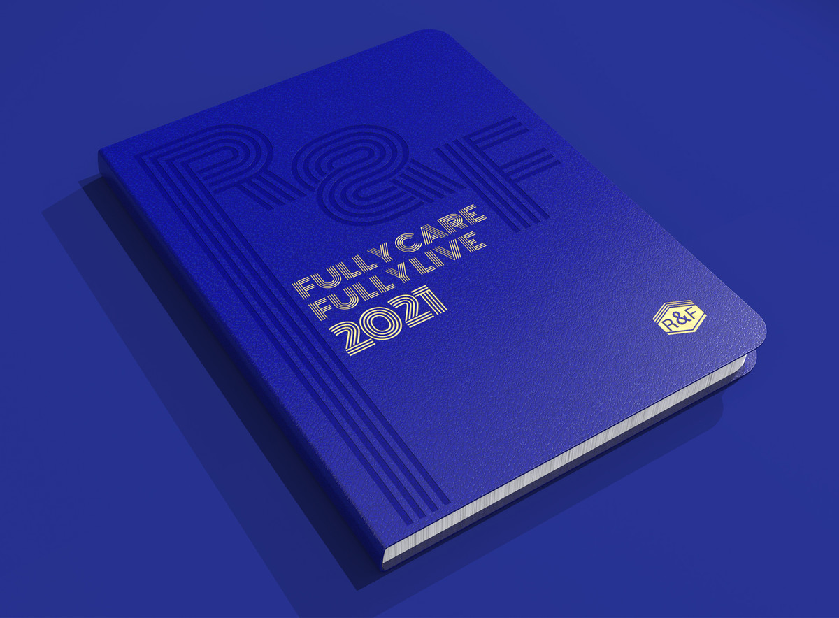
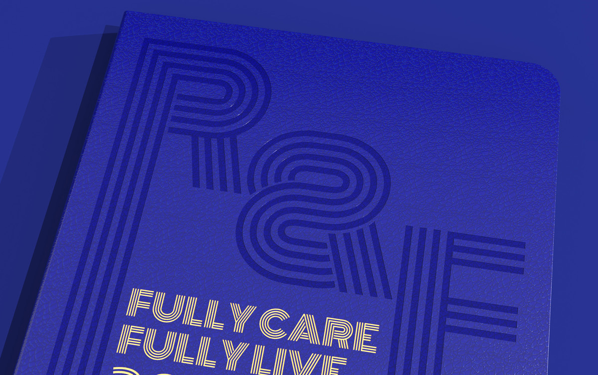
富力,英文簡稱R&F,R為Rich、F即Force。 R&F是其商標的主要元素,已對公眾形成廣泛的記憶印象,這就是最代表富力的符號。因此,是次設計就以「R&F」來展開。
An annual notebook design project for R&F Group.
This kind of official item is mainly used for the staffs and as a gift to their business partners, just like a special business card. Therefore, in addition to conforming to the brand style, its design needs to present the unique characteristics or symbols of the company.
As a large group with comprehensive business, R&F has been involved in fields beyond the real estate industry. It is difficult to generalize a brand of this size, and the company itself does not want to confine its diversified business to a single tone. After some thinking, we found that the most representative of R&F is actually "R&F". As a brand that has been established for decades in its industry, R&F's reputation is no one knows, and there is no need to describe it anymore.
R stands for Rich, and F stands for Force, it has formed a broad memory impression on the public yet. Therefore, the design will be ok to base on the word "R&F".
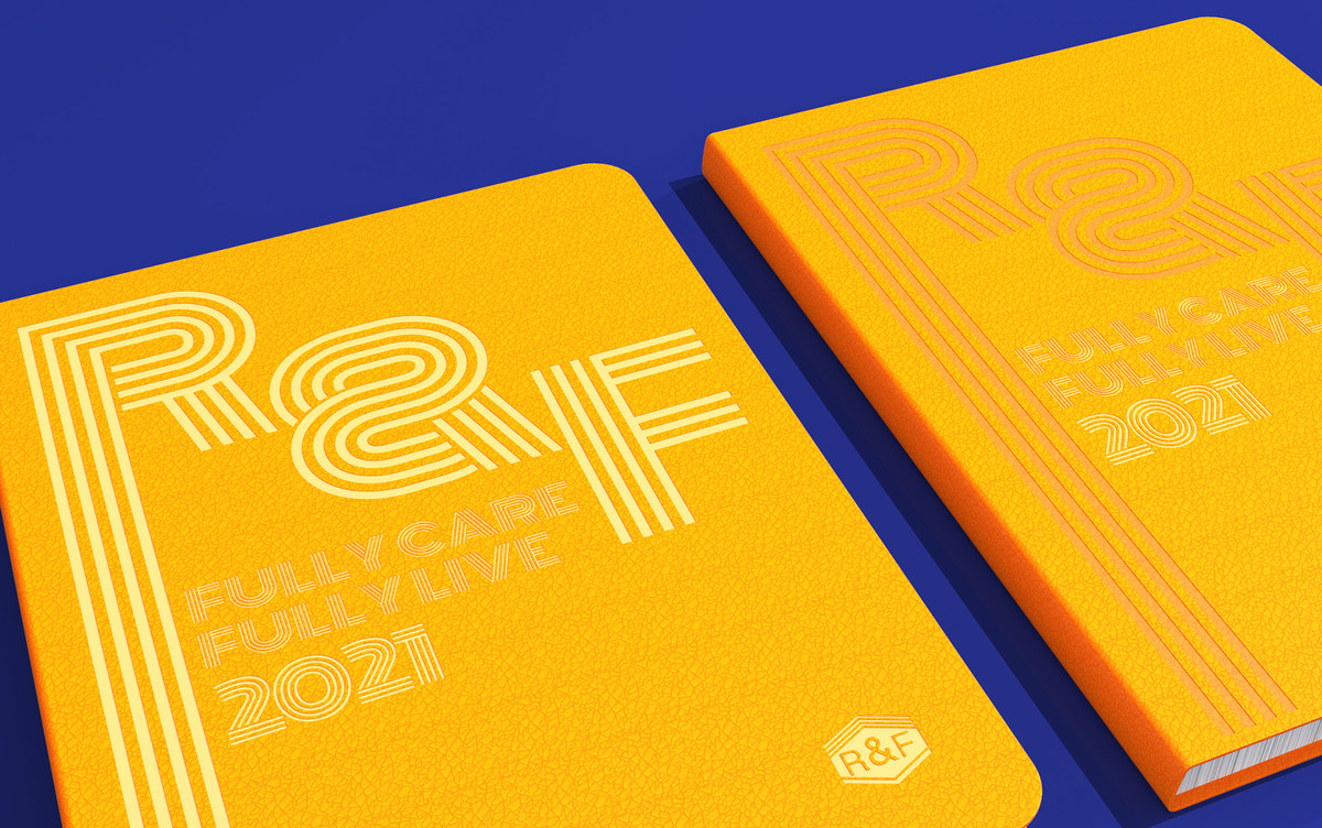
我們不滿足停留於表面的平面設計,更希望這本筆記簿能與「R&F」有實質意義的功能結合,彼此深入關聯,展現出對本企業的唯一性,而非換個封面就可以用在別家的貼牌式設計。
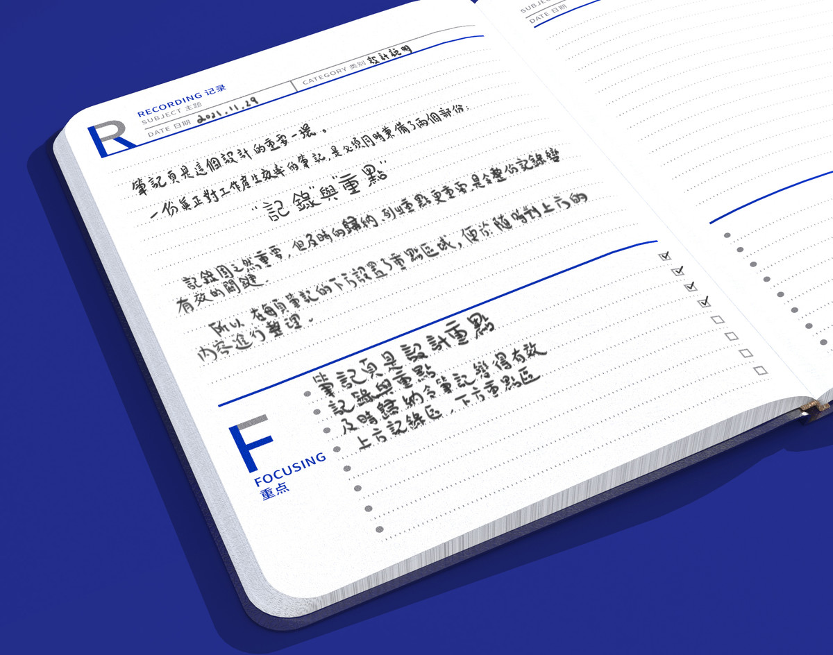
於是,我們重新審視這本筆記簿的存在價值和意義。這種辦公筆記簿的主要功能就是工作筆記或會議筆錄。那何謂一份好的工作筆記?在清晰記錄的同時,要有及時的梳理、歸納出重點,從而指引日後的工作,一份好的工作筆記理應如此。
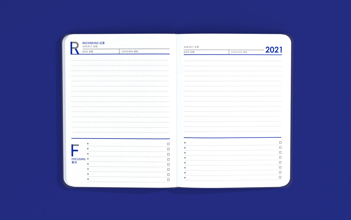
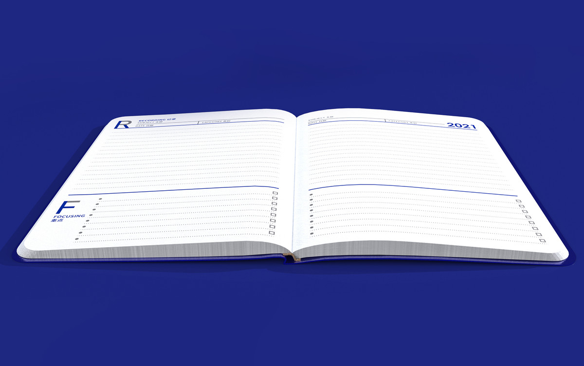
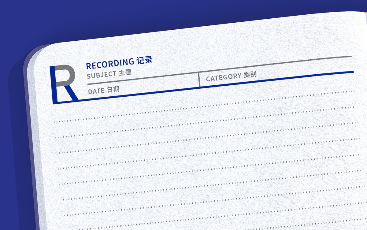
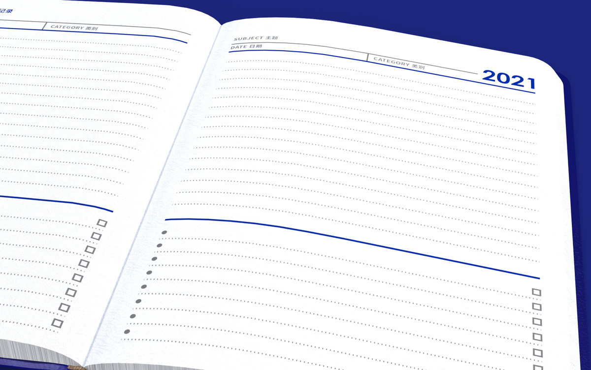
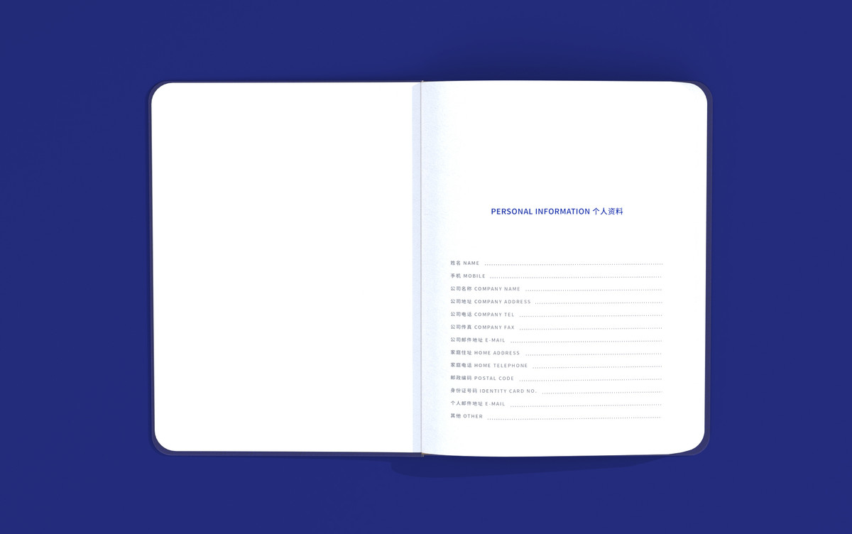
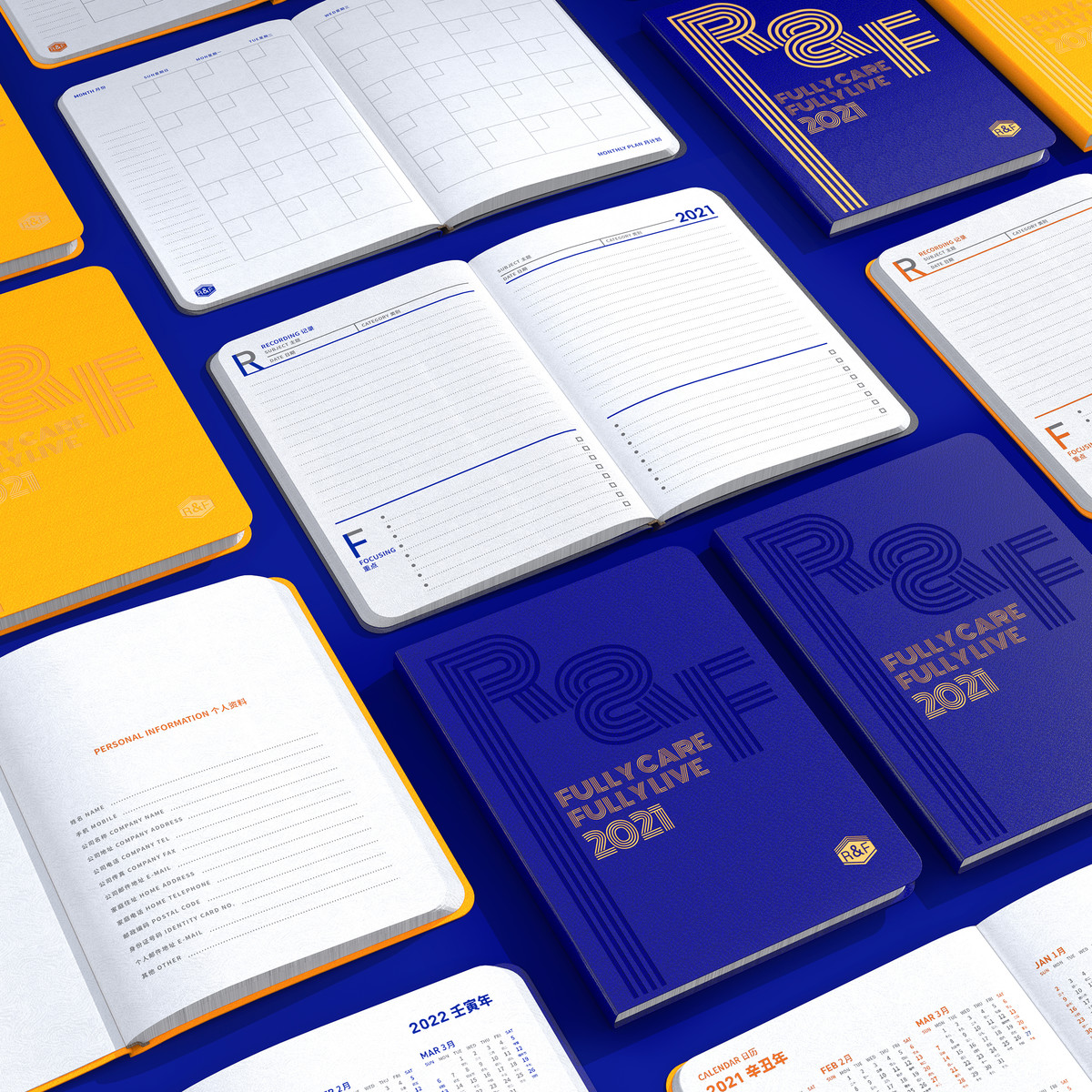
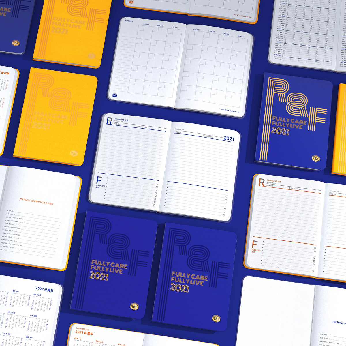
除了筆記者自身應建立良好的習慣,作為設計者,我們也希望能在筆記簿提供清晰的頁面佈局、打造一個有條理的使用流程。我們將整個打開的頁面作為完整的筆記空間,並自上而下劃分大約2/3的區域為「記錄區」,作即時筆記之用。餘下的1/3,則是「重點區」,用來梳理上方的筆記。「重點區」每一行前面都有項目符號,末尾有空白框,以便清楚地檢查每個關鍵點。
將記錄和梳理安排於同一頁面下,也讓筆記的整理更為方便,最終亦有助培養良好的使用習慣。
我們將「記錄區」命名為R,即Recording;「重點區」命名為F,即Focusing,換言之,整個頁面就是由「R&F」所組成。就這樣,將富力集團的符號融入到功能當中,讓這本筆記簿成為本企業的真正專屬物。
We prefer not to stay at the level of graphic design, and hope that the notebook can have a deep connection with the word "R&F" in a meaningful way, and present the uniqueness of the company, instead of a superficial design that can be used for other brands or companies by just changing the cover.
Therefore, we rethink the value and meaning of this notebook. The main function of this kind of office notebook is working or meeting notes. What would be a good working note? It should be clearly recorded, then timely sorting out and summed up the key points, to guide the future works.
In addition to the users themselves should establish good habits, as the designer of the notebook, we also hope to provide a clear lay out and create an organized usage process for users. We used the whole open pages as a completed space for the note, and divide about 2/3 of the area from top to bottom as the "recording area" for instant notes. The remaining 1/3 is the "focusing area", which is used to sort out the notes above. Each line in the "focusing area" has bullets at the front and blank boxes at the end to check each key point clearly.
Keeping recording and sorting on the same page also makes the organization of notes more convenient, and ultimately helps to cultivate good usage habits.
We named the "recording area" as R, and the "focusing area" as F. In other words, the entire page is composed of "R&F". In this way, the symbol of R&F Group has been integrated into the function of this notebook, and made it become the real exclusive item of the company.