獨特的節日賀卡
Unique Greeting Cards
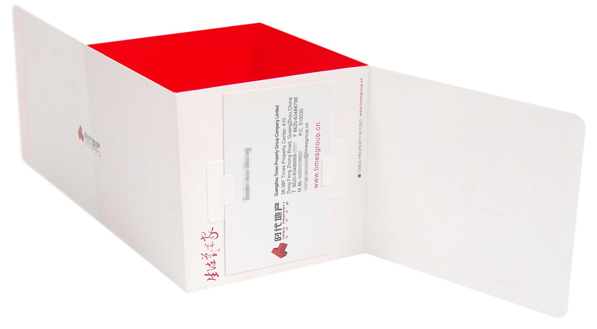
CLIENT : 時代地產 Times Property
PROJECT SERVICE : 節日賀卡 Greeting Cards
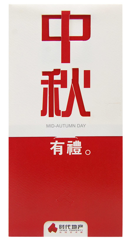
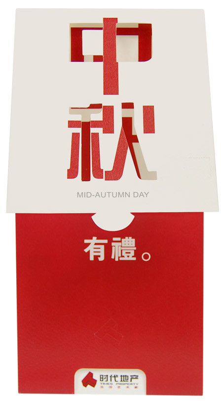
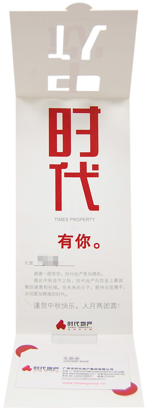
時代地產(現名為時代中國)以「生活藝術家」作為品牌定位,希望透過設計傳遞其高品質生活的理念與文化內涵。我們收到了他們中秋賀卡的設計委託,在此次設計中,我們的目標是在視覺上呈現簡潔清晰,並且在互動體驗中傳遞祝福信息,同時反映品牌對藝術和生活的重視。
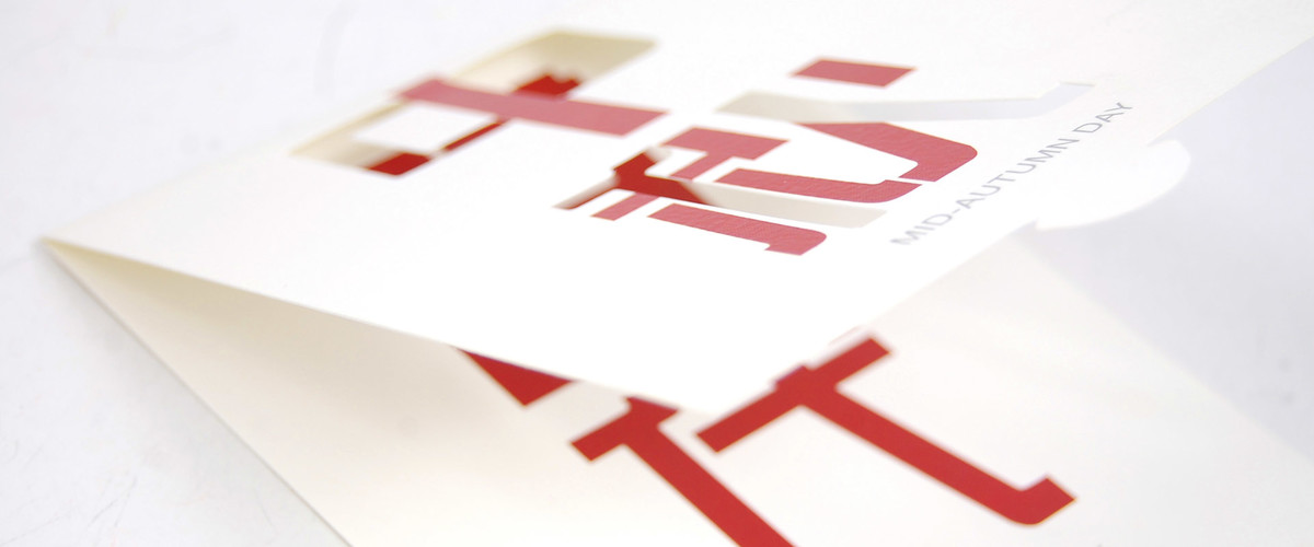
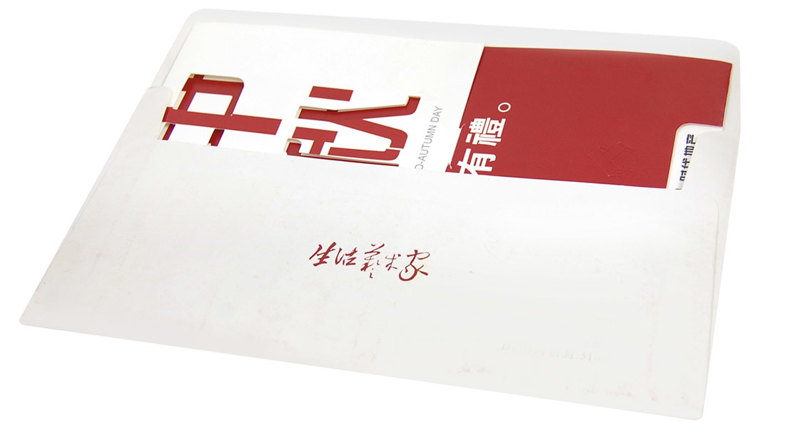
設計的核心是對字體結構的創意演繹,通過巧妙的筆畫共享實現「中秋」與「時代」的字體融合。打開賀卡時,內容逐漸顯現,形成獨特的視覺體驗,讓使用者感受到一種發現與參與的樂趣。同時,賀卡內的對應語句「中秋有禮」與「時代有你」相互呼應,強調節日的祝福與品牌對用戶的重視。
配色選擇了紅白對比,既呼應中秋的節慶氛圍,也體現簡潔現代的設計風格。內頁鏤空設計增強了層次感,使整體視覺效果更加立體和有趣。設計不依賴過多裝飾,而是聚焦於文字本身的創意,這種回歸本質的設計方式更加清晰直接,也讓賀卡內容成為視覺的焦點。
整張賀卡旨在平衡實用性與藝術價值,滿足品牌的傳訊需求,同時體現對用戶體驗的細節關注和誠意。
Times Property (now known as Times China) positions itself as a brand advocating the idea that "Life Artist," aiming to reflect high-quality living and cultural depth through its designs. We received their design commission for Mid-Autumn Festival greeting cards. For this greeting card, the goal was to create a visually clean and straightforward piece while delivering a festive message through an interactive user experience that embodies the brand's focus on art and lifestyle.
The design centers on a creative approach to typography, integrating the characters for "Mid-Autumn" and "Times" through shared strokes. As the card is opened, the content unfolds gradually, providing a unique visual experience that invites user interaction and a sense of discovery. The paired phrases inside—"Mid-Autumn, with gifts" and "Times, with you"—complement each other to convey both festive wishes and the brand's appreciation for its audience.
A red-and-white color scheme was selected to reflect the festive mood of the Mid-Autumn Festival while maintaining a clean and contemporary design aesthetic. The die-cut details inside the card add depth, enhancing the overall visual appeal without relying on excessive decorative elements. By focusing on the creativity within the typography itself, the design achieves a direct and impactful presentation, making the card's content the centerpiece.
This greeting card seeks to balance practicality with artistic value, addressing the brand's communication needs while reflecting attention to detail and sincerity in user experience.
經過中秋賀卡設計的成功案例,時代地產對我們的設計能力表現出了極大的認可與讚賞,並進一步委託我們為他們設計新年賀卡。這次的設計需求同樣要求兼具設計感和記憶點,能夠在傳遞品牌祝福的同時,帶給收件人一個難忘的互動體驗。我們將創意與品牌價值緊密結合,深入挖掘傳統賀卡設計的新可能。
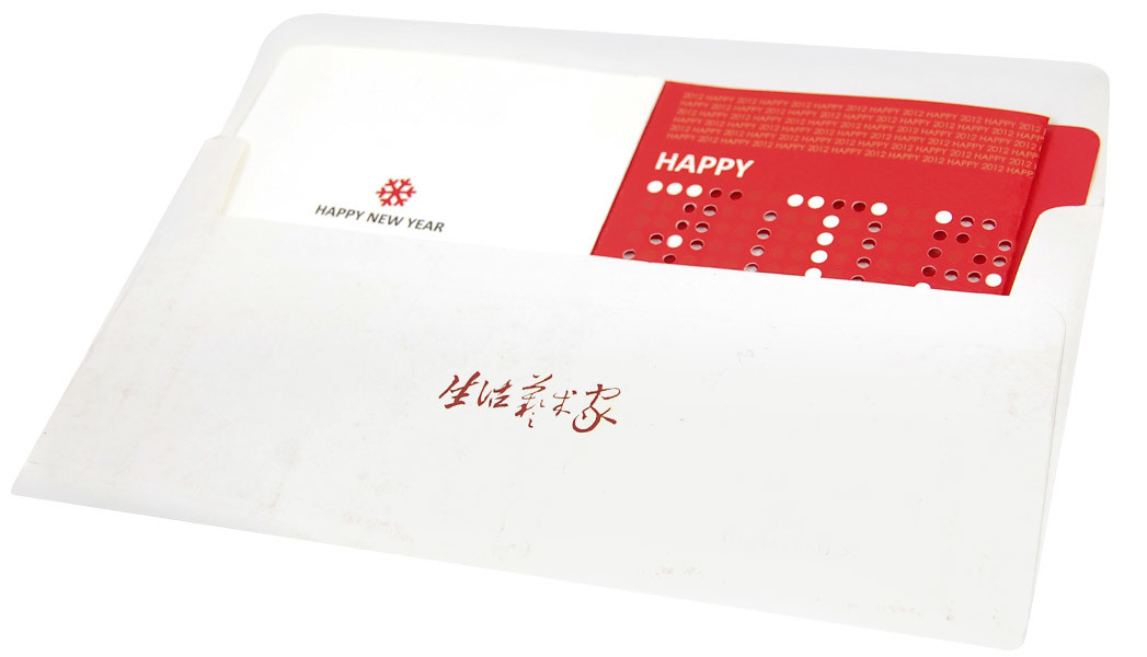
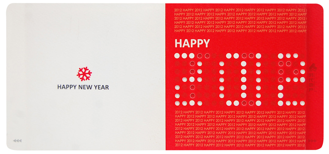
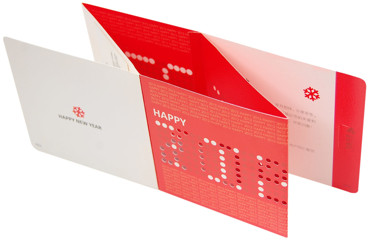
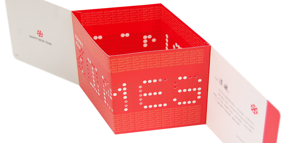
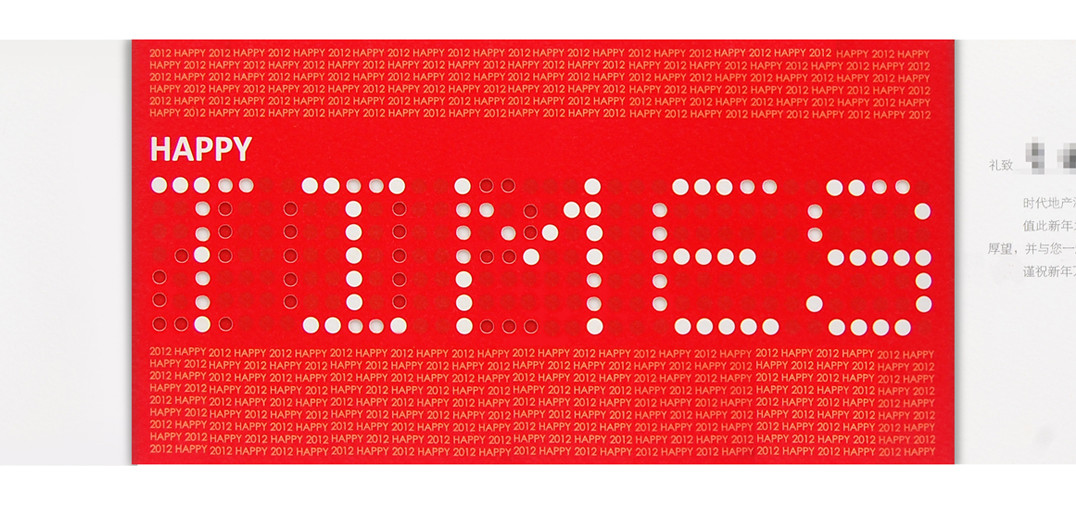
這款新年賀卡的設計靈感來自於兒時玩具中的點陣記憶,並以此為基礎打造出別具一格的結構設計。通過平行四邊形摺疊角度的精妙應用,卡片內部形成了雙重錯層空間,既提升了結構上的層次感,也增強了賀卡的互動性與趣味性。當客人打開並探索這張卡片時,會驚喜地發現隱藏其中的祝福語「HAPPY 2012,HAPPY TIMES」。這一雙關設計不僅賦予了賀卡豐富的語意層次,也彰顯了品牌幽默且智慧的形象。
整個設計過程始終秉持加啲添™「多一點探索,多一點創造」的理念,力求在結構創新與細節打磨之間實現完美平衡。我們希望這款賀卡不僅是一份新年的問候,更是一份能夠帶來愉悅與驚喜的創意作品,充分體現品牌的用心與誠意。
After the success of the Mid-Autumn Festival card, Times Property expressed great admiration for our design work and entrusted us with the task of creating a New Year's card. The new brief demanded a design that was both visually striking and memorable, capable of delivering heartfelt greetings while offering recipients a unique interactive experience. We combined creative ingenuity with the brand's values, exploring new possibilities for traditional card design.
The inspiration for this New Year's card came from childhood memories of dot-matrix toys, reinterpreted to create a distinctive structural design. By leveraging the folding angles of parallelograms, we introduced dual overlapping spatial layers that add depth and interactivity. Recipients engaging with the card are delighted to uncover the hidden message, “HAPPY 2012, HAPPY TIMES.” This clever wordplay not only enriches the card's message but also highlights the brand's playful and intelligent identity.
Throughout the design process, we adhered to Gaa Di Team™'s philosophy of “explore a little more, create a little more,” striving to achieve a perfect balance between structural innovation and meticulous craftsmanship. This card transcends the traditional New Year's greeting, offering a joyful and surprising experience that reflects the brand's care and sincerity.