

是禮盒,也是糖果盒。
A gift box, as well as a candy box.
是禮盒,也是糖果盒。
A gift box, as well as a candy box.
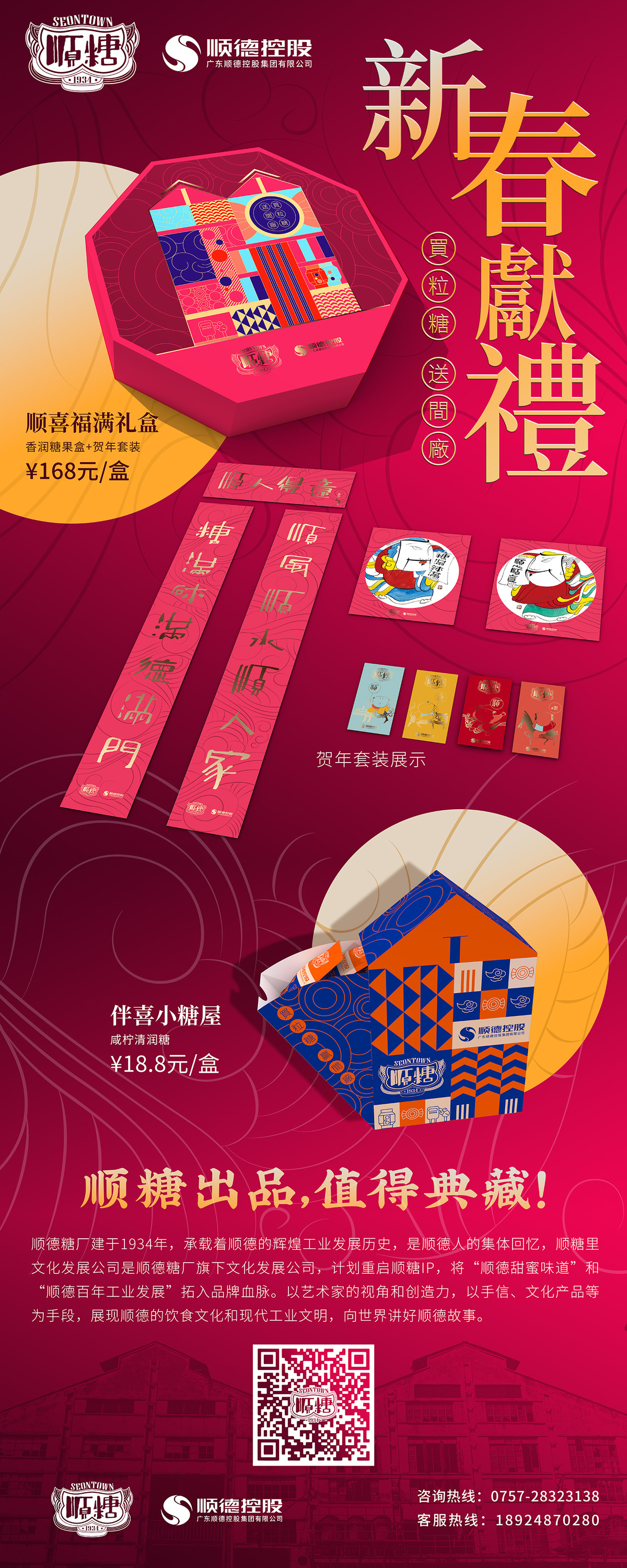
順糖1934 賀年禮盒
Seontown 1934 Lunar New Year Gift Box
5e0d21CLIENT : 廣東順德順糖里文化創意有限公司
PROJECT SERVICE : Packaging Design
我們為順糖1934設計的農曆新年禮盒,由於本項目是品牌的初試牛刀,因此在過程中進行了數次的規劃調整。
We designed a Lunar New Year gift box set for Seontown 1934, Since it was the brand's first product, several strategic adjustments were made throughout the process.
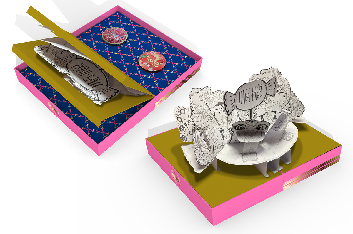
Phase 1:甜蜜彈起 The Pop-up Sweetness
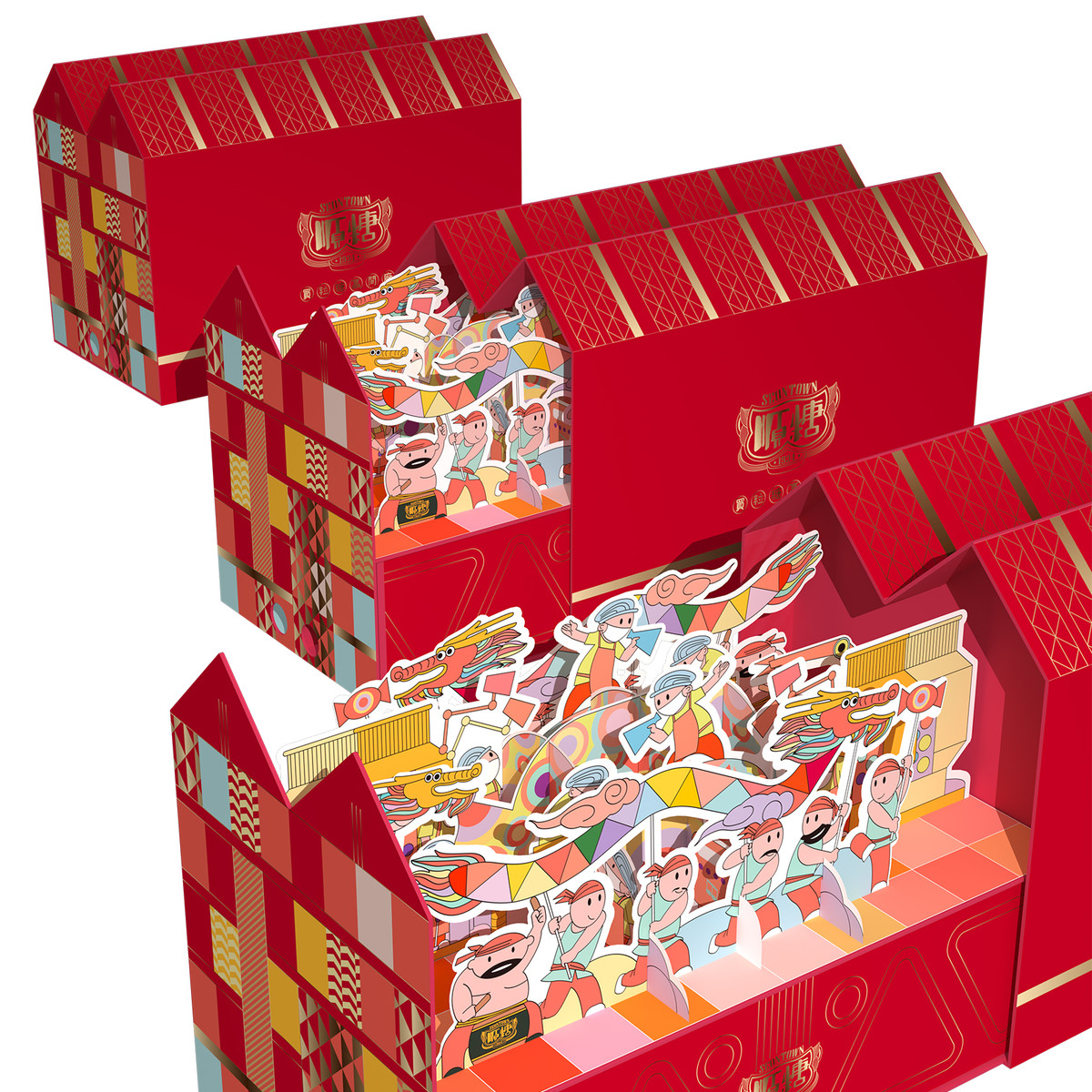
最初的計劃是推出一系列不同價位的三款禮盒套裝,以滿足不同的賀年需求。值得一提的是,其中一款糖果禮盒,以「甜蜜」呼應順德糖廠的主題。我們設計了一幅隨著禮盒打開而彈起的立體畫,創造出意想不到的開箱體驗,並使禮盒成為新春擺件,裝飾家中節日氛圍。
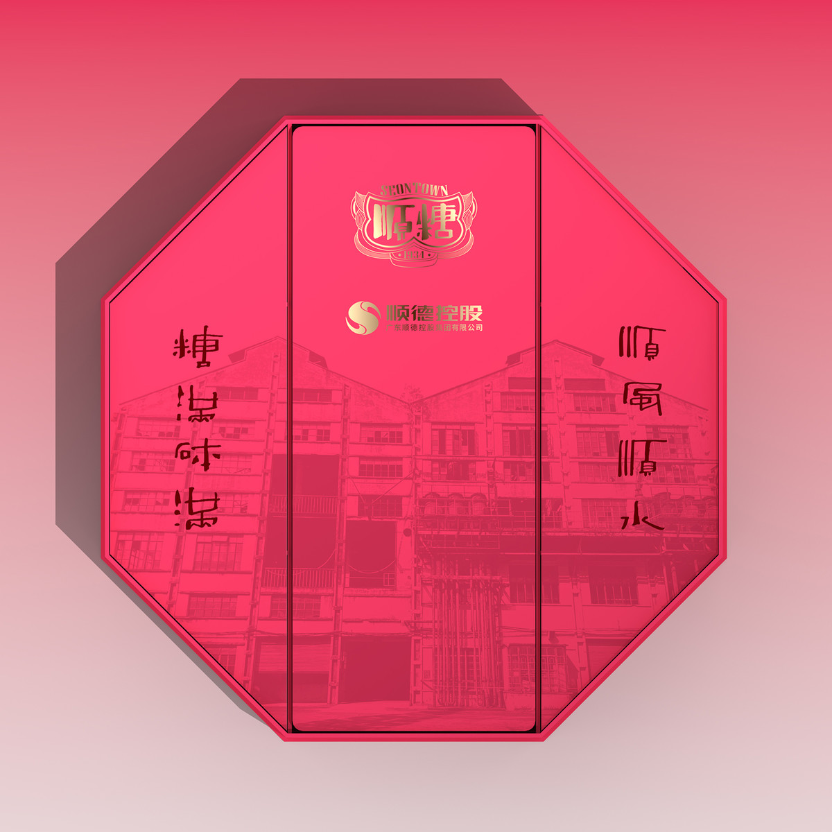
盒身的花紋設計靈感源自順德糖廠的建築風格,作為鮮明的品牌元素,可以融入未來的產品設計中。
The initial plan is to launch a series of three gift box sets with varying price points, catering to different greeting needs. It is noteworthy that one of these options includes a candy gift box, perfectly aligning with the theme of The Shunde Sugar Factory and its essence of "sweetness". We have incorporated a pop-up scene upon opening the gift box, creating an unexpected unboxing experience while transforming it into a festive New Year decoration for homes.
The decorative pattern design of the box is inspired by the architectural style of Shunde Sugar Factory, serving as a distinctive brand element that can be incorporated into future product designs.
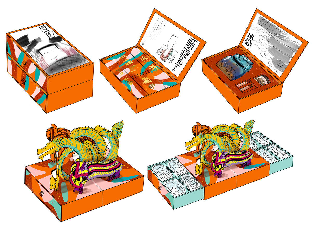
Phase 2:買粒糖,送間廠 Buy a Candy, Gain a Factory
當進入開發的第二階段時,客戶調整了計劃以考慮節日禮物的時間敏感性。於是,他們決定將原來的三個禮盒合而為一,集中資源,以達到最佳效果。客戶希望透過首款產品的推出,讓順糖1934在消費者心目中穩固地建立為順德糖廠文化推廣的代表品牌。
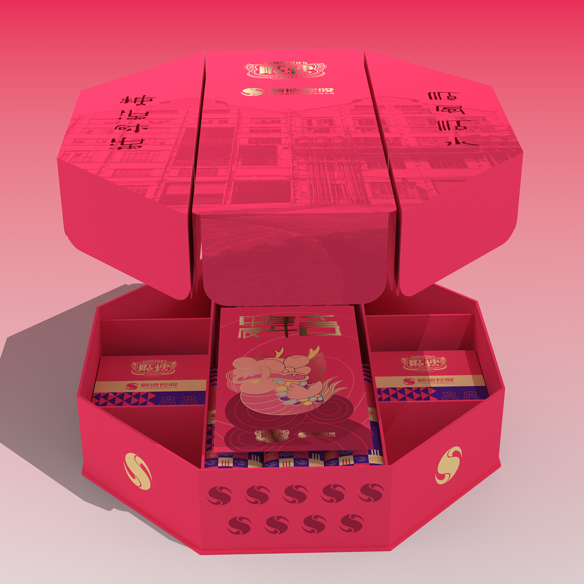
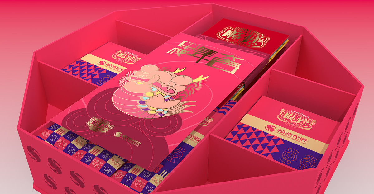
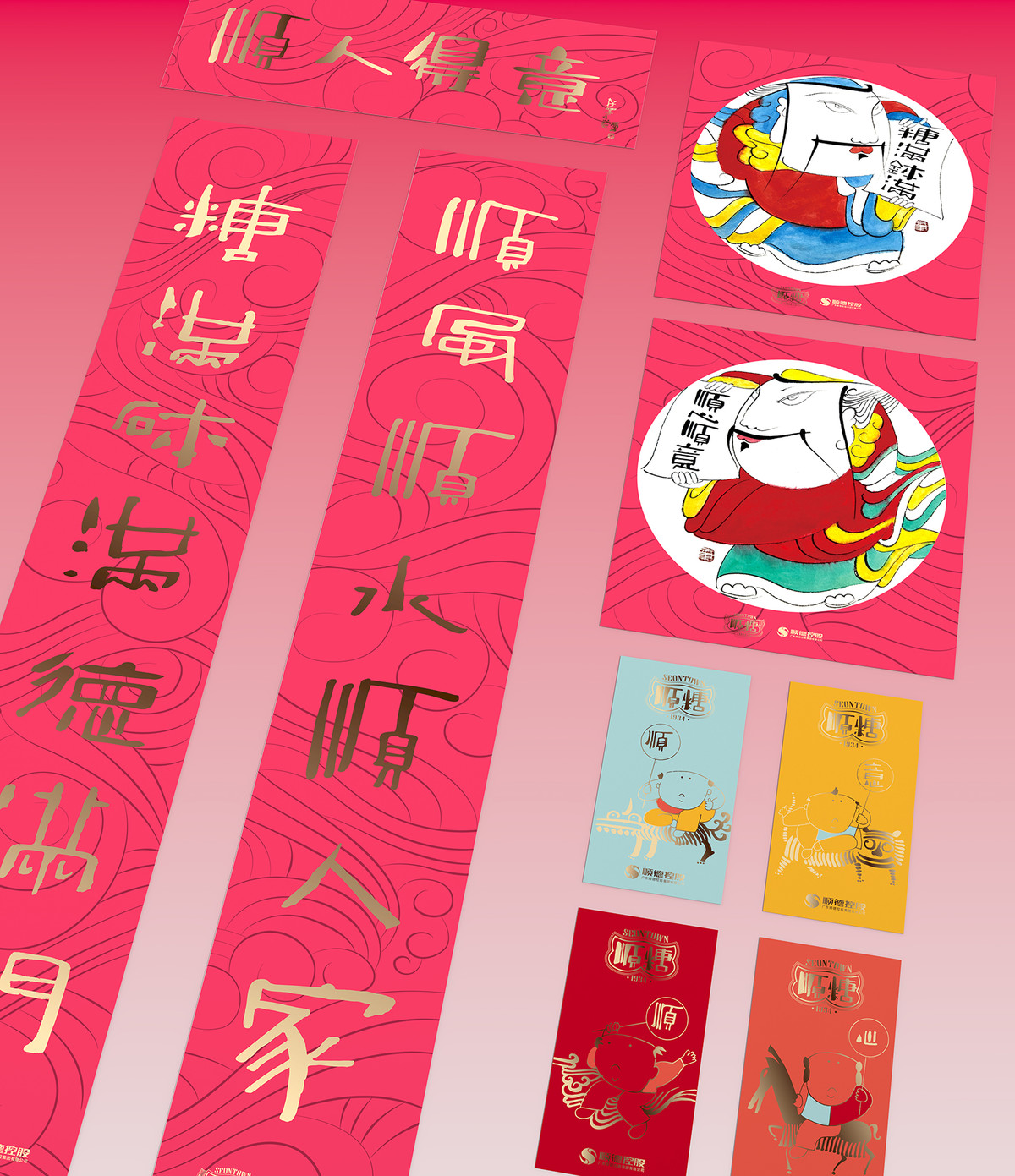
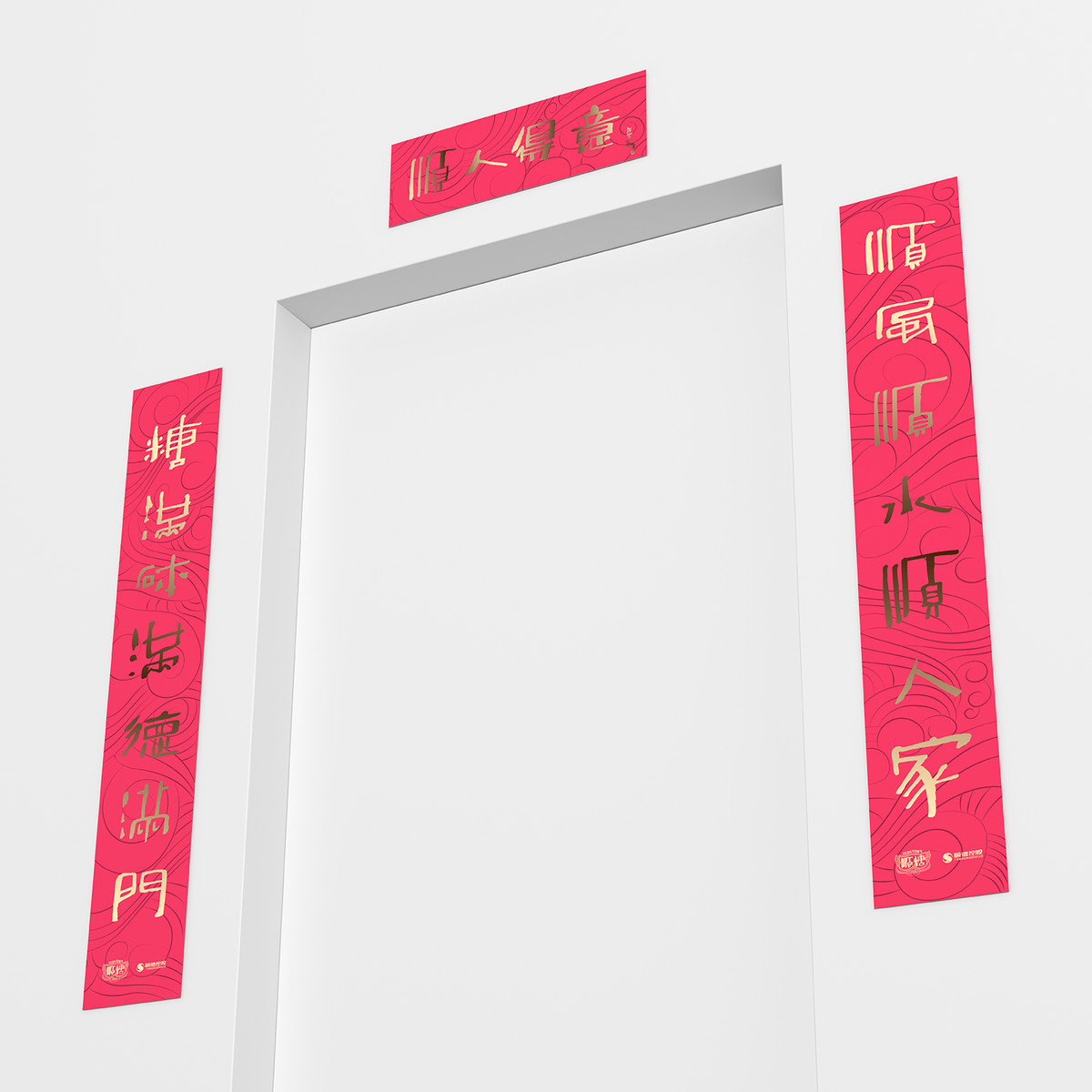
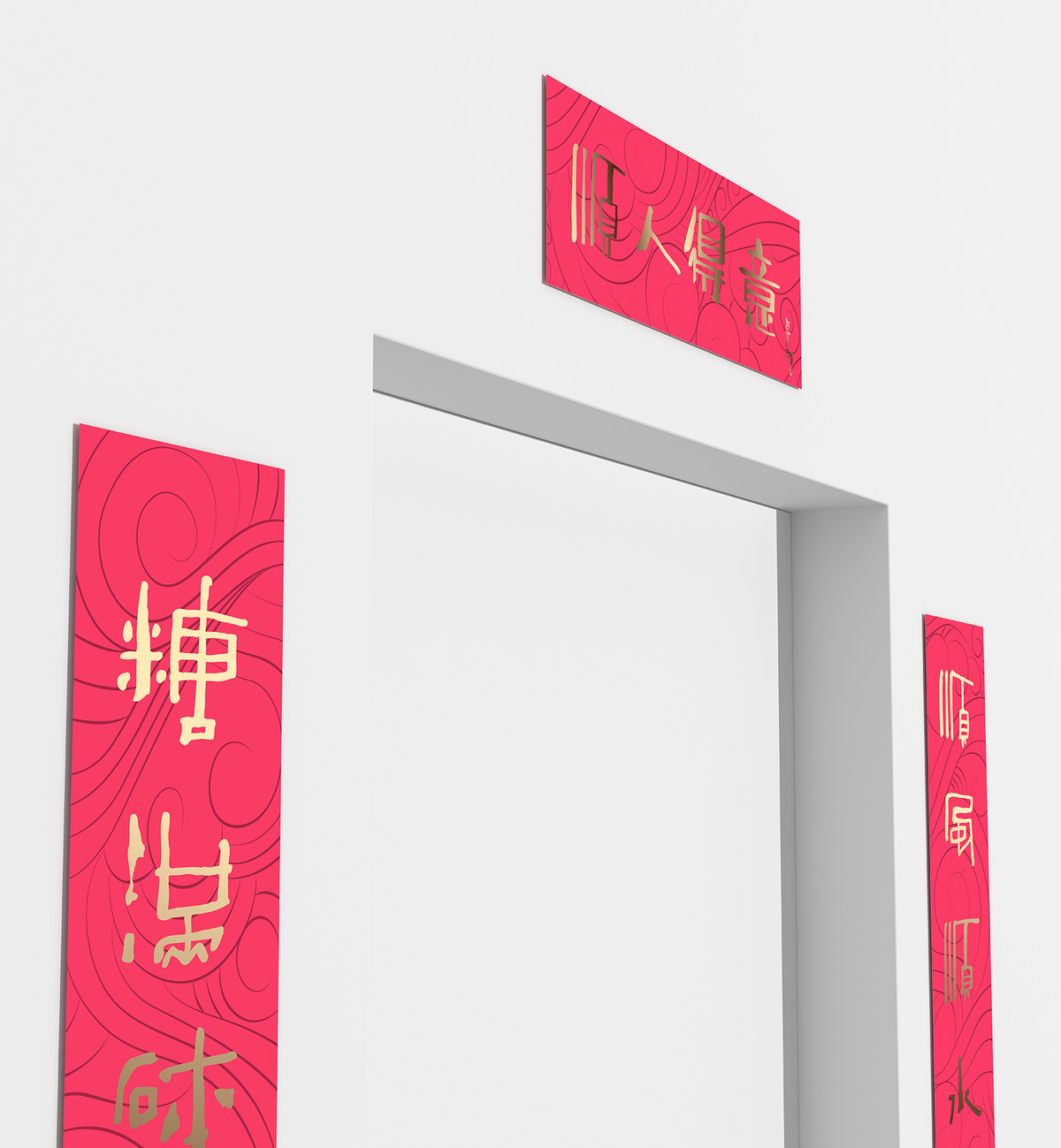
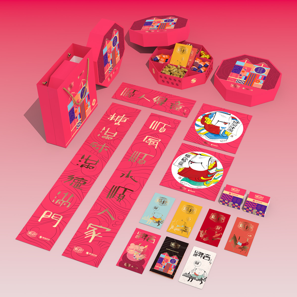
基於上述要求,我們重新調整了理念,以糖廠標誌性的人字形廠房為靈感,設計了新的禮盒造型。禮盒現採用側開式設計,內部分為兩層:上層是立體畫裝飾,描繪熱鬧的糖果製作場景,呼應糖廠主題,營造出濃郁的節日氣氛; 下層作為「倉庫」,一側放置著由陶瓷大師曾鵬師傅所繪製的賀年揮春、對聯等年貨,另一側是四盒糖果。
When entering phase 2 of the development, the client adjusted their planning to account for the time sensitivity of holiday gifts. Consequently, they decided to consolidate the original three gift boxes into one and pool resources in order to achieve optimal outcomes. With the launch of their first product, they aspirated that Seontown 1934 will firmly establish itself as a representative brand for Shunde Sugar Factory's cultural promotion in consumers' minds.
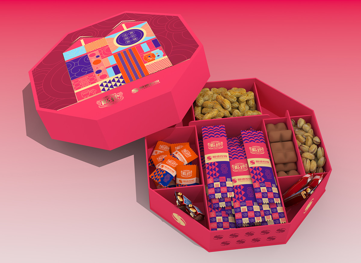
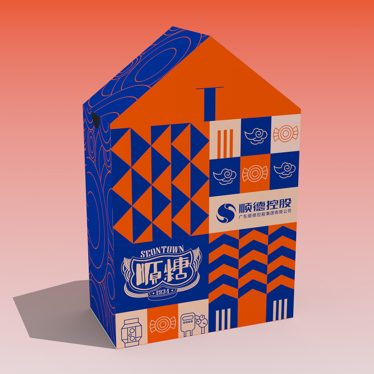
Based on the aforementioned requirements, we have readjusted our concept and designed a new gift box shape inspired by the iconic building with double triangle roof of the sugar factory. The gift box now features a side-opening design with a two-layer interior: the upper layer showcases paper decorations depicting the lively candy-making scene, which echoes the theme of the sugar factory and creates a strong festive atmosphere; while the lower layer functions as a storage area, containing four boxes of candies and the couplet set created by famous ceramic master Zeng Peng.
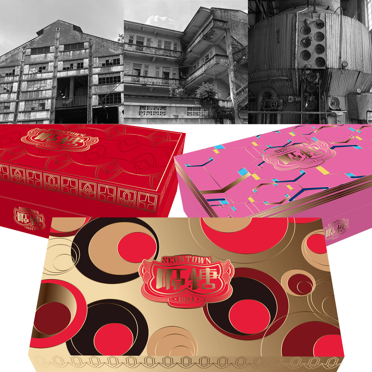
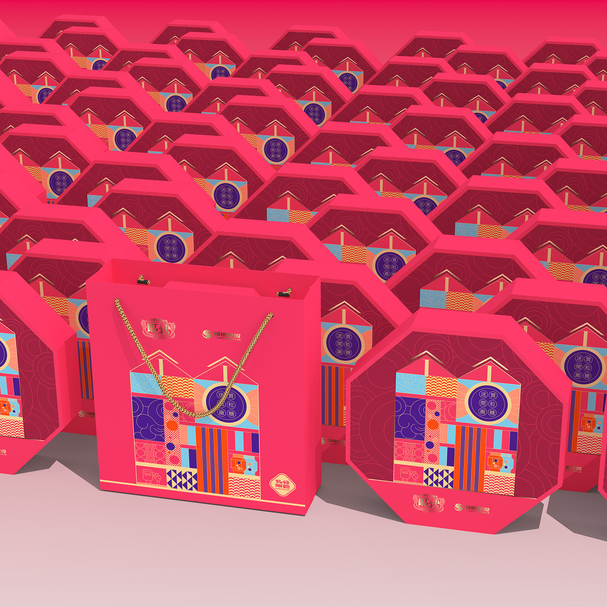
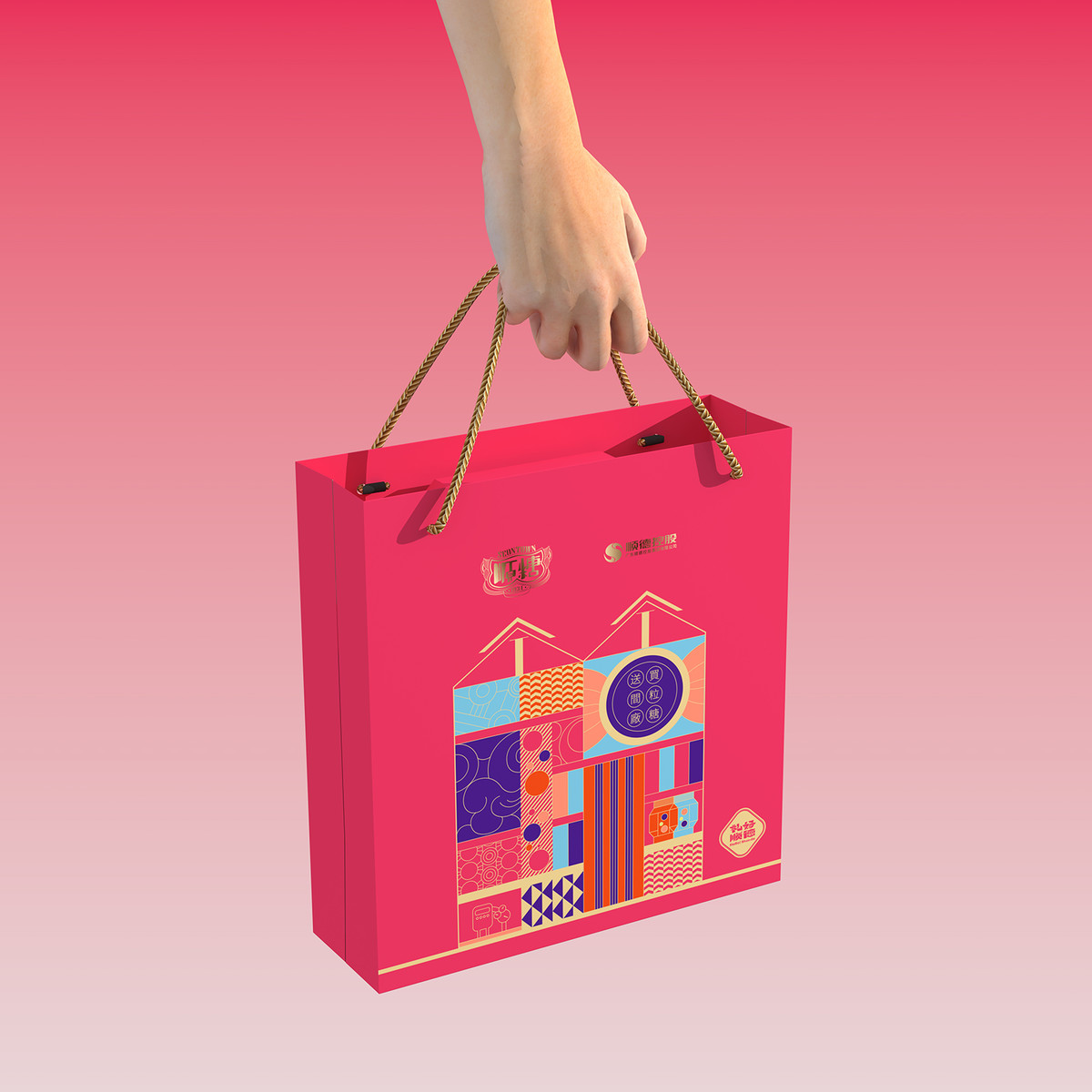
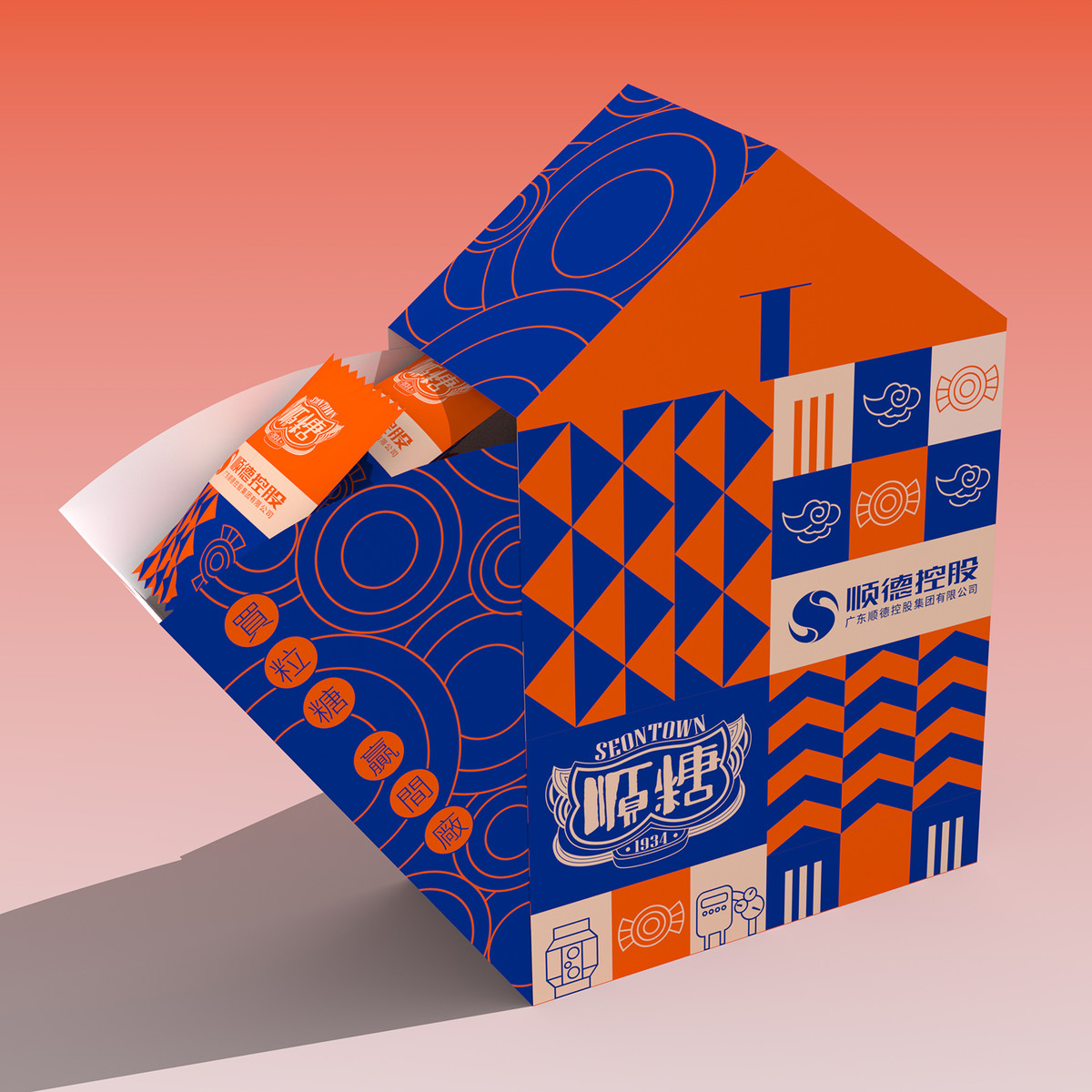
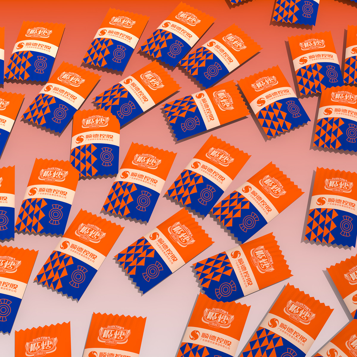
Phase 3:既是禮盒,也是糖果盒 A gift box, as well as a candy box.
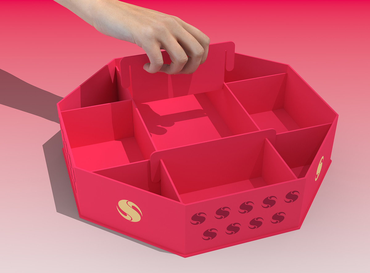
客戶再次修改了產品方案,並表示希望設計更加精簡。此外,他們也提出了新的要求:增加禮盒在取走內容物後的實用性,可轉變為賀年糖果盒,符合當今減廢和可持續應用的環保理念。
這個要求讓人想起我們幾年前為中國大酒店設計利是封時引入的「角色轉換」概念,旨在賦予利是封新的用途,防止浪費。禮盒改造成糖果盒,在外觀上較易處理,只需要採用糖果盒的典型造型語言——例如將八角錦盒的形狀套用到禮盒上,便能讓大部分用戶從觀念上接受它作為糖果盒使用。
The client once again revised the product plan and expressed a desire for a more streamlined design of the gift box. Additionally, they put forth a new requirement: to create the utility of the gift box after the contents are taken away, transforming it into a New Year candy box that aligns with today's environmental concept of waste reduction and sustainable applications.
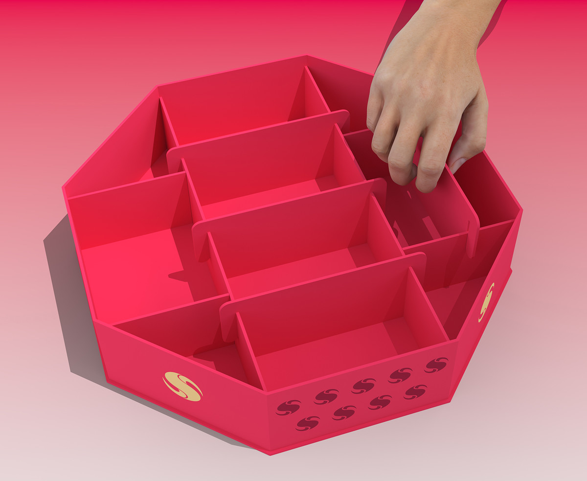
The requirement is reminiscent of the "role conversion" concept we introduced during the design of red envelopes for China Hotel a few years ago, aiming to prevent waste by imbuing them with new utility. The gift box is transformed into a candy box, which is easier to handle in terms of appearance. We simply need to adopt the typical styling language of the candy box, such as opting for the shape of an octagonal brocade box and applying it, thereby ensuring that most users perceive it as a candy box based on its concept.
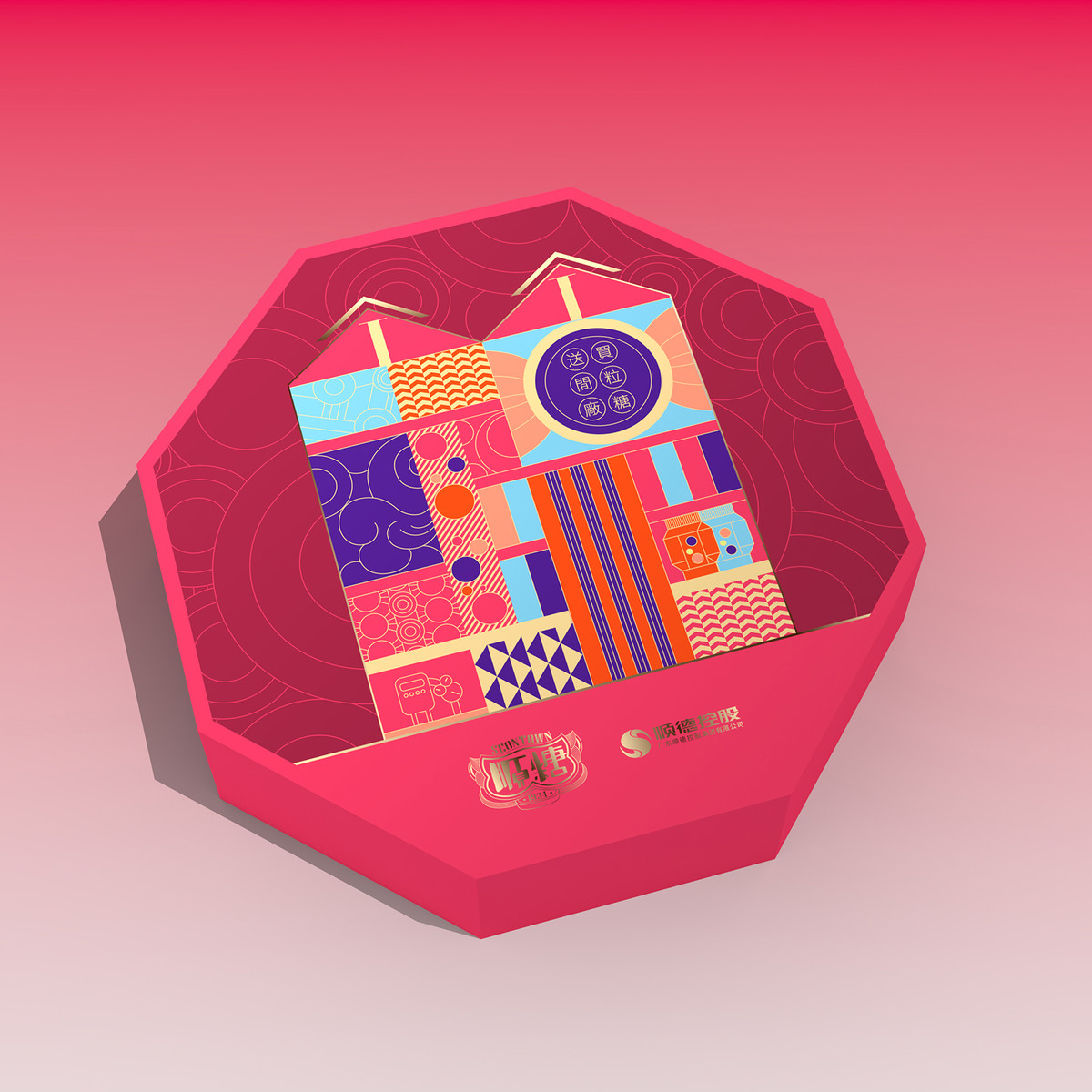
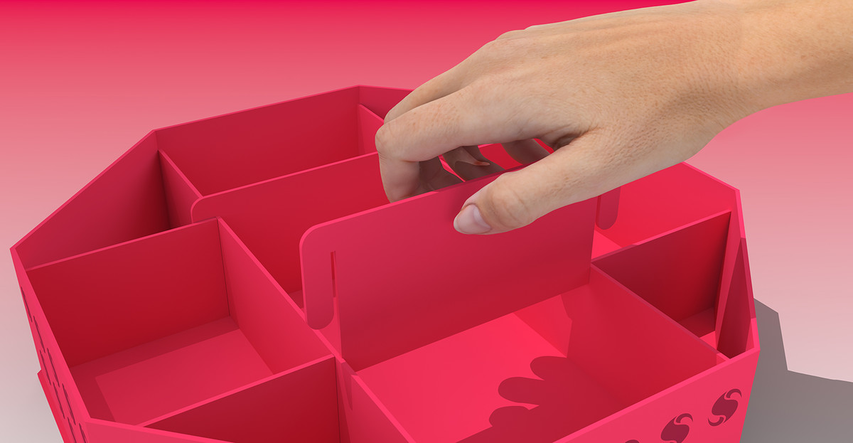
相對地,內部結構在這個設計中起著關鍵作用,因為它需要容納年貨紙品的最大寬度。 因此,禮盒內部的橫向分格擋板被一分為三,中間部分採用了可拆卸的設計。當禮盒過渡到糖果盒功能時,由用戶自行安裝這些組件。此時,整個設計方向就變得清晰明了。 我們乾脆額外提供多一組擋板,讓用戶根據自己的喜好靈活佈置糖果盒分區。
這個看似簡單且微小的改變,卻對生產產生了重大影響。由於橫向隔間擋板被分成三部分,影響了傳統的支撐原理,因此必須與製造商進行討論,設計出一種新穎的粘合方法,才最終實現這一獨特的成品。
On the contrary, the internal structure plays a pivotal role in this design, as it needs to accommodate couplets with their maximum width. Hence, the horizontal partition baffle inside the gift box is divided into three sections, with a removable design implemented for the middle part. When transitioning to the candy box function, users will install these components by themselves. Now, the entire design direction becomes lucid and straightforward. We provide an additional set of baffles to empower users to flexibly arrange candy box partitions according to their preferences.
The seemingly straightforward and minor alteration has had a significant impact on production. Due to the division of the transverse partition baffle into three parts, which affected the conventional support principle, it was imperative to engage in discussions with the manufacturer, devise a novel bonding method, and ultimately achieve successful realization of this distinctive finished product.

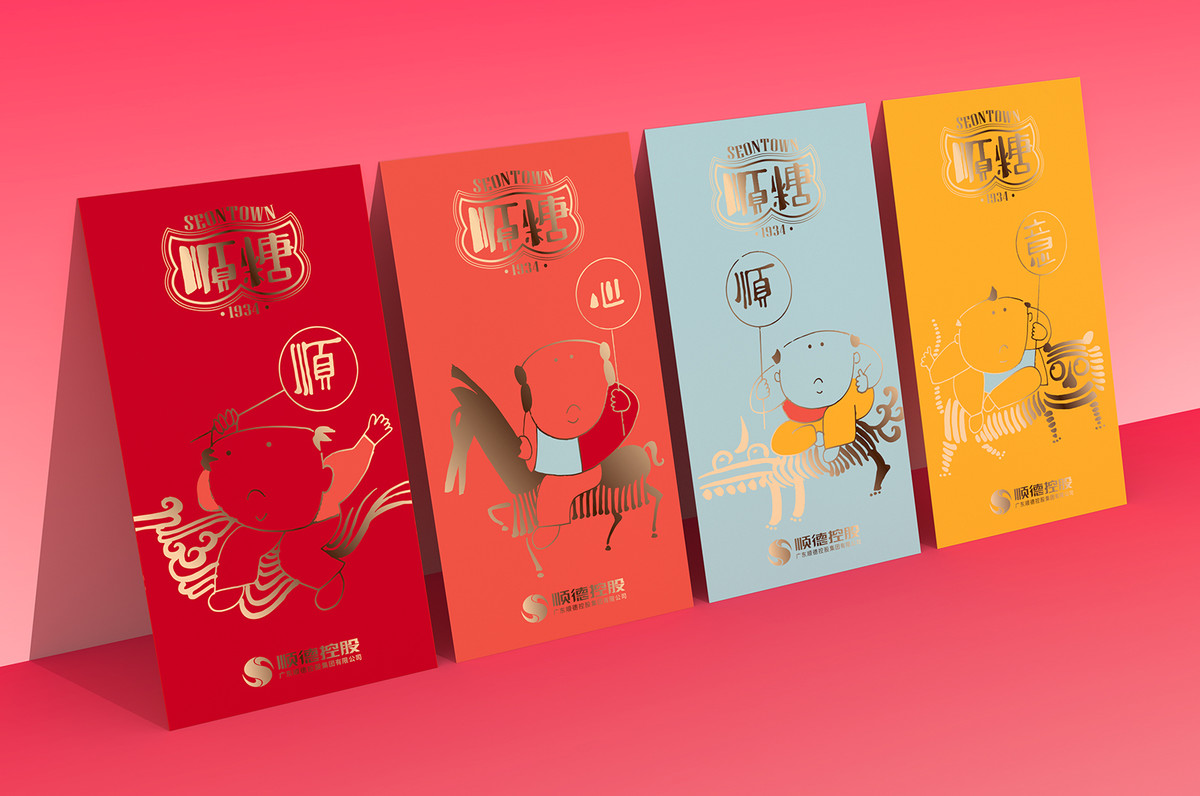
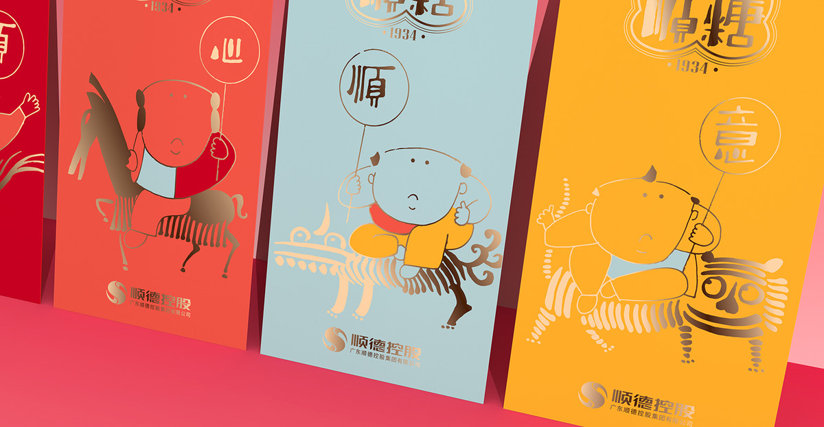
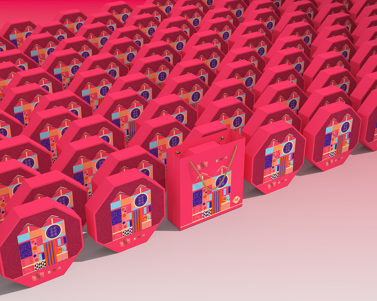
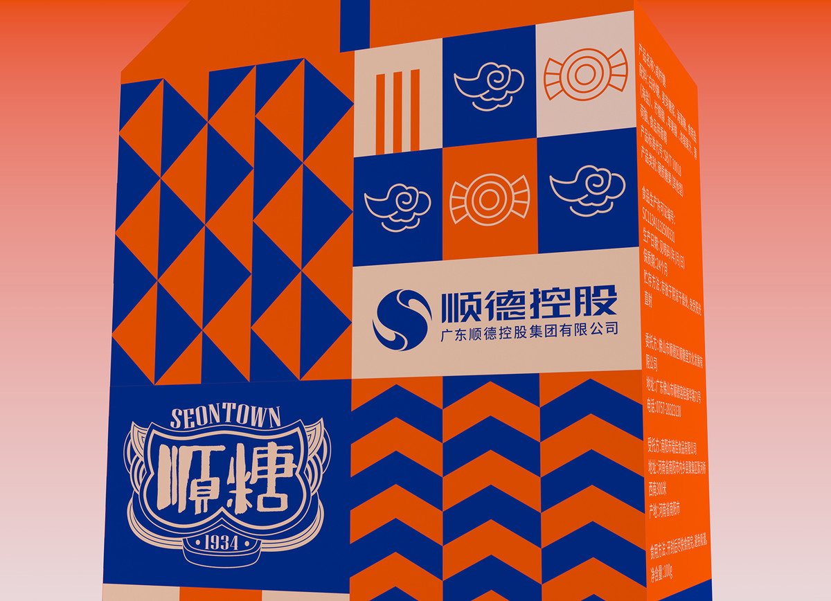
廠房的概念仍有保留,並轉化為另一件伴手禮的包裝設計,作為順糖 1934的品牌推廣之用。
The idea inspired by the factory building isn’t wasted and incorporated into the package design of another souvenir item, serving for Seontown 1934’s brand promotion.

Continue Reading 延伸閱讀:
. 順糖1934 視覺識別設計 Visual Identity of Seontown 1934
. 顺糖1934 | 把顺德故事讲给世界听