

隆重登场 Grand Debut
隆重登场 Grand Debut
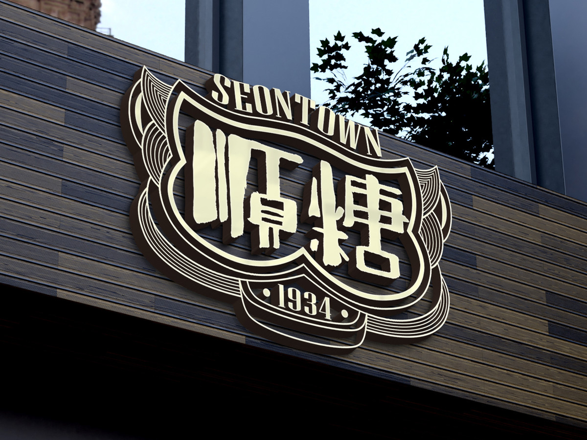
順糖1934 視覺識別設計
Visual Identity of Seontown 1934
CLIENT : 廣東順德順糖里文化創意有限公司
PROJECT SERVICE : Visual Branding
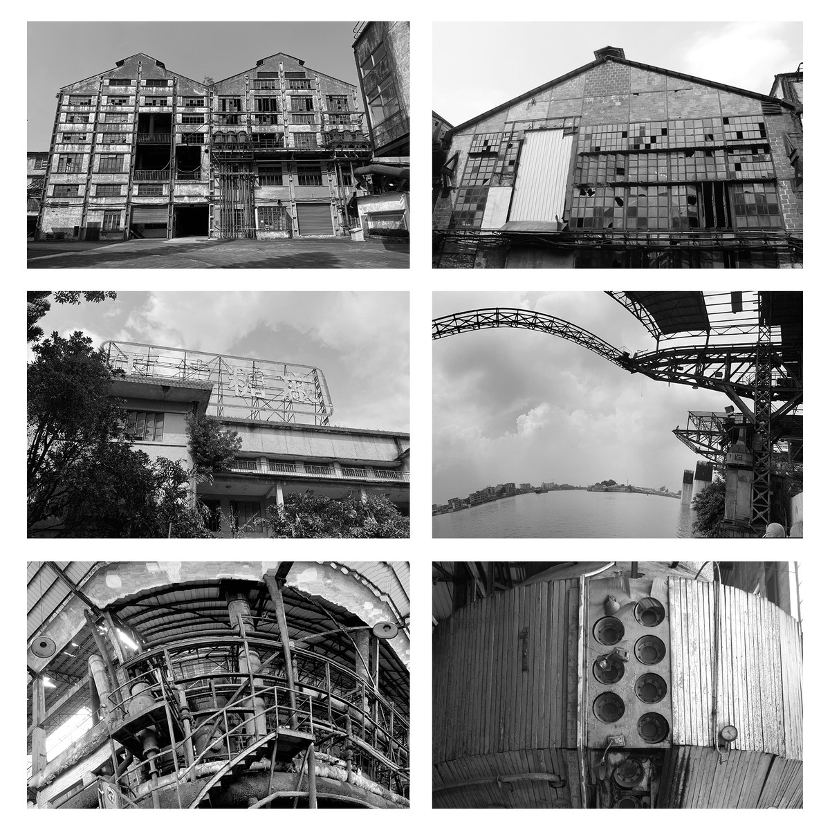
順德糖廠建於1934年,是中國現代化糖廠的先驅之一。 它見證了中國製糖業和廣東現代工業發展的歷史軌跡,是順德人的集體回憶。 作為順德糖廠旗下的新興文化品牌,「順糖1934」深植於順德深厚的文化底蘊。 其核心價值圍繞著「順德甜蜜味道」和「順德百年工業發展」,透過多元化的紀念品和文化產品體現順德人民所珍視的獨特生活方式和飲食文化。
The Shunde Sugar Factory, established in 1934, stands as one of China's pioneering modern sugar factories. It bears witness to the historical trajectory of China's sugar industry and the development of Guangdong's modern industrial sector. As an emerging cultural brand affiliated with the Shunde Sugar Factory, "Seontown 1934" is deeply rooted in this rich cultural heritage. Its core values revolve around "Shunde Sweet Taste" and "Shunde Centennial Industrial Development," which are exemplified through a diverse range of souvenirs and cultural products that showcase the distinctive lifestyle and dietary culture cherished by the people of Shunde.
收到順糖1934的視覺識別設計委託,對方希望既能保留順德糖廠豐富的歷史所沉澱的悠久感覺,同時吸引現代消費者並避免顯得過時。 我們選擇了「隆重登场」作為品牌的基調。 在當今這資訊豐富的時代,品牌需要強烈的存在感。 「登場」一詞不僅意味著開幕,也代表了顧客看到標誌的每一個瞬間,留下持久的視覺印象。
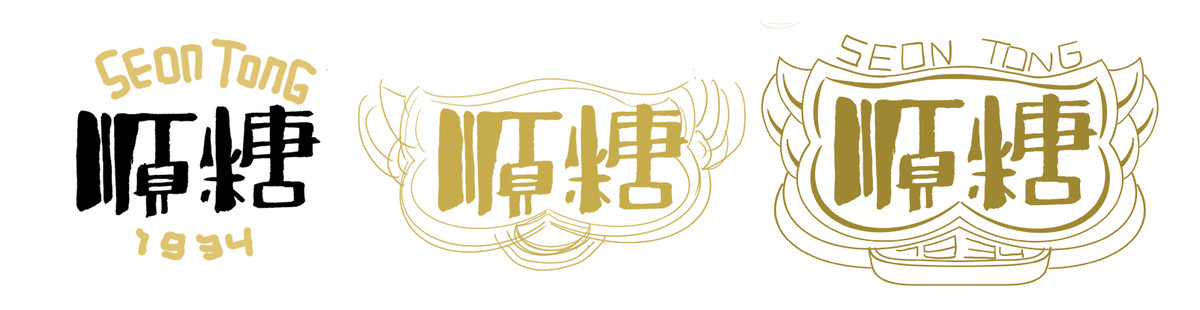
設計過程堪比烹飪創作。鮮明的基調就像是確定菜餚風味的基礎,然後專注於「食材」的搭配,即添加相應的設計元素。
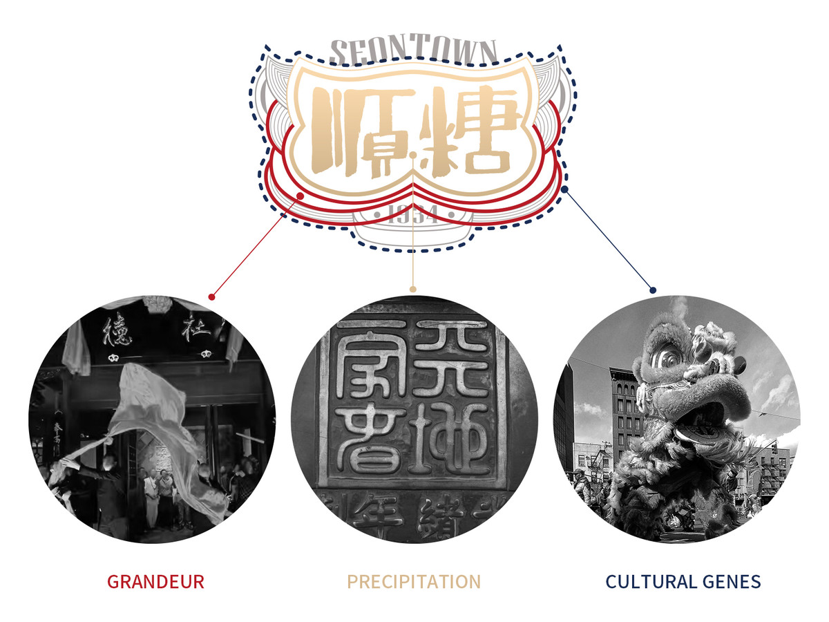
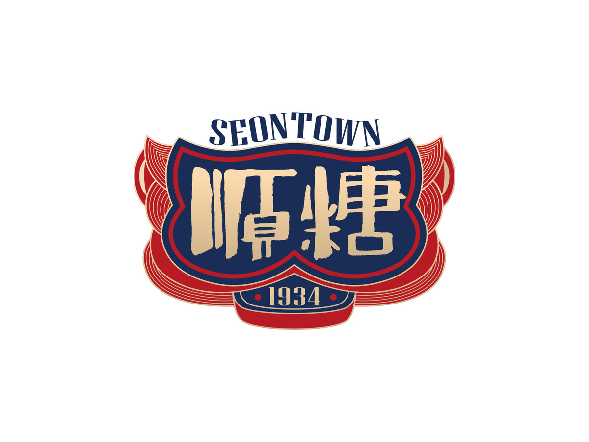
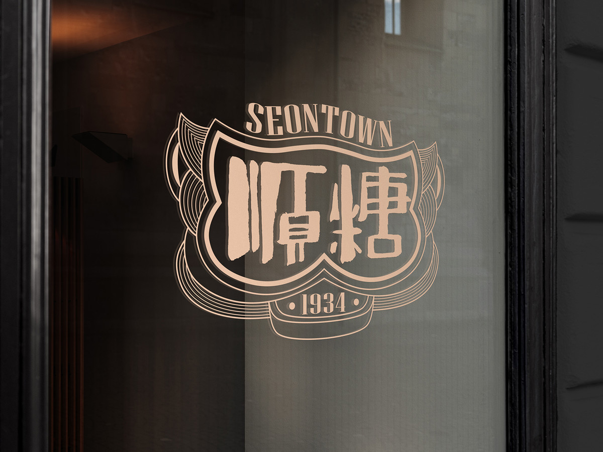
第一步,「沉澱感」:傳統老字號會有很多的印章印鑑,我們將此概括成造型語言放到設計當中,結合陶瓷大師曾鵬師傅筆下「順糖」二字,雙得益章。
第二步,「隆重感」:根據傳統,在品牌開業之前,其名稱會隱藏在一塊覆蓋在牌匾上的紅布下面。 我們將這種儀式感融入設計元素中,值此營造品牌的隆重感。
第三步,「文化基因」:標誌的輪廓靈感源自雄偉的醒獅頭,不僅象徵著「隆重登場」的基調,也體現了華南深厚的文化底蘊和力量與活力的內涵,為品牌形象注入動力。
Receiving the visual identity commission from Seontown 1934, we aim to preserve the rich history of Shunde Sugar Factory while also appealing to modern consumers and avoiding obsolescence. We have chosen "Grand Debut" as the brand's tone. In today's information age, a strong presence is essential. The term "Debut" not only signifies an opening but also represents every moment when customers encounter the logo, leaving a lasting visual impression.
The design process is comparable to the culinary creation. A distinct tone is like the foundation for determining the flavor of the dish, then focusing on the match of the "ingredients", that is, adding the corresponding design elements.
First, "Precipitation": The traditional brands have seals,which we have incorporated into a cohesive design language along with the characters "順糖" calligraphed by ceramics master Zeng Peng.
Second, "The Grandeur Sensation": According to tradition, prior to the opening of a brand, its name is concealed beneath a red cloth that drapes over the plaque. We have incorporated this sense of ritual as a design element to evoke an sense of grandeur for the brand.
Third, "Cultural Genes": The logo's outline draws inspiration from the majestic head of a dancing lion, symbolizing not only the tone of "Grand Debut," but also embodying South China's rich cultural heritage and connotations of strength and vitality—infusing the brand image with dynamism.
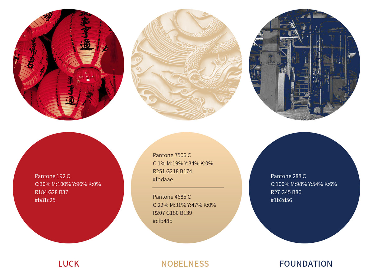
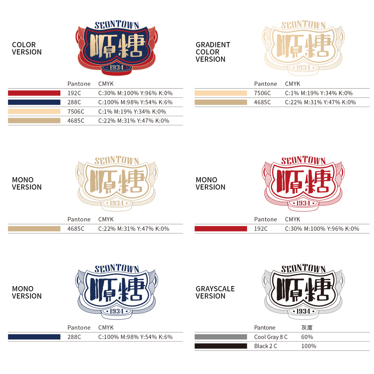
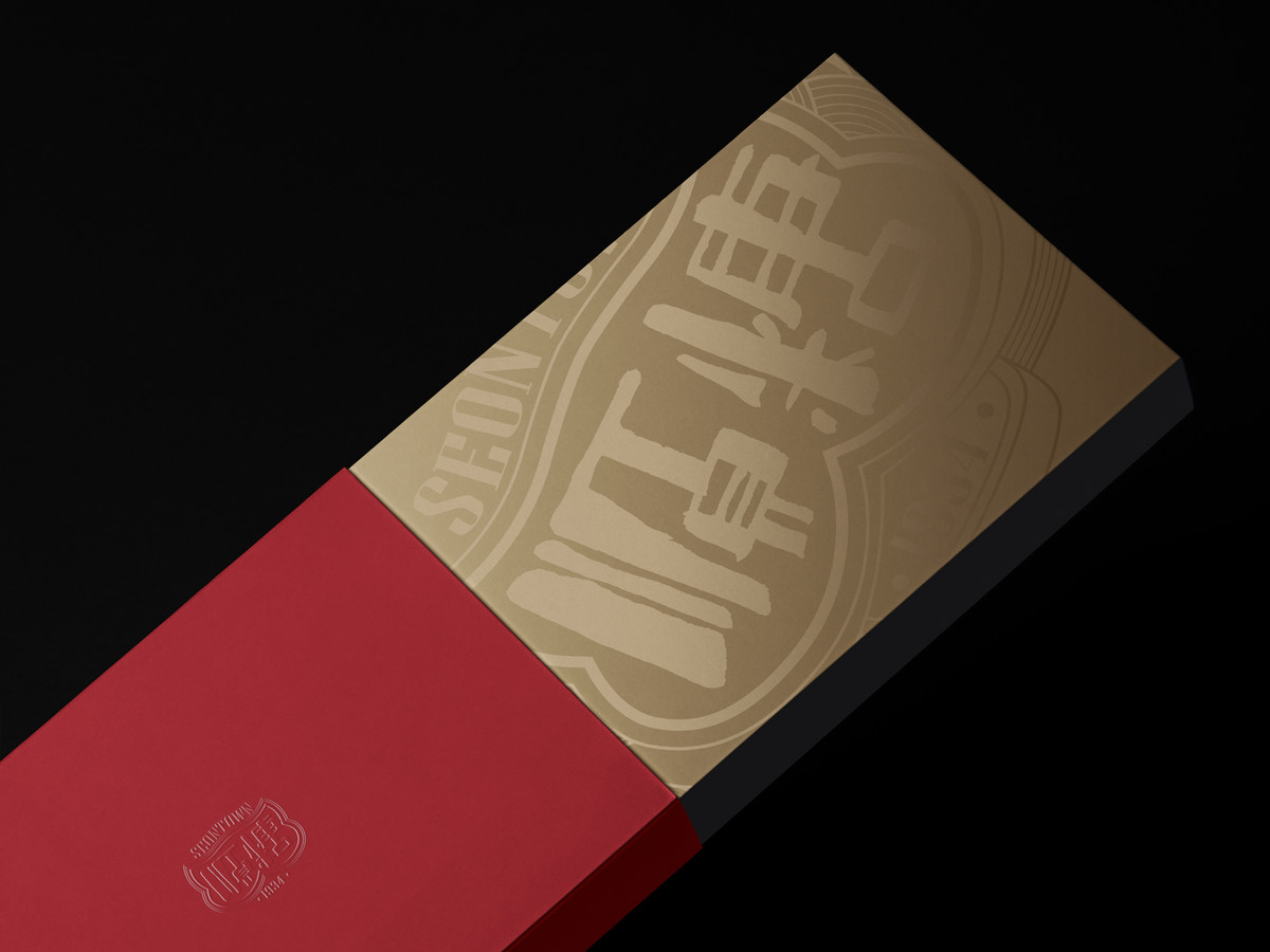
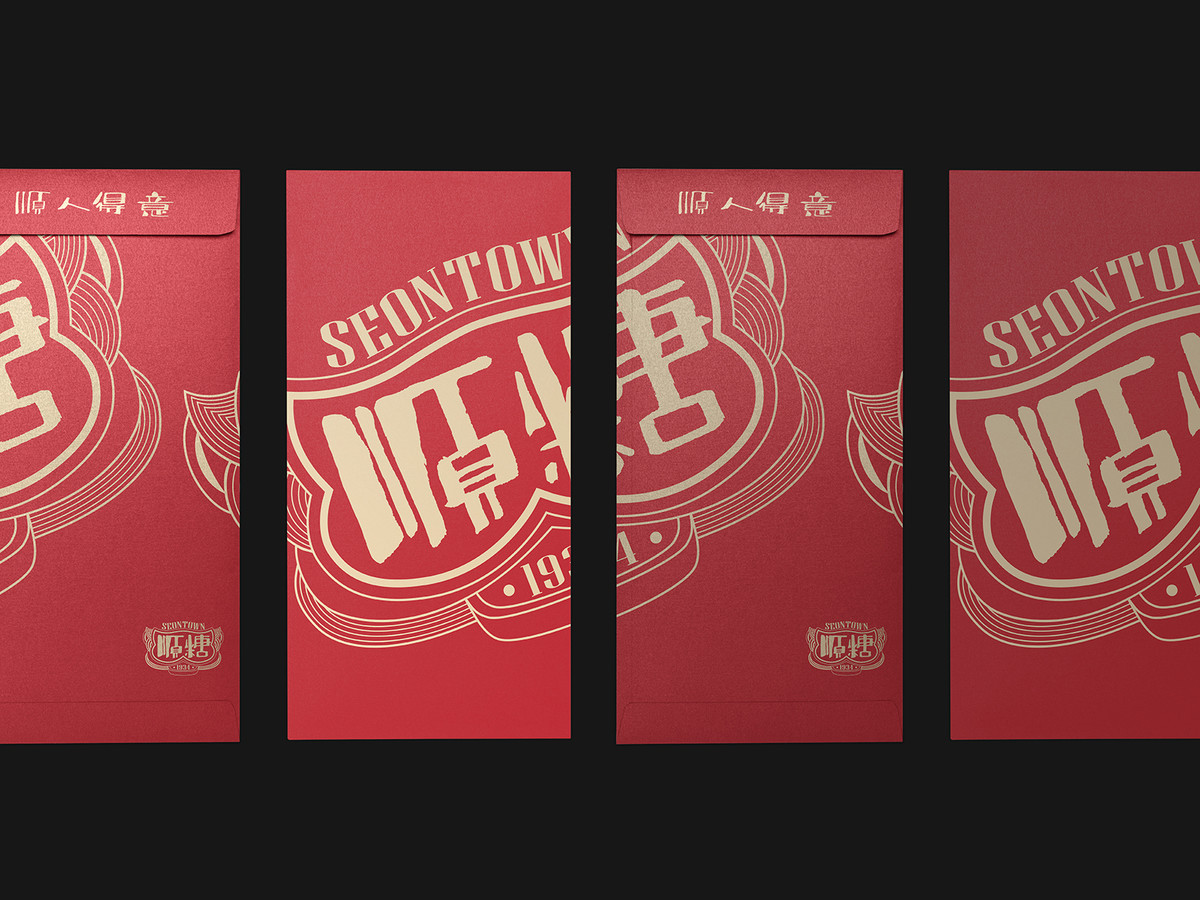
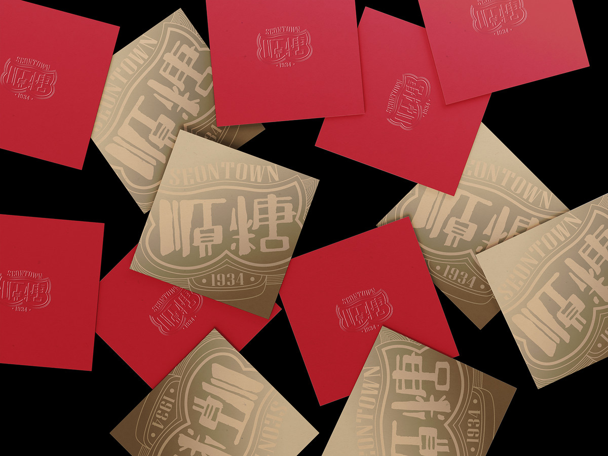
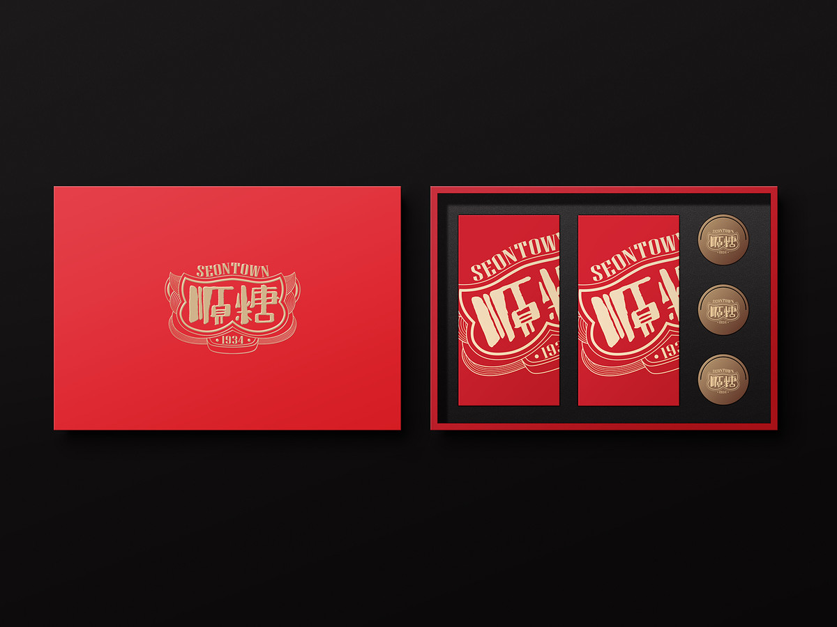
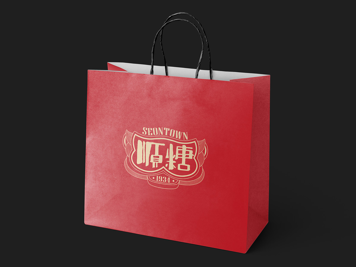
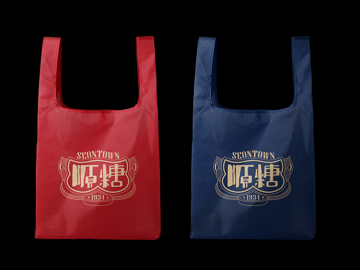
顏色方面,主要色調為紅色和金色,紅色代表喜慶和幸運,金色代表尊貴,這與順糖1934在紀念品和禮品方面的核心業務相一致。 輔以深藍色背景,不僅增強了品牌穩定性,象徵著糖廠的悠久根基,也透過鮮明的對比吸引了視覺注意力。 而且,從色彩心理學的角度來看,藍色一直被視為品牌的可靠選擇。
In terms of color, the primary palette consists of red and gold. Red represents joy and luck, and gold represents nobleness, aligning with their core business in souvenirs and gifts. Complemented by a backdrop of dark blue, this enhances brand stability, signifies the sugar factory's longstanding foundation, and captures visual attention through sharp contrast. Moreover, from the perspective of color psychology, blue has always been regarded as a dependable choice for brands.
Continue Reading 延伸閱讀:
. 顺糖1934 | 把顺德故事讲给世界听