

不設限 No Boundaries
不設限 No Boundaries
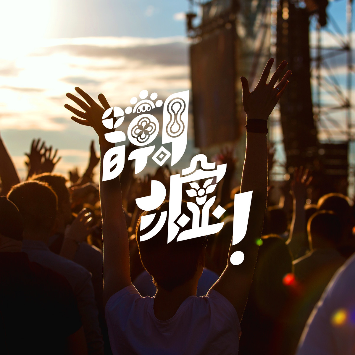
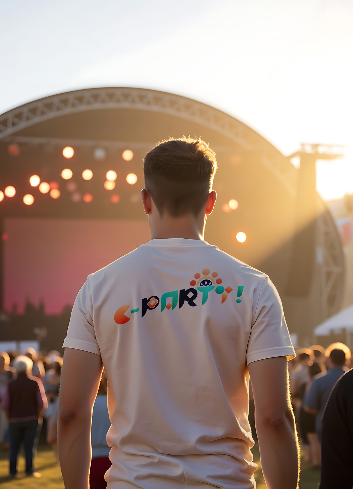
潮墟 C·PARTY 品牌標識設計
Brand Identity System for C·PARTY
CLIENT : 廣州廣電傳媒集團 Guangzhou Broadcasting Media Group
PROJECT SERVICE : Brand Identity Design
「潮墟 C·PARTY」由廣州廣電傳媒集團主辦,致力打造一個融合潮流文化、創意設計與本地生活方式的多元平台。市集匯聚來自各領域的設計師、手作職人、藝術創作者及原創品牌,透過市集形式推動創意產業發展,促進文化交流與社區互動。活動內容涵蓋原創手作、設計產品、音樂演出及特色美食等,吸引大量追求個性與新鮮體驗的年輕族群參與,是城市文化、青年社交與靈感交流的創意節點。
為了令整個「潮墟 C·PARTY」品牌形象更獨立鮮明,我們接受委託,為其設計一套完整的VI系統。
Organized by Guangzhou Broadcasting Media Group, C·PARTY is a cultural initiative aimed at fostering a dynamic platform that blends trend culture, creative design, and local lifestyle. Gathering designers, artisans, artists, and original brands from various fields, the market uses the form of a creative fair to support the development of the cultural and creative industries, promote cultural exchange, and facilitate community interaction. With original crafts, design products, live music, and signature street food, C·PARTY has quickly become a vibrant cultural hotspot for young urban audiences seeking individuality and fresh experiences—a social and creative node for the city’s youth culture.
To give the C·PARTY brand a more distinct and autonomous identity, we were commissioned to develop a complete Visual Identity system.
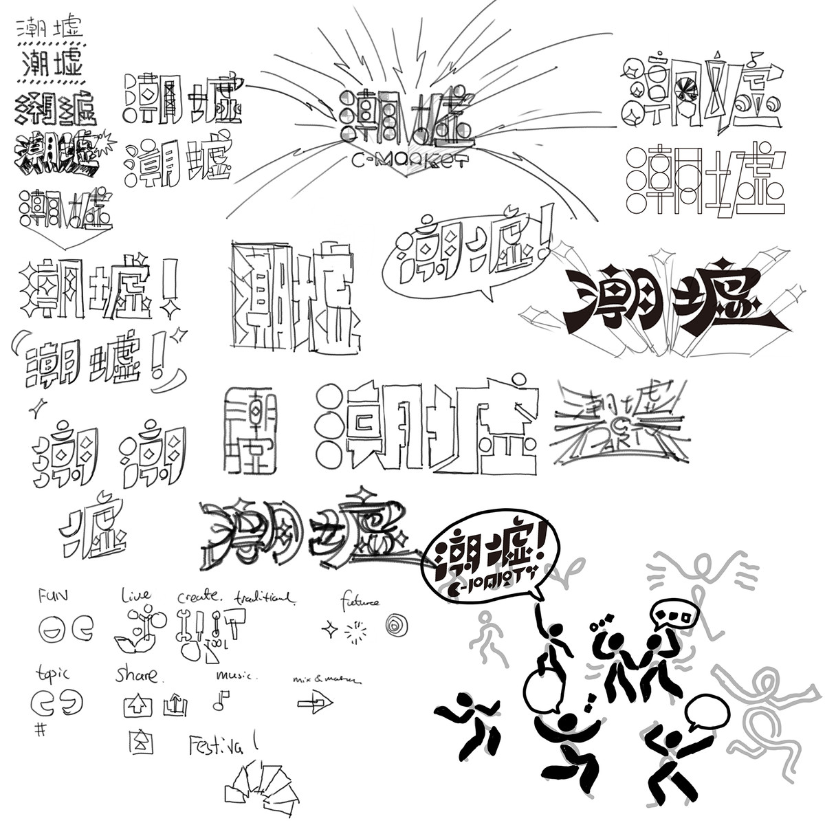
如今創意市集早已不再是新鮮事物。為建立鮮明而持久的印象,我們首先為「潮墟」作出清晰的定義 —— 它並非一個固化的實體品牌,而是一個以策劃活動、推動文化項目的形式持續發展的內容平台,應當多姿多樣具有無限可能性,不要被任何固定概念所定義、某一具體風格所標籤。因此,與其說要設計一個標誌符號,不如說要構建一套能靈活應對各類型活動、風格與內容的識別系統,能為無論是已知抑或未來未知的各種模式活動或業務所用。
「不設限」是我們為「潮墟」所定義的核心概念。
設計之初,我們提煉出一組關鍵詞作為品牌精神指引,包括:Fun 樂趣|Communicate 交流|Lively 生機|Create 創造|Mix & Match 迸發|Tradition 傳統|Share 分享|Music 音樂(特別一提 Music:雖然現階段潮墟未有與音樂直接掛鈎,但在任何與青年文化相關的空間中,音樂皆是不可或缺的情緒載體,亦能靈活以多元形式融入活動場景)。
潮墟就如一場城市青年不定期的social聚會,是一場又一場以創意、生活、文化為主題的派對。雖然每場活動主題、風格可能不同,但「人與人的動態感、活躍的氣氛、快樂的時刻」是潮墟不變的靈魂 —— 亦正是我們本次設計的起點。
Creative fairs are no longer a novelty in today’s landscape. To help C·PARTY stand out and build a lasting impression, we began with a strategic definition: C·PARTY is not a fixed or material brand—it exists as a flexible platform for curating events and driving cultural projects. With that, the visual identity must reflect variety and adaptability, avoiding rigid style associations or fixed aesthetic labels. Rather than designing a single, definitive logo, our goal was to create an identity system that could fluidly adapt to any known or future activity, theme, or form.
“No Boundaries” became our core brand concept.
We first extracted a set of keywords to guide the tone of the design:
Fun|Communicate|Lively|Create|Mix & Match|Tradition|Share|Music
(A note on “Music”: Though not yet a core component of C·PARTY, music is an essential emotional catalyst in any space related to youth culture and can be organically embedded into future experiences.)
C·PARTY is like a recurring city-wide social event for the youth—a series of parties themed around creativity, lifestyle, and culture. While every event may differ in content and style, the essence of “dynamic people, vibrant energy, and joyful moments” remains unchanged. This became the origin of our design concept.
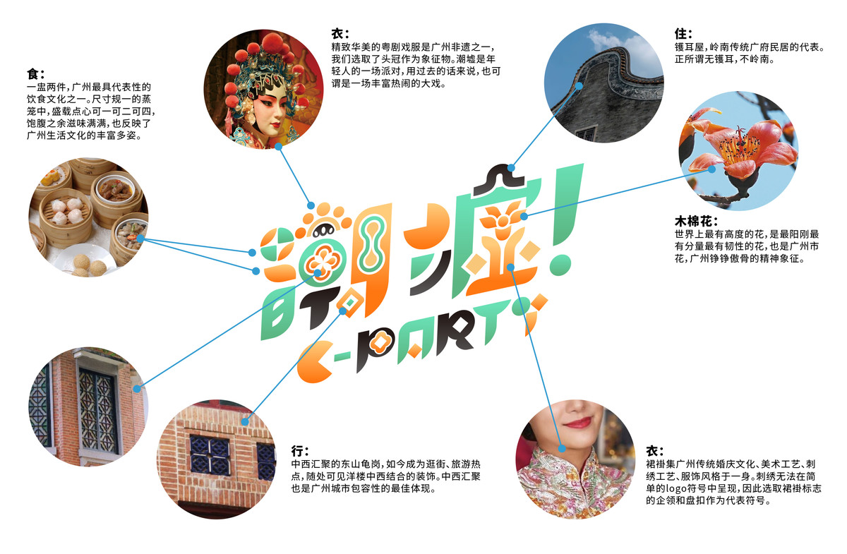
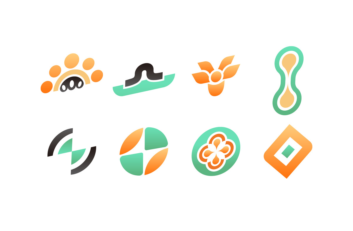
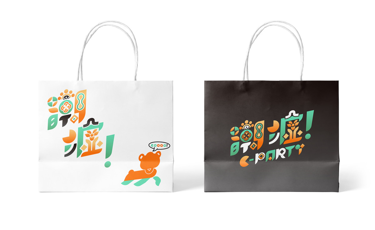
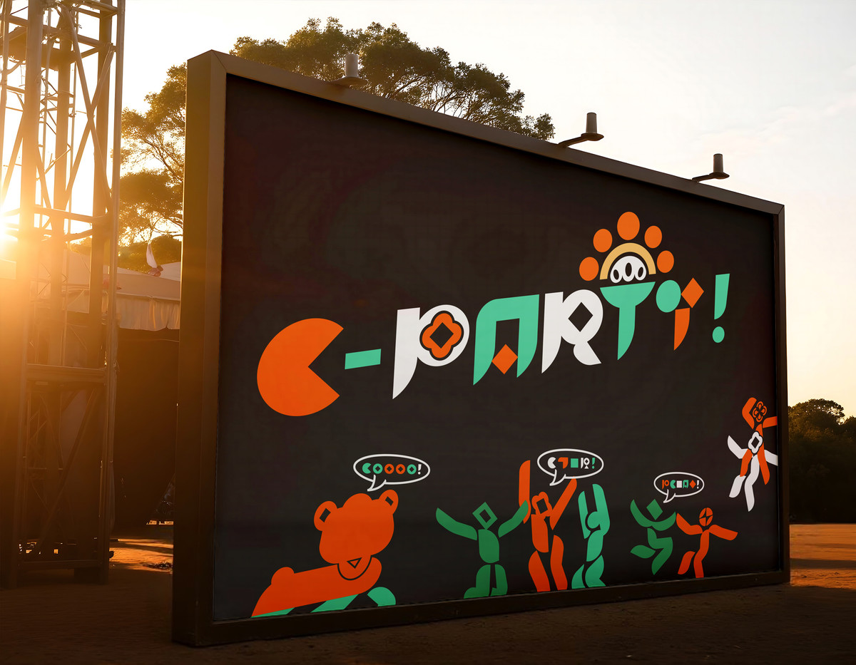
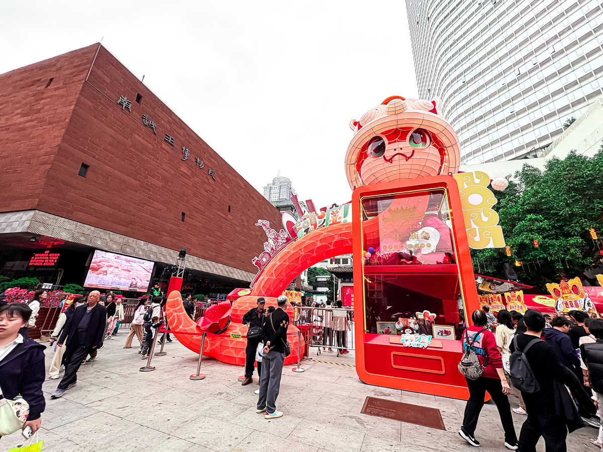
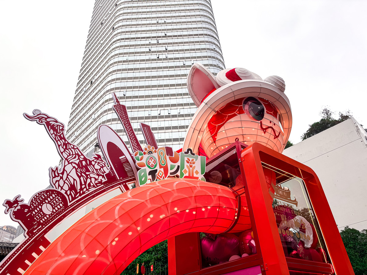
在視覺語言上,我們以簡單圖形為基礎,賦予筆劃鮮明的幾何造型特徵,使其具有高度辨識性與延展性。在此基礎上,為了進一步突顯「潮墟」與廣州的連結,我們從「衣、食、住、行」四個生活層面提煉出地方象徵符號,融入主標誌的筆劃之中,包括帽、飾、碗、公雞碟等具廣府生活特色的元素,為品牌注入在地文化的辨識度與親切感。作為發源地城市,潮墟的未來想必也會朝著成為廣州這城市的名片作為發展方向之一。
Visually, the identity is built from simple graphic components, with each stroke shaped by geometric characteristics for strong recognizability and scalability. To further localize the brand and emphasize its Guangzhou roots, we embedded symbolic icons from four everyday lifestyle aspects—clothing, food, housing, and mobility—into the primary logo’s strokes. These include culturally familiar elements like hats, accessories, rice bowls, and traditional Cantonese tableware. As Guangzhou is the birthplace of C·PARTY, we believe these design touches strengthen its potential to become a local cultural icon.


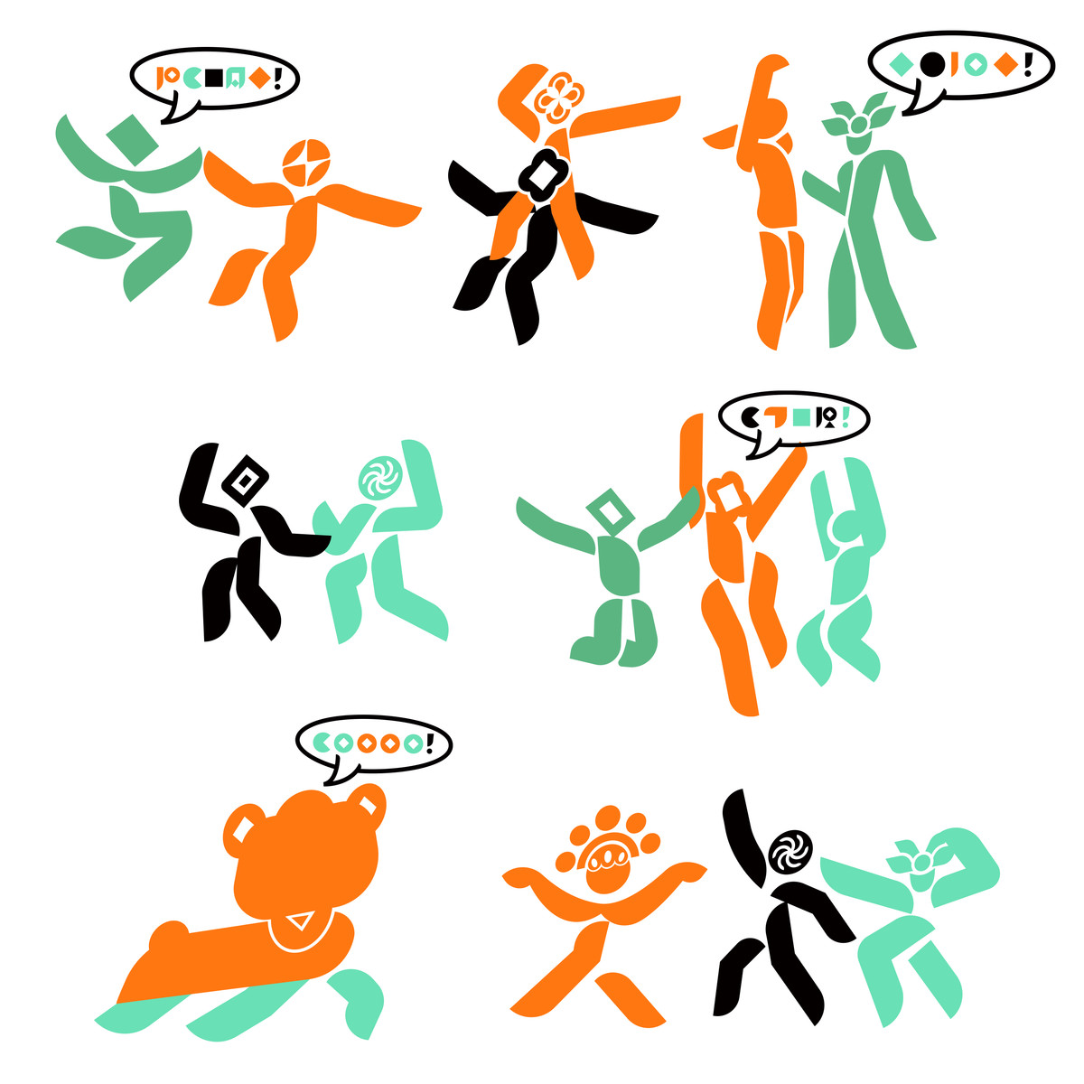
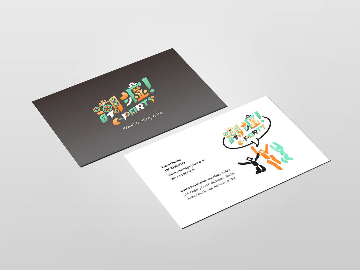
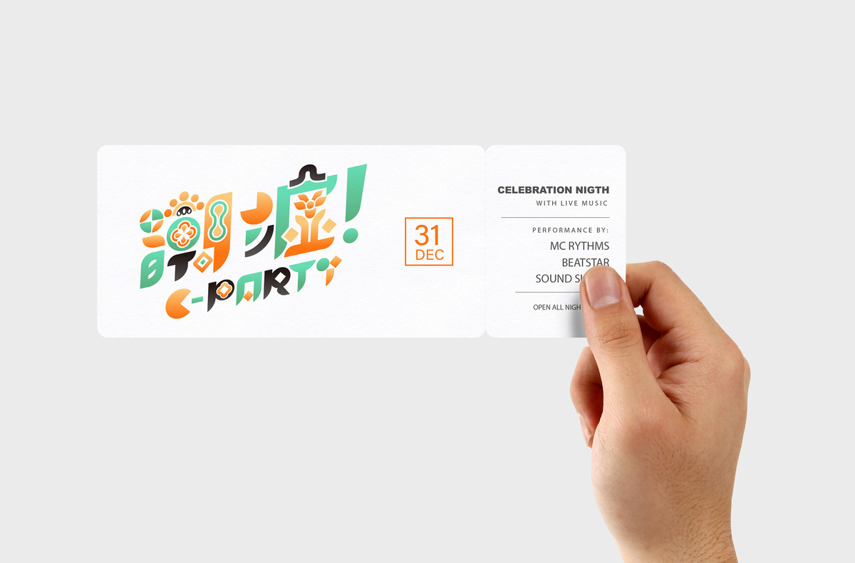
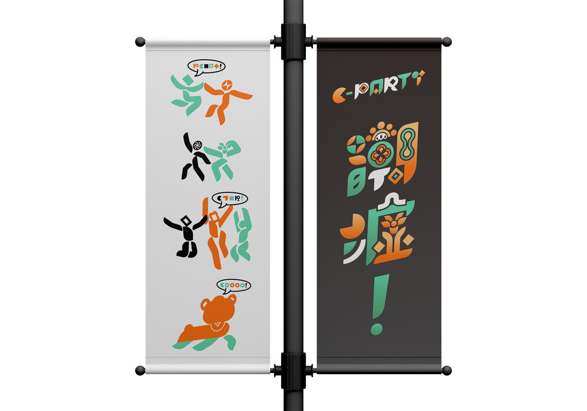
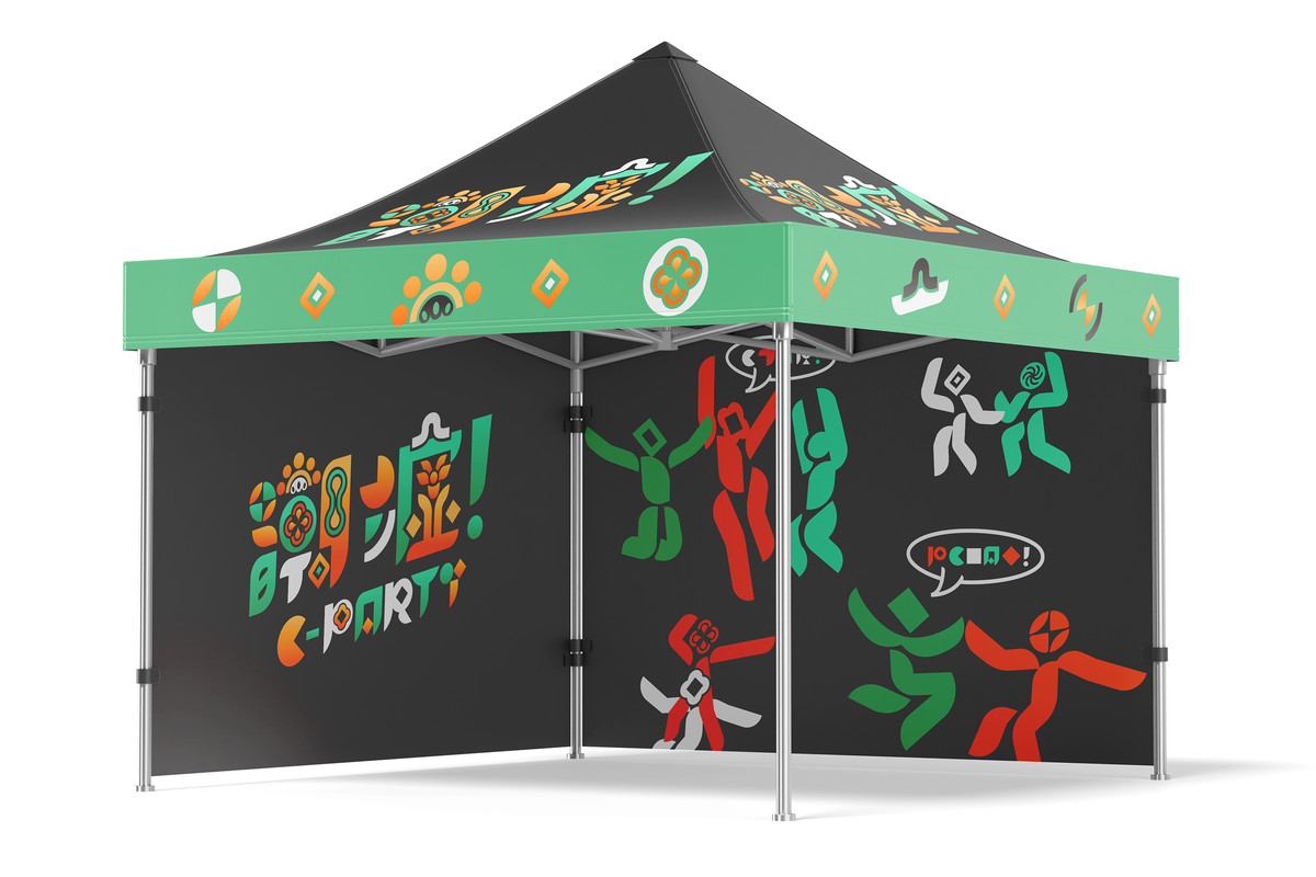
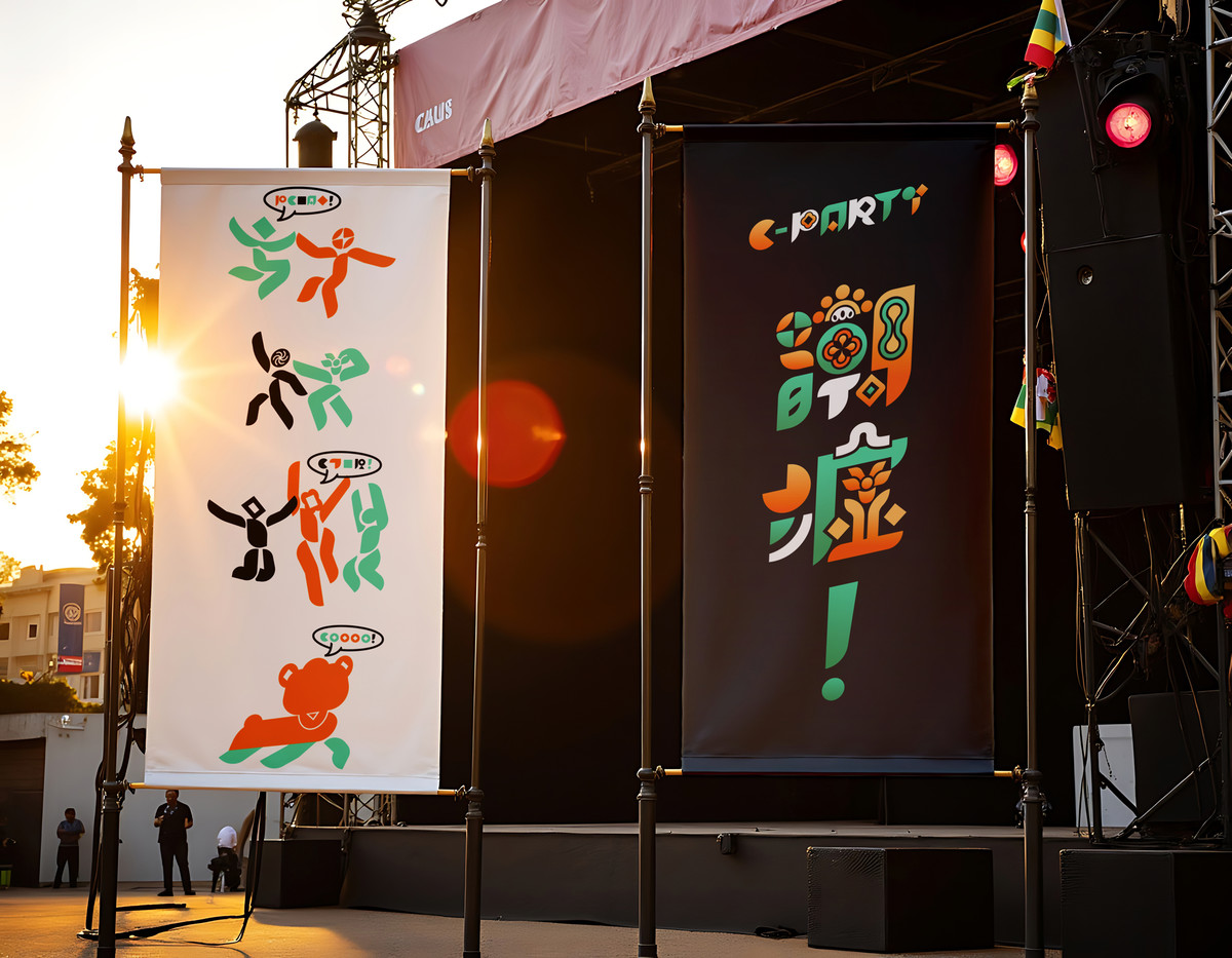
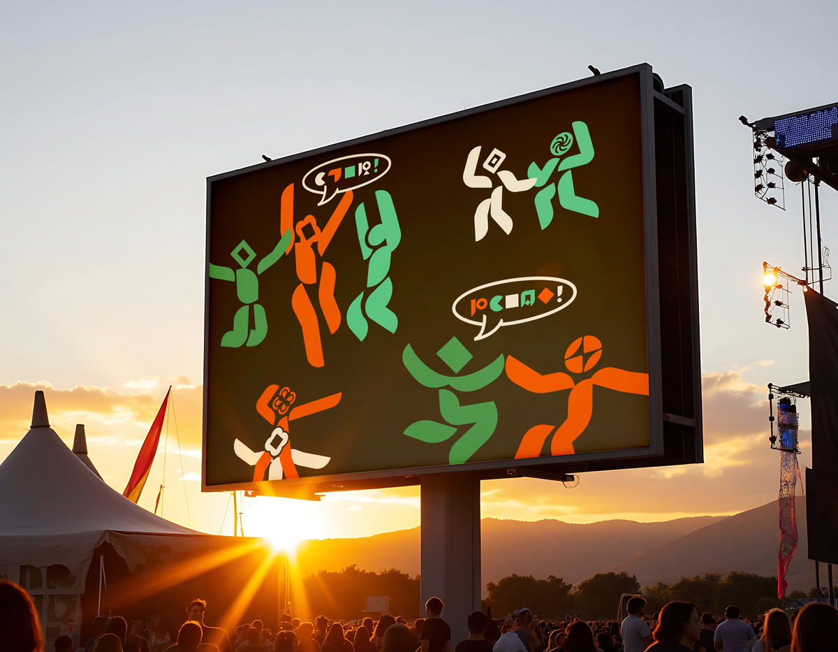
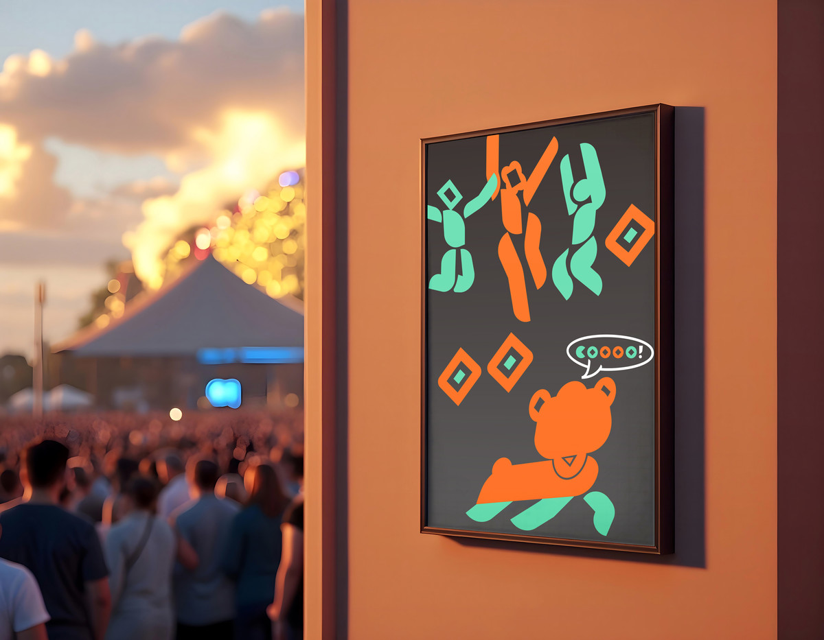
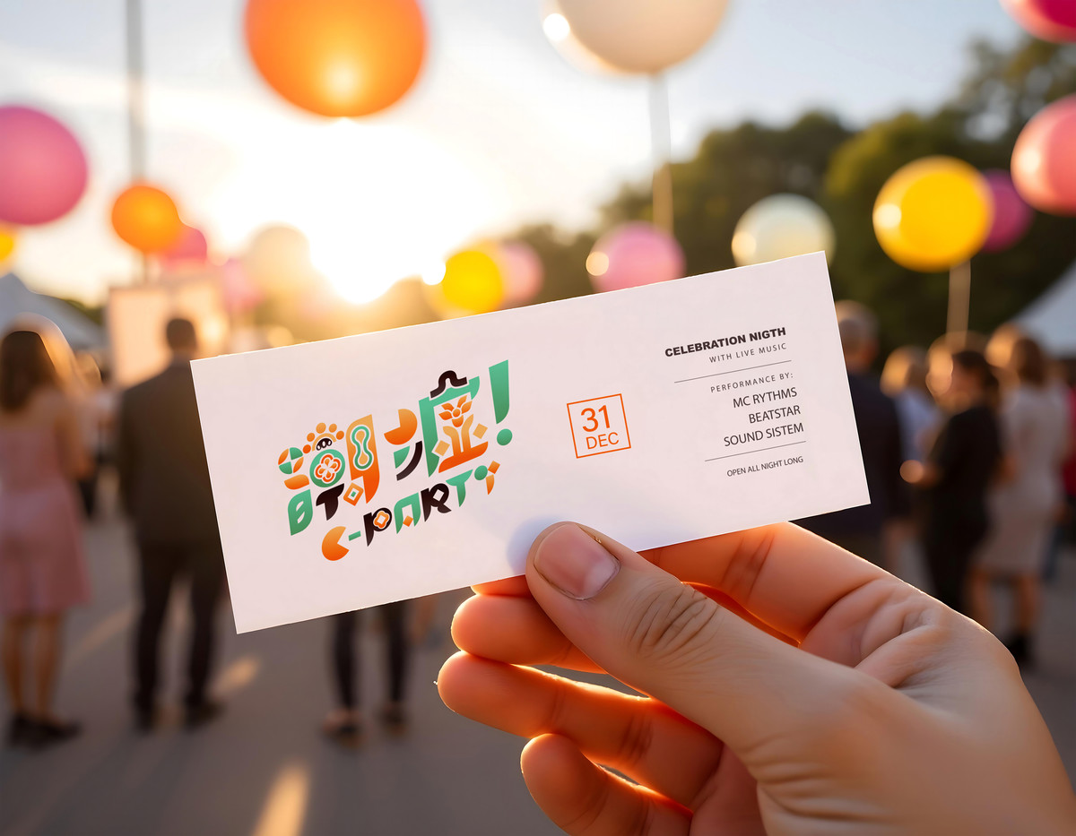
主視覺之外,標誌的每一筆畫都能拆解並組合為輔助圖形,用於各種應用場景。基於此規則,我們設計了一套人物插圖系統,以簡潔幾何造型描繪人物動作、互動與表情,生動呈現「潮墟」的熱鬧氛圍與活力時刻,亦可靈活應用於不同活動主題與周邊物料中。在應用系統上,我們亦為潮墟設計了一套靈活模組,不同的筆劃元素獨自成形,讓主辦方日後在舉辦不同主題活動時能夠自由組合、衍生更多延伸設計,用以應對主視覺、社交貼文、活動頁面、印刷品與周邊產品等多元化應用。
Beyond the main visual, each stroke in the logo can be broken down and recombined into auxiliary graphic elements. We developed a system of character illustrations based on geometric styling, representing various postures, interactions, and expressions. These figures inject warmth, community spirit, and human energy into the brand system while allowing flexible adaptation across event themes and merchandise.On a practical level, we also created a modular visual toolkit where each design element exists as an independent unit. This allows organizers to freely remix and expand upon the visuals when launching new events—be it for key visuals, social media content, event posters, printed matter, or product packaging.
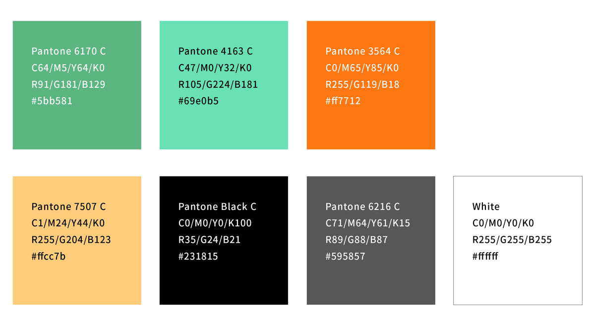
整體色彩策略方面,我們採用鮮明的對比色組合,包括螢光綠、亮橙與深藍,塑造年輕、活力且具有節慶感的主視覺印象,適用於市集帳篷、橫額、門票、地貼、指示牌與舞台屏幕等各類型場景與物料中。
In terms of color, we chose a vivid and energetic palette of neon green, bright orange, and deep blue. This high-contrast combination projects youthfulness, optimism, and festive energy—suitable for use across canopies, tickets, banners, floor graphics, signage, and stage visuals.
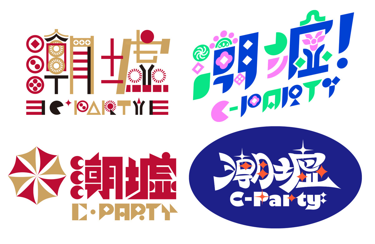
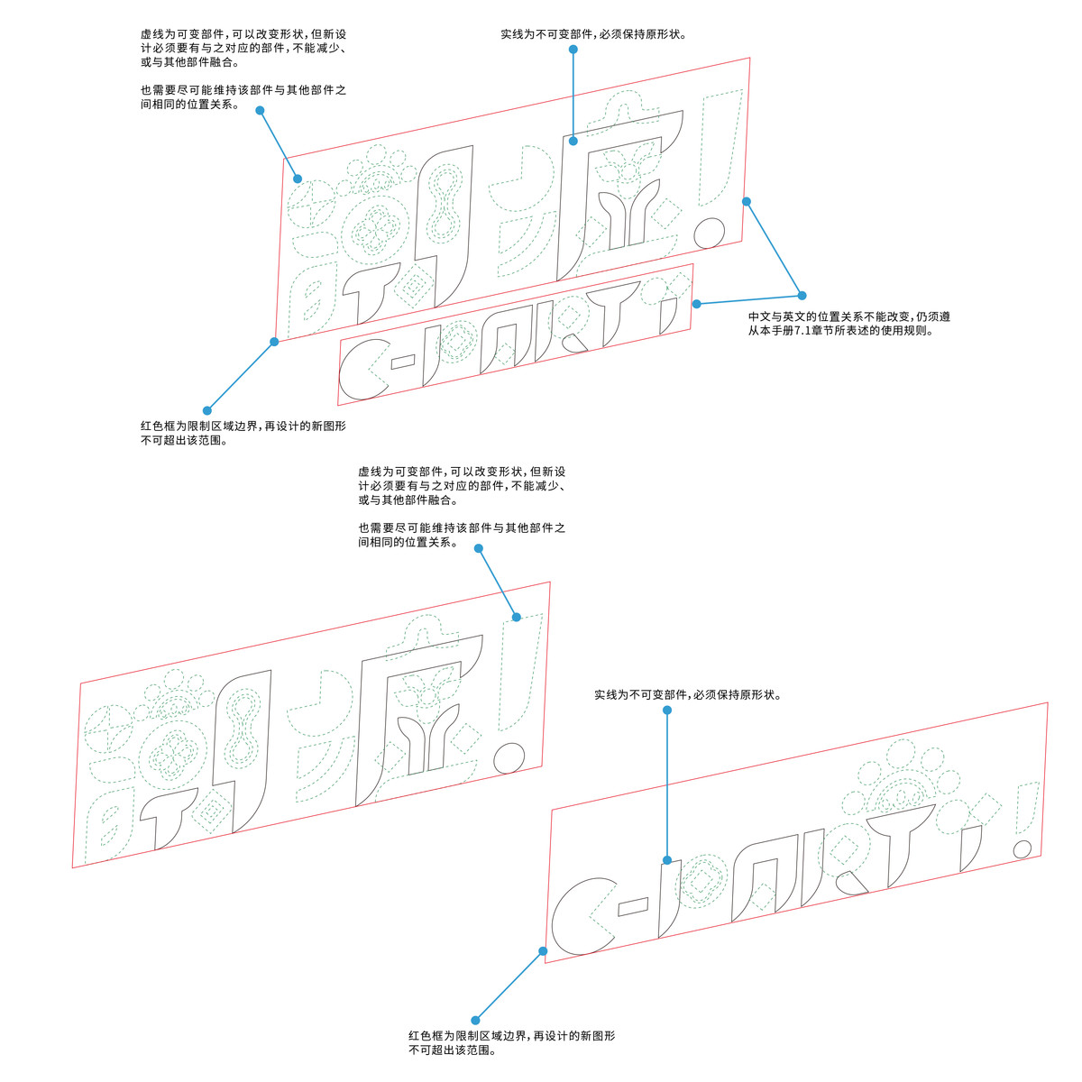
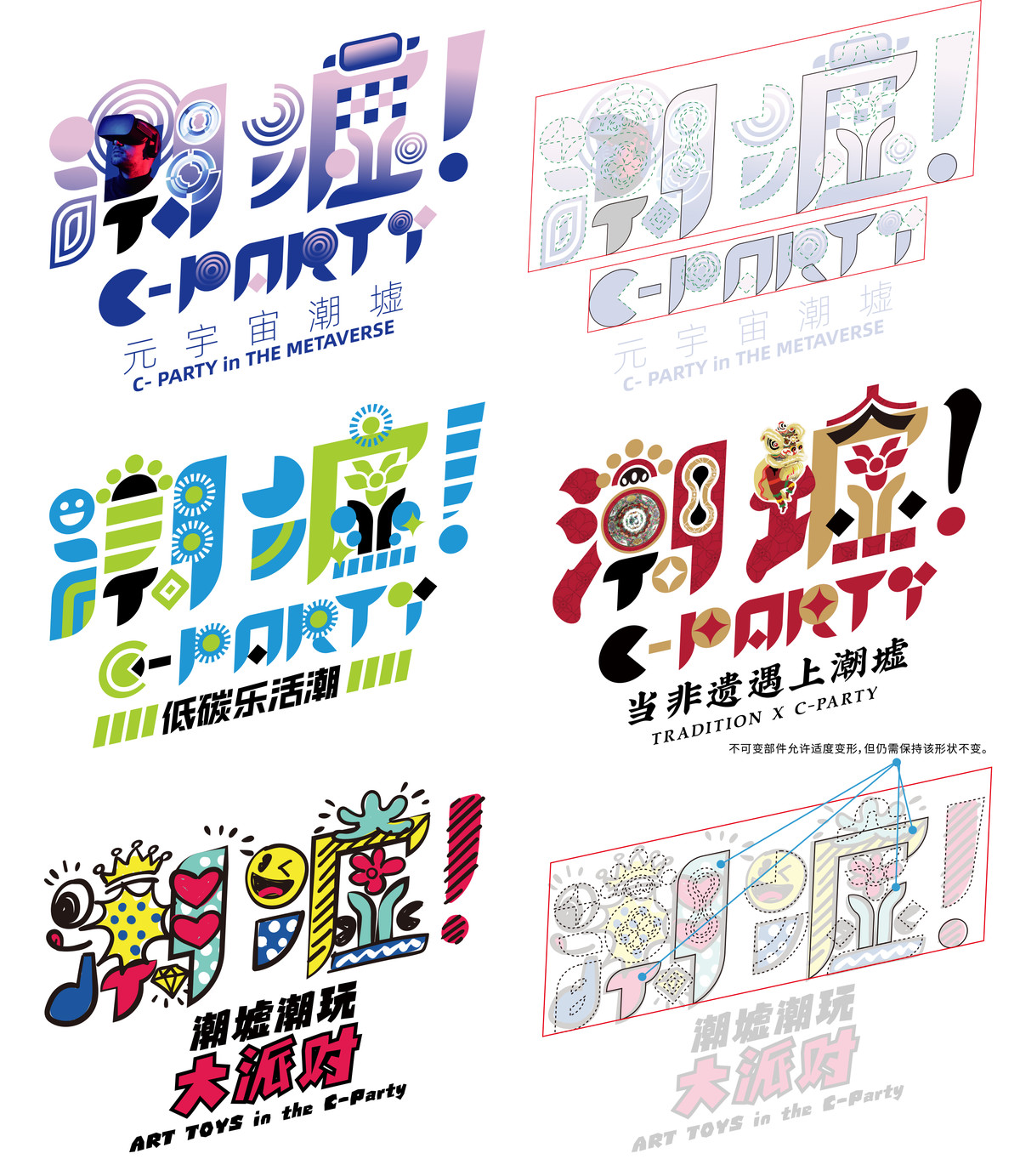
當主標誌的骨架建立後,我們亦進一步延伸開發出一套子Logo系統,能靈活應用於不同主題的活動項目。每一個版本皆依循統一的結構邏輯,透過圖形、配色與細節變化,展現出各自的主題調性,同時又與品牌主體保持視覺血緣關係。這正是我們於設計初期所設定的目標 —— 建構一套具延展性與適應性的視覺標準,讓潮墟在未來面對不同場景與主題時,依然能穩定輸出多樣但一致的品牌形象。
Once the core framework of the main logo was established, we further developed an extended system of sub-logos to adapt to various themed events. Each version follows a consistent structural logic, incorporating visual variations in graphics, colors, and details to reflect different thematic tones—while still maintaining a strong visual connection to the master identity. This approach aligns with our initial design goal: to create a flexible and expandable visual standard that allows C·PARTY to present a diverse yet cohesive brand image across evolving contexts and future applications.
這套VI系統並非為潮墟定義一種「固定」形象,而是構建一個開放的視覺語言平台 —— 能回應變化、容納多元、引發互動。希望透過本次品牌升級,讓「潮墟 C·PARTY」真正成為城市中每一場創意聚會背後的那股熱力,承載青年文化的豐富能量,也不斷為城市注入新鮮靈感。
This VI system does not aim to define a single, static image for C·PARTY, but rather to build an open visual language—one that evolves with the city, embraces diversity, and inspires interaction. Through this brand upgrade, we hope C·PARTY becomes the energy behind every creative gathering in the city—a vehicle for youth expression, cultural dialogue, and new ideas that keep flowing.
Continue Reading 延伸閱讀:
. 广州新春打卡新地标:潮墟“潮兔迎新春·WELCOME兔花城”等你来
. 白天逛潮墟,夜晚看电影,“红棉潮墟”开市活动不断!
. 潮龙出墟,非遗“潮”你走来
返回首頁 RETURN TO MAIN