

文字為本,資訊為橋
Text First, Connection Next
文字為本,資訊為橋
Text First, Connection Next
拾易坊品牌包裝設計
A Packaging Design Strategy for SubYeeFong's Brand Revamp
CLIENT : 拾易坊 Subyeefong
PROJECT SERVICE : Packaging Design
拾易坊(SubYeeFong)為主打中藥養護的香港本土品牌,致力將中醫藥的補養理念融入日常生活產品之中,強調產品具臨床驗證與實效性,並以推廣中醫藥文化為己任,冀讓更多人受惠於中藥的養生智慧。在個人護理市場競爭日趨激烈的背景下,品牌希望為旗下產品形象進行全面更新,期望透過全新設計,擺脫傳統中藥所帶來的陳舊印象,同時清晰地傳遞品牌的核心價值。
在項目展開前,我們首先進行品牌現況分析,務求釐清其設計重點與策略方向。作為一個以中藥為本、聚焦細分市場的本地品牌,拾易坊面對的最大挑戰,在於資源有限,品牌推廣相對受限,故產品包裝在市場上除了承載品牌形象外,更須肩負吸引消費者目光、從貨架中脫穎而出的任務。
SubYeeFong is a Hong Kong brand dedicated to integrating the nourishing philosophy of Chinese herbal care into everyday personal care products. Emphasizing clinically validated efficacy, the brand aims to share the wisdom of Chinese herbal wellness with a wider audience. Amid an increasingly competitive personal care market, the brand sought to refresh its visual identity to shed outdated perceptions of traditional herbal products while clearly communicating its core values.
Before initiating the redesign, we conducted a thorough brand audit to identify key design priorities and strategic direction. As a local, niche-focused brand rooted in Chinese herbal traditions, SubYeeFong faces the challenge of limited resources and constrained promotional reach. As such, product packaging must not only convey the brand image but also function as a powerful visual asset to capture attention and stand out on crowded shelves.
在資訊氾濫的消費環境中,簡約而鮮明的設計反而更容易脫穎而出。簡潔設計的優勢,在於其普遍易於接受,具條理的畫面能有效建立第一印象,尤其在當代視覺疲勞情況普遍的情況下,過於複雜的畫面更容易被忽略。
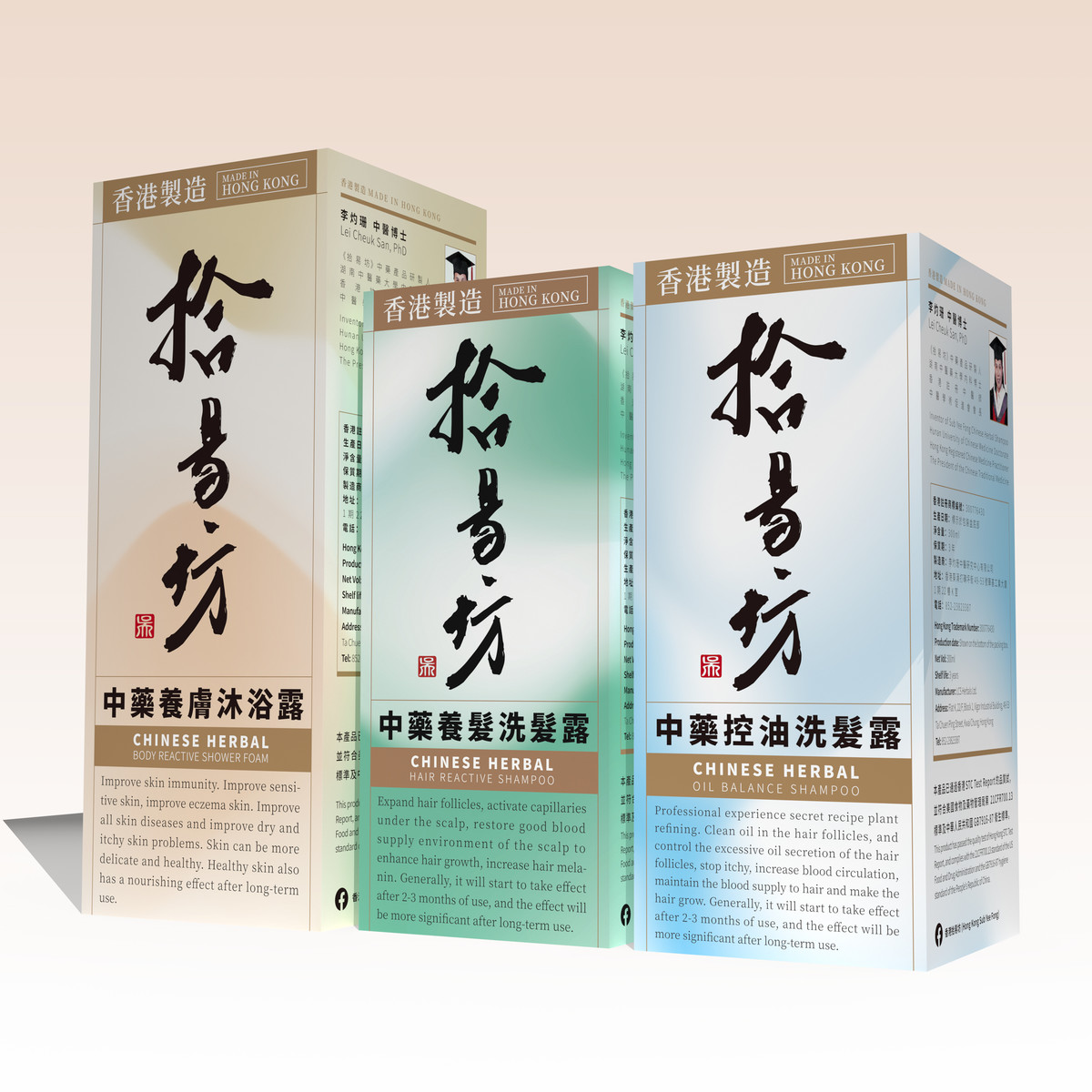
簡約設計其中一項關鍵策略,是將文字作為主要視覺元素。透過剔除冗餘裝飾與訊息,令文字本身直接承載品牌與產品資訊,消費者在第一眼接觸時已可接收到簡明訊息,從而引發初步興趣,進一步促使其拿起產品,深入了解。
此外,設計需清晰傳達品牌定位與產品效益,不能僅流於意象層面,而須實在有效地溝通產品特點與功效。我們希望每件產品包裝均能成為品牌的「小型廣告牌」,讓顧客於貨架前能迅速讀取品牌信息,確認產品是否符合自身需求,從而增加購買機會。文字,正是實現這一目標最直接有效的手段。
In a marketplace flooded with information, bold simplicity often cuts through the noise more effectively. A clean, structured design can quickly establish a positive first impression, particularly in today's visually saturated landscape where overly complex visuals tend to be overlooked.
One of our key strategies was to make typography the central visual element. By stripping away excessive decoration and non-essential messaging, we allowed text itself to carry core brand and product information. This ensures that even at first glance, consumers are presented with clear, direct content that sparks curiosity and invites deeper engagement.
Moreover, the design had to communicate both brand positioning and product benefits clearly and effectively—not just through vague imagery but through tangible, informative language. Our aim was to make each product package act as a "mini billboard" for the brand, enabling consumers to instantly grasp whether the product suits their needs, thereby increasing the likelihood of purchase. Typography proved to be the most efficient and direct tool to achieve this.

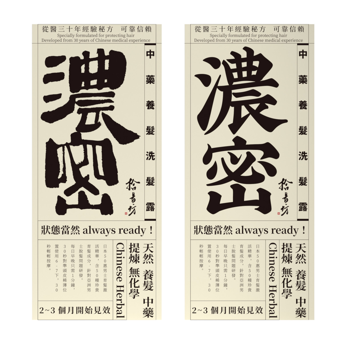
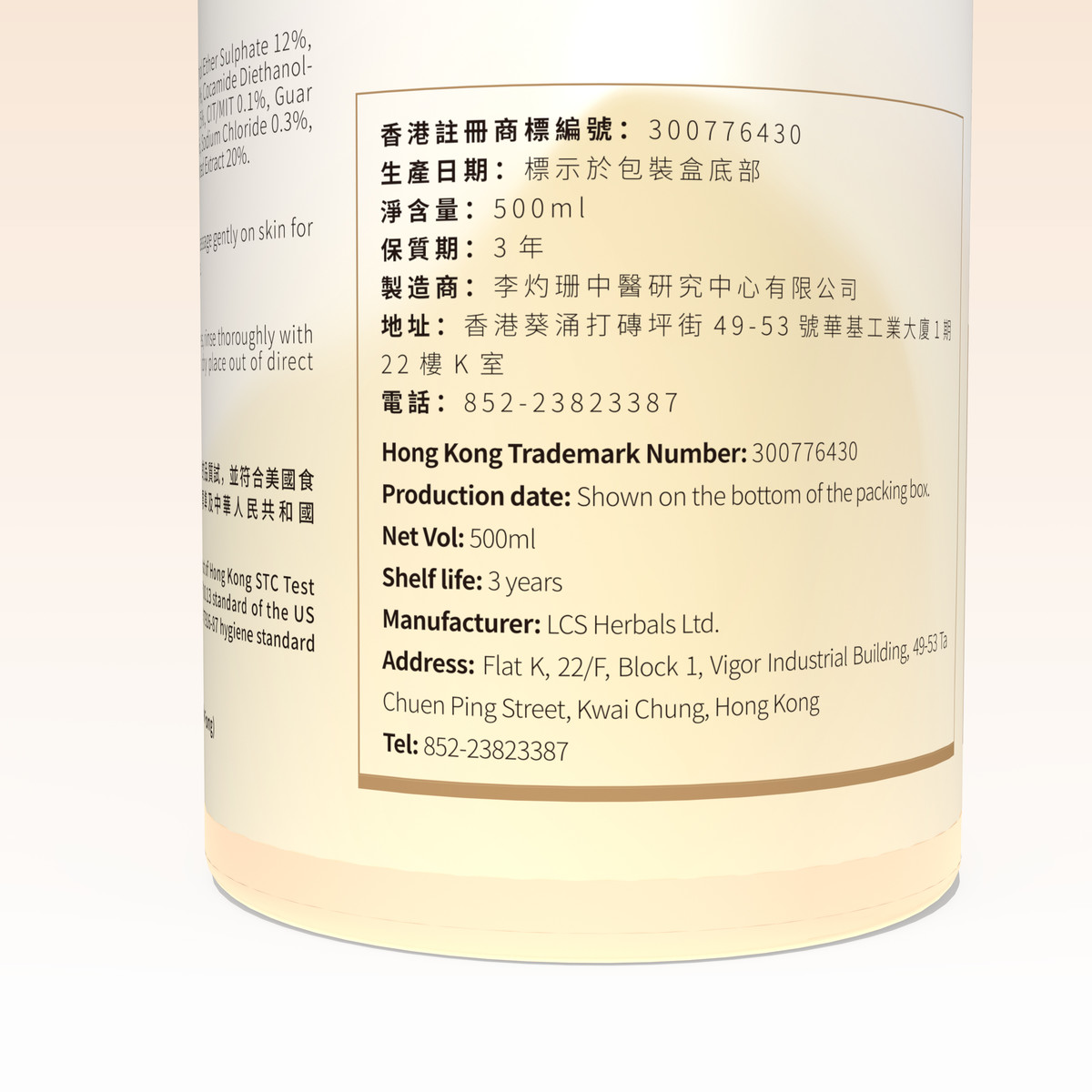
有見及此,設計方向遂得以確立 —— 以文字為核心,建立有層次的資訊架構。設計上的文字訊息將按照閱讀順序分級處理:第一級文字,為最先引起目光的重點內容,顧客能夠離遠便可閱讀,且內容簡潔有力,是產品本身最具吸引力的概述,能與顧客潛在需求迅速產生聯繫,推動其主動接觸產品;當產品成功吸引注意並被拿起,其他次級文字資訊如詳細特色、使用方式、品牌理念等,便可發揮補充作用,進一步加深理解與信任感。
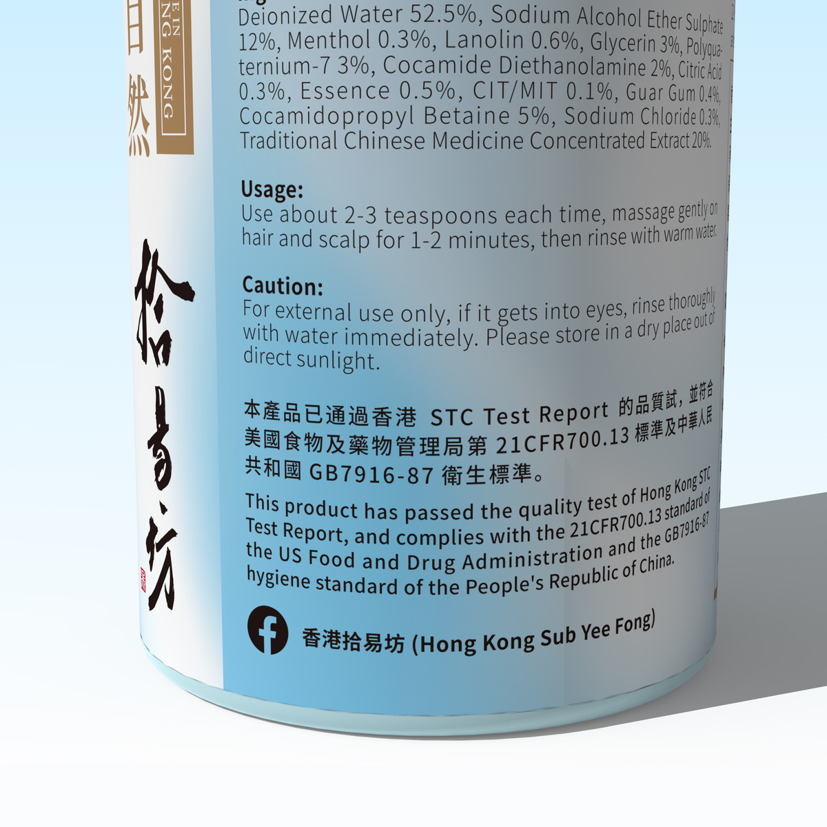
至於中醫藥文化的呈現亦為設計需平衡的重要一環。我們希望保留品牌文化核心,但不流於過時,於是我們從中醫典籍獲取靈感,借鑑古籍書頁常見的框架式版式,文字排佈有序分明,既能喚起人們對中藥文化的聯想,又能順利融入現代簡約設計語言,更與以文字為主體的設計策略不謀而合。
然而,簡潔畫面雖具美感,但若尺度把握不好容易節奏平淡,在視覺競爭激烈的貨架上被淹沒。因此我們需於視覺調性上作適度調整與補足。拾易坊主打中藥護理,需突顯天然與專業,但我們亦希望減低「用藥」感覺,避免消費者將產品與傳統藥物聯想。為此,我們在設計語言上引入個人護理產品常見的特質——清新、柔和、自然、舒適,塑造每日可安心使用的個人護理品印象。這一策略既契合中藥「純天然」的產品屬性,亦有效更新消費者對中藥固有的刻板形象。
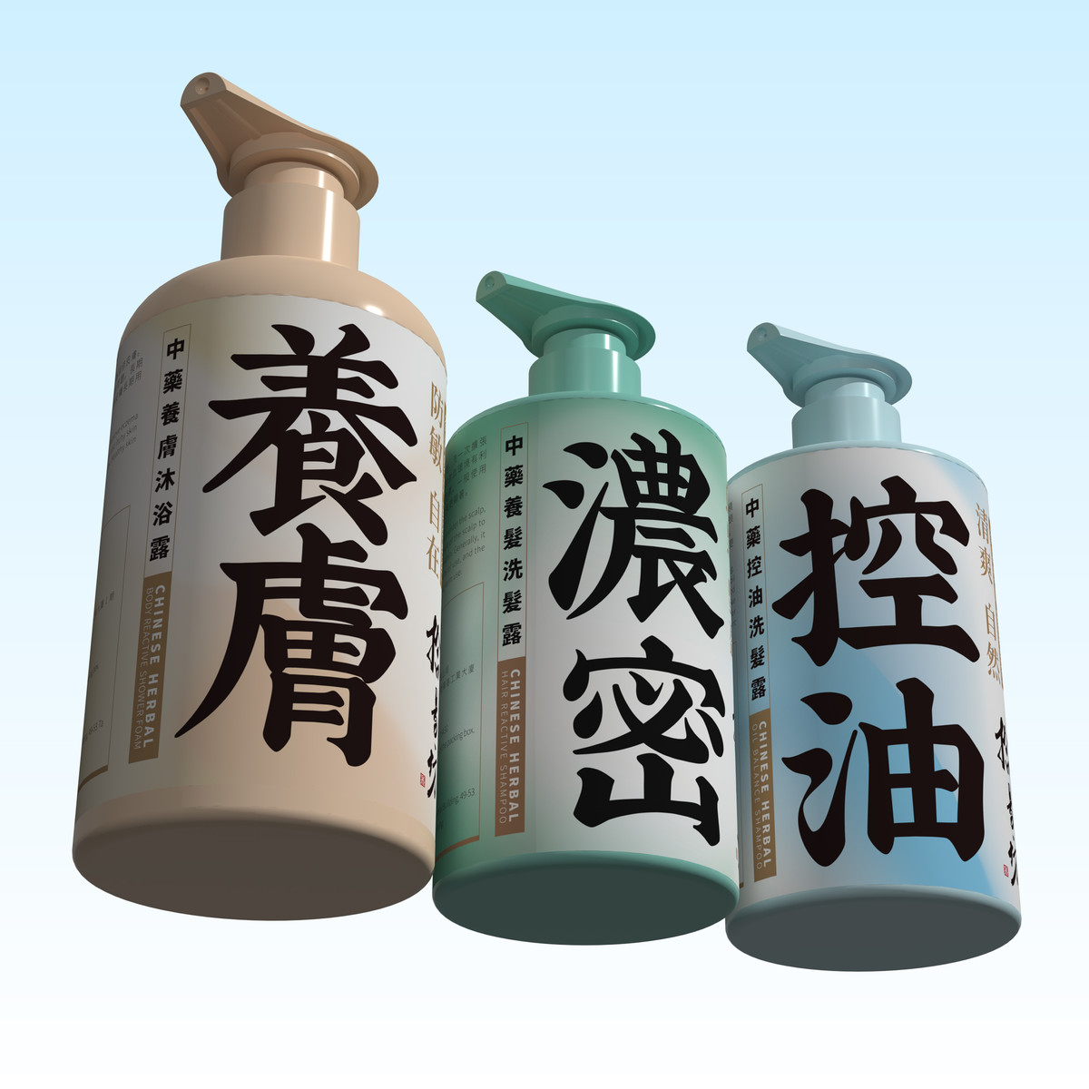
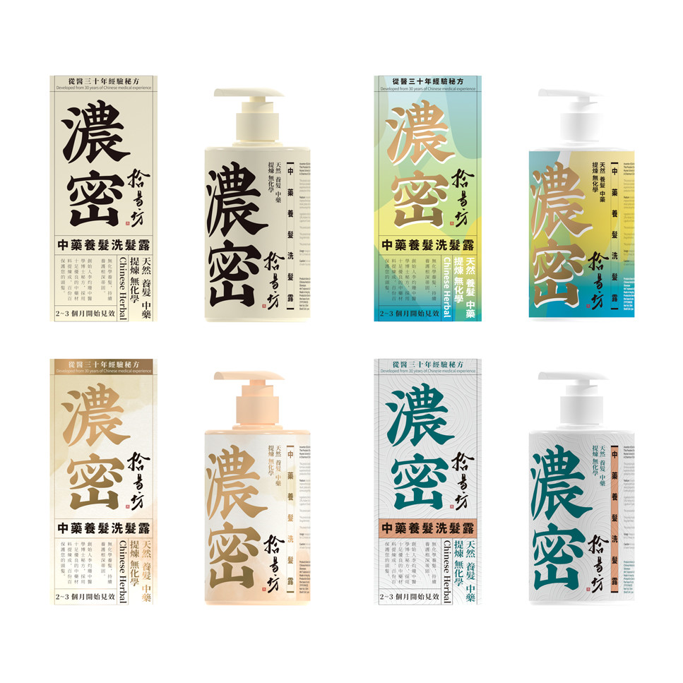
視覺層面上,我們採用大面積底色以強化感性印象,三款產品以不同主色區分,清晰標示品類,強化系列之間的關聯與品牌一致性;底紋處理上,我們引入流動感質感,表達產品帶來之滋潤、絲滑使用感受,進一步提升整體品牌觀感與記憶點。
This led to a defined design approach—centering the layout around a structured hierarchy of textual information. Primary messages are designed to capture attention from a distance, offering concise, compelling overviews of the product's unique strengths. Once the product draws a consumer closer, supporting text—such as product features, usage instructions, and brand ethos—reinforces trust and deepens understanding.
Conveying Chinese medicinal culture was another vital element requiring balance. While retaining the brand's cultural essence, we sought to avoid outdated stylistic tropes. Drawing inspiration from classical Chinese herbal manuscripts, we adopted a framed layout structure common in ancient texts. This ordered typography evokes a sense of heritage while seamlessly blending with a modern minimalist aesthetic, aligning perfectly with our type-driven strategy.
Still, a purely minimal visual approach risks becoming too subdued and losing presence on a competitive shelf. Therefore, we refined the overall visual tone to strike a delicate balance. While SubYeeFong's core lies in herbal care—emphasizing natural and professional qualities—we intentionally dialed down the "medicinal" feel to avoid evoking traditional pharmaceutical associations. Instead, we infused the design with qualities commonly seen in personal care products: freshness, softness, naturalness, and comfort, building a reassuring image of gentle, everyday use. This direction both reinforces the brand's commitment to natural ingredients and reshapes consumer perceptions of Chinese herbal care.
Visually, we utilized expansive color blocks to create an emotive impact. Each product features a distinct primary color to clearly distinguish categories while reinforcing brand coherence across the range. Subtle flowing textures in the background echo the product's moisturizing and smooth application experience, enhancing the tactile and emotional resonance of the design.

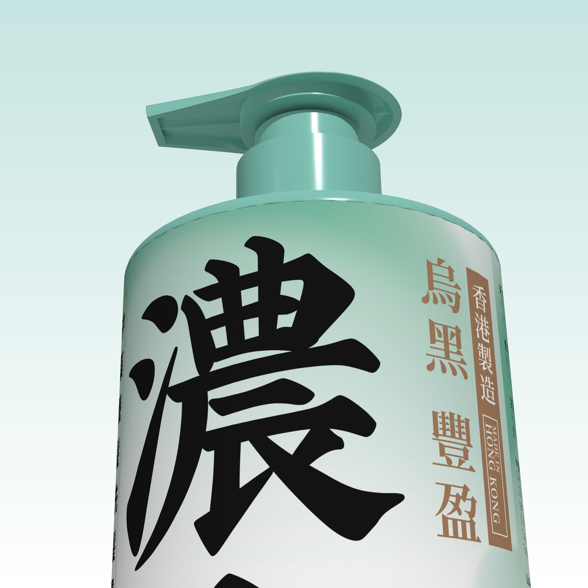
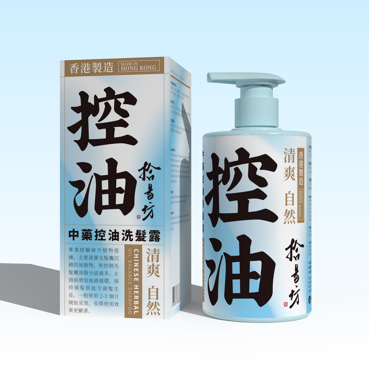
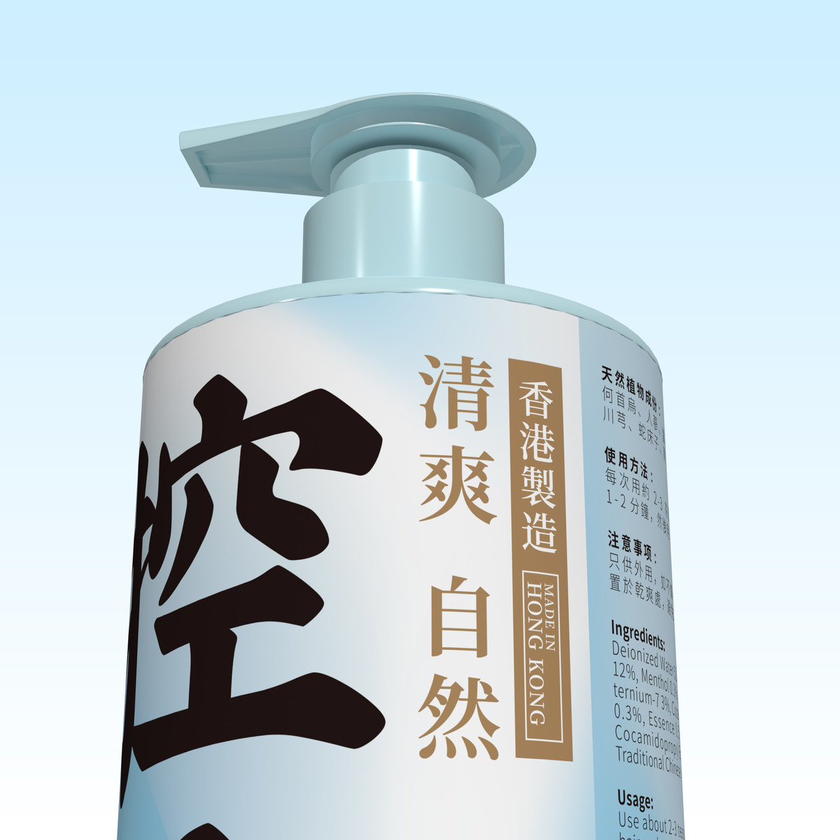
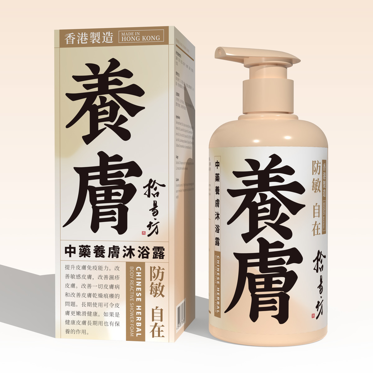
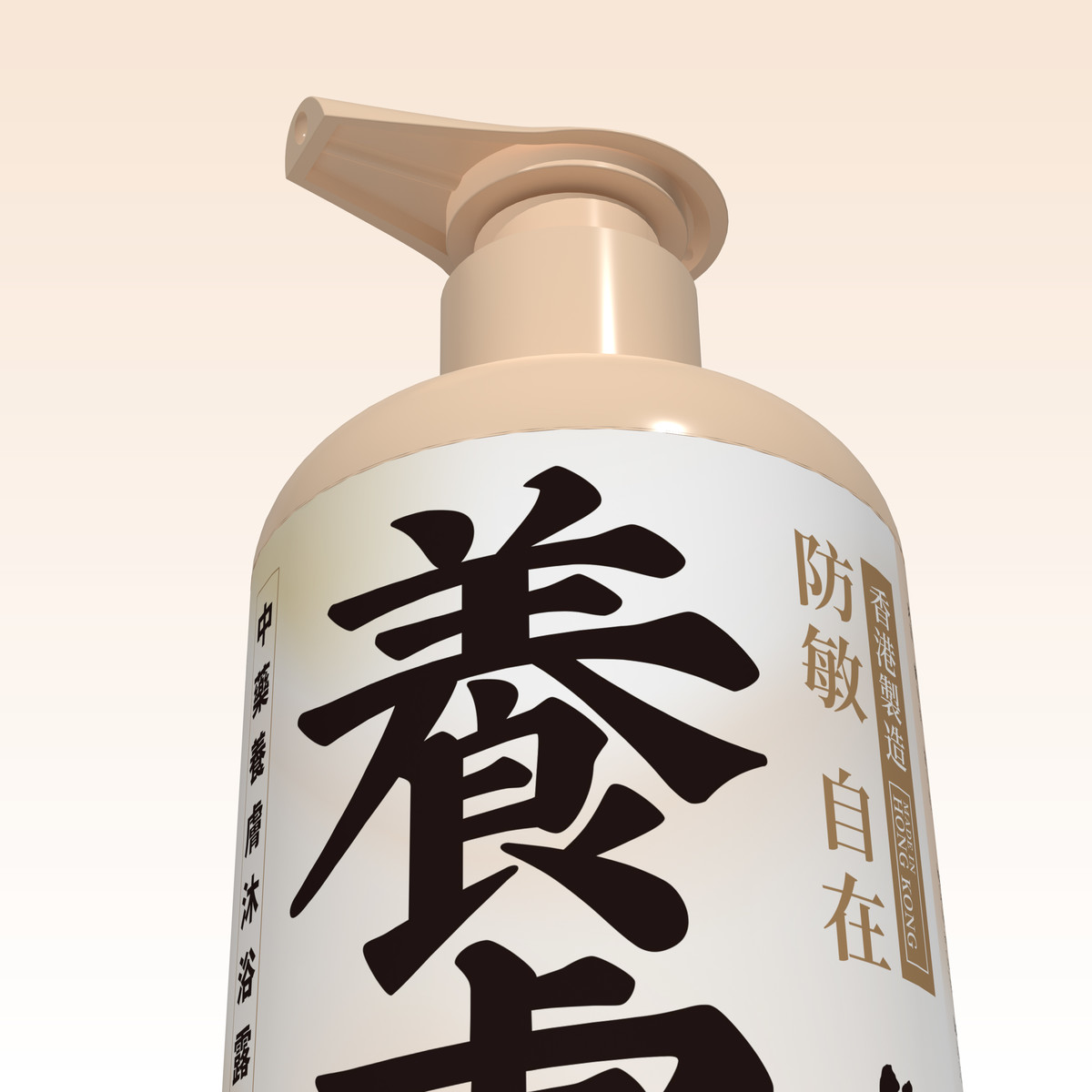
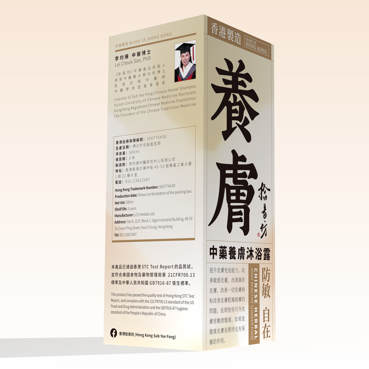
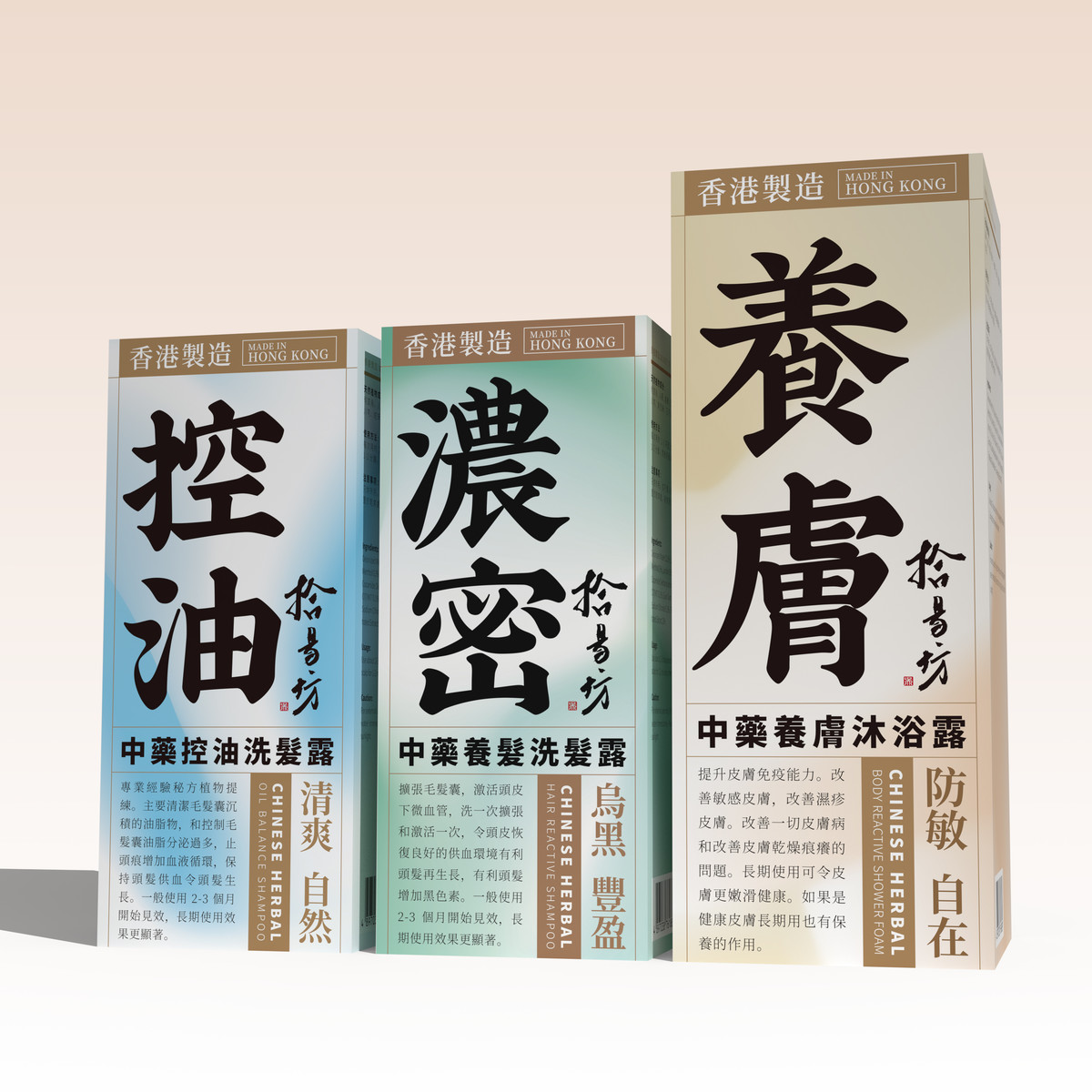
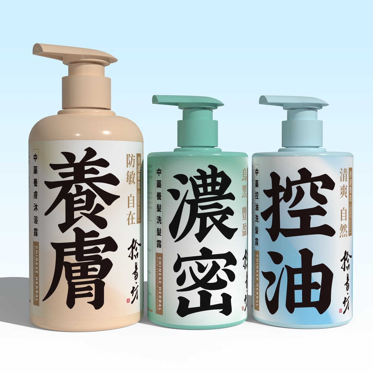
為突顯「控油」帶來的清爽與潔淨感,主色選用了清新藍,營造潔淨舒適的印象。「濃密」象徵了髮絲的健康與生命力,因此選用代表自然與生機的綠色,同時呼應中藥強調的天然特質。而粉橙色貼近溫潤膚色,應用於「養膚」系列,有助喚起人們對紅潤滋養肌膚的聯想,營造親切自然的護理印象。
是次設計並非單純視覺革新,更是一次圍繞品牌定位、市場策略與用戶心理的整體思維轉向。每一項設計決策,均回應品牌所處的市場條件、用戶期待與未來發展路徑,讓拾易坊以全新姿態回應市場,逐步培育中藥個人護理這一細分領域,燃起大眾對中醫藥養生文化的信心與興趣。
To highlight the refreshing and purifying effect of "Oil Control", a clean, cool blue was chosen as the primary color to evoke a sense of clarity and comfort. "Density" signifies healthy, vital hair. Green — a color associated with vitality and nature — was selected to represent both hair strength and the natural essence of Chinese herbal ingredients. And a soft peach tone, close to healthy skin tones, was used for the "Skincare" range to suggest nourishment, radiance, and a sense of natural, gentle care.
This project is more than a visual facelift—it represents a holistic rethinking of brand positioning, market strategy, and consumer psychology. Every design decision responds to SubYeeFong's unique market conditions, customer expectations, and long-term vision. Through this updated identity, the brand is now equipped to re-engage the market and gradually cultivate the growing niche of herbal-based personal care, inspiring renewed confidence and interest in the culture of Chinese herbal wellness.