

鋒利與堅韌的信念
The Belief in Sharpness and Resilience
鋒利與堅韌的信念
The Belief in Sharpness and Resilience
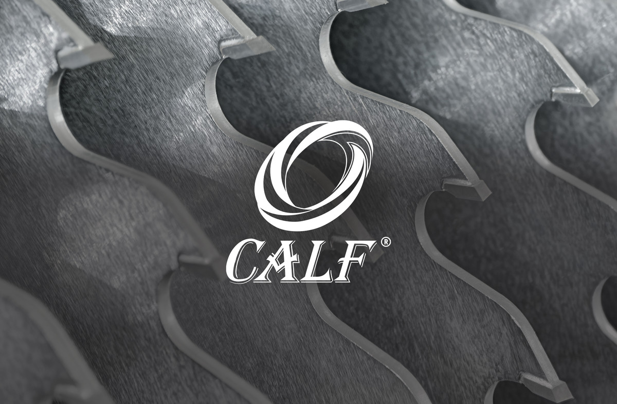
先鋒鋸業 品牌標識設計
Brand Identity Design for Calf Brand
CLIENT : 東莞市先鋒鋸業有限公司 Dongguan Pioneer Saw Industry Co., Ltd.
PROJECT SERVICE : Brand Identity Design
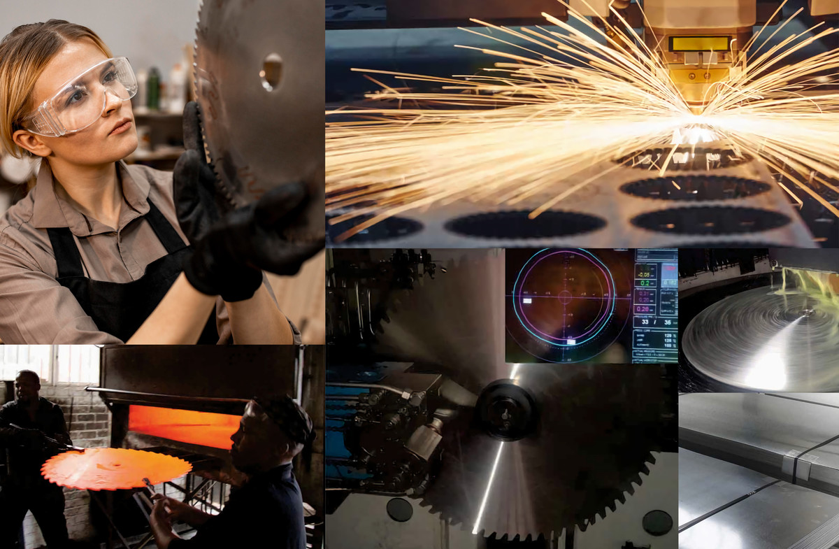
東莞市先鋒鋸業有限公司深耕鋸片製造領域,專業生產及銷售各類切鋁合金鋸片、金剛石鋸片及精加工鋸片,擁有20年技術積累與行業影響力。適逢企業創立20週年,客戶委託我們進行品牌標識重塑,以更現代化的視覺形象體現企業的專業實力與國際化發展方向。新標識需兼顧當代審美趨勢,同時準確傳遞品牌價值,提升市場識別度。
Dongguan Pioneer Saw Industry Co., Ltd. specializes in the manufacturing and sales of aluminum alloy saw blades, diamond saw blades, and precision processing saw blades. With 20 years of expertise, the company has established a strong presence in the industry. On its 20th anniversary, the company commissioned us to redesign its brand identity, aiming for a more modern visual representation that reflects its professional excellence and international outlook. The new identity needed to align with contemporary aesthetics while effectively communicating the company's core values and strengthening its recognition in both domestic and global markets.
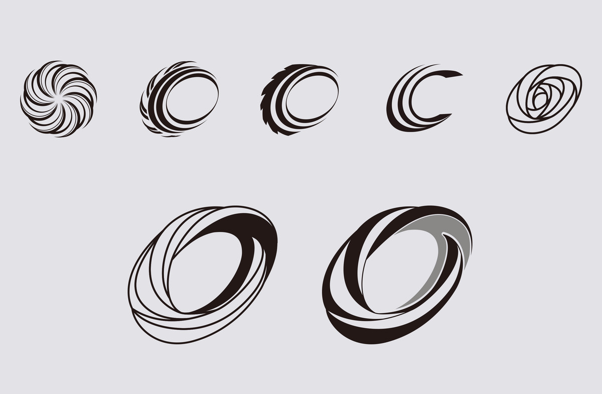
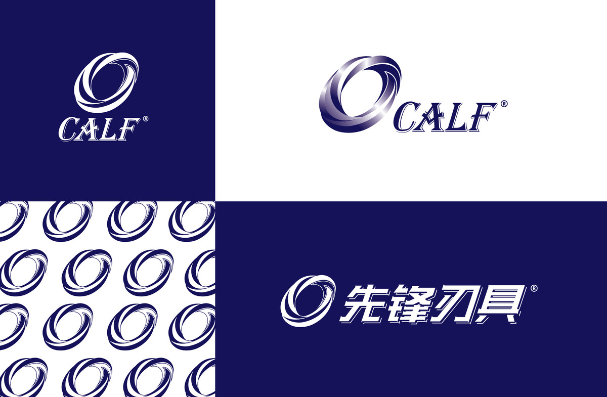
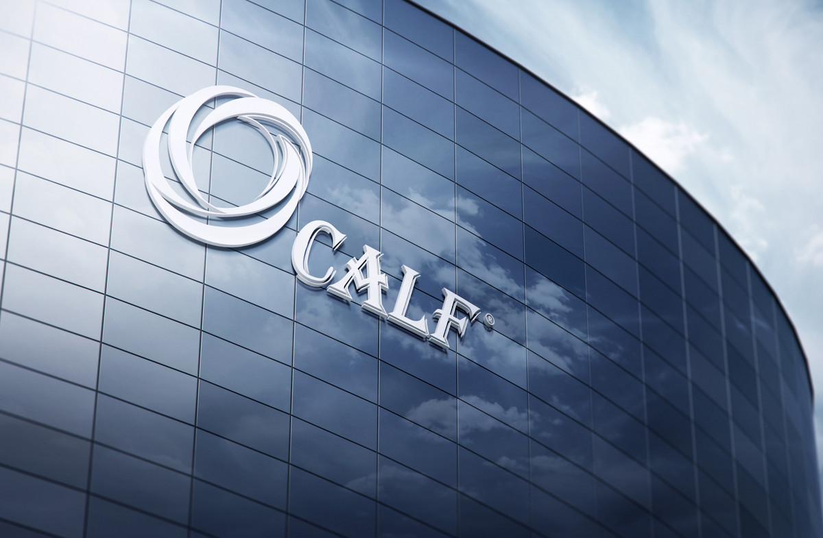
品牌命名與設計方向
Calf是先鋒鋸業旗下的鋸片品牌。其原意為「牛仔」,象徵創業初期的開拓精神。經過20年發展,品牌已超越最初的語意限制,成為獨立且具辨識度的名稱。因此,在設計策略上,我們從業務屬性出發,直接聚焦品牌核心特質,提煉「C」作為標識基礎,結合鋸片的視覺語彙,使標識更具象徵性與行業聯繫。
視覺語彙:鋒利、堅硬、速度感
設計核心圍繞三大關鍵詞:鋒利(Sharpness)、堅硬(Hardness)、速度感(Speed)——這不僅是鋸片的產品特質,更是品牌精神的體現。
- 鋒利與競爭力
鋸片的鋒利度決定切割品質,而企業的競爭力則源於精準與突破。是次標識設計運用俐落的線條與幾何切割感,象徵鋸片的銳利精準,也突顯品牌歷經20年,仍然保持創業時期的進取和初心。
- 如鋼材般堅硬的企業信念
鋸片的核心價值來自材料的高硬度與耐久性,這亦是企業發展的象徵。我們在標識中融入金屬質感,傳遞穩健、可靠與專業的品牌形象,展現企業在市場中的長期競爭力。
- 速度與動感
高速旋轉的鋸片象徵企業不斷突破與前行的動力。我們對標識中的圓形結構進行斜向變形,營造鋸片高速運轉的動態感,使標識視覺上更具動勢,營造迅捷、銳利的視覺效果,象徵品牌邁向更遠大的未來。
Brand Naming & Design Direction
Calf is the flagship saw blade brand of Pioneer Saw Industry. Originally, the name symbolized the pioneering spirit of a cowboy, reflecting the company's bold and adventurous beginnings. However, after 20 years of growth, the brand has evolved beyond its original meaning, standing independently as a recognizable name. Thus, our design strategy shifted focus from its literal interpretation to its industry relevance, using the letter "C" as the foundational element, incorporating saw blade characteristics to enhance its symbolic connection to the industry.
Visual Language: Sharpness, Hardness, and Speed
The core of the design revolves around three key attributes: Sharpness, Hardness, and Speed—qualities that define not only the product but also the brand's spirit.
- Sharpness & Competitive Edge
A saw blade's sharpness determines its cutting precision, just as a company's sharp vision defines its market competitiveness. The logo features sleek, angular lines and geometric cuts, mimicking the precision of a saw blade while reinforcing the brand's forward-thinking and competitive stance.
- Metallic Strength & Brand Reliability
The essence of a saw blade lies in its high-strength materials, mirroring the company's resilience and reliability. The logo incorporates metallic elements to convey a sense of durability and professionalism, highlighting the brand's long-term competitiveness.
- Speed & Dynamic Motion
A saw blade operates at high speed, symbolizing the company's drive for continuous progress. The circular form of the logo is subtly tilted and dynamically shaped to suggest rapid motion, creating a sense of energy and direction, emphasizing the brand's vision for the future.
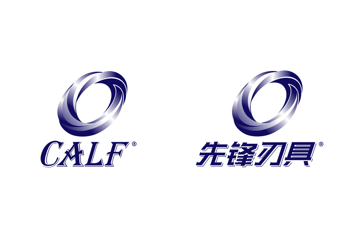
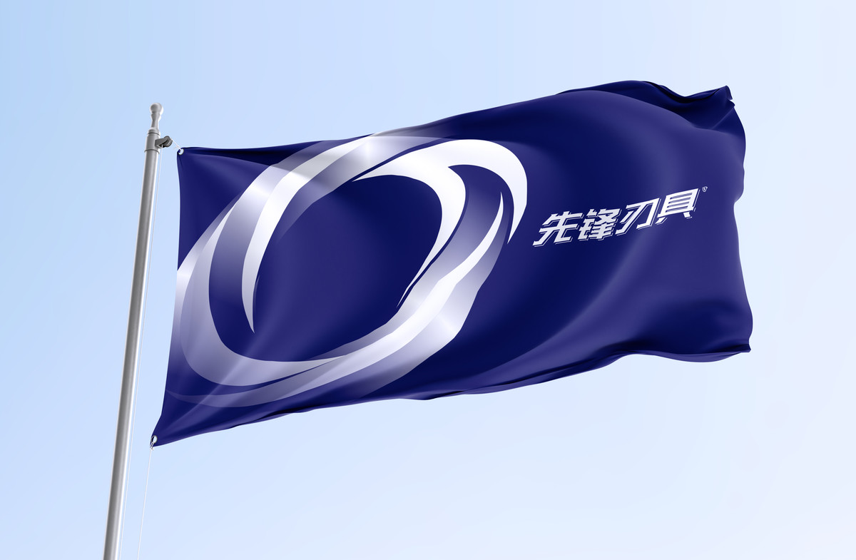
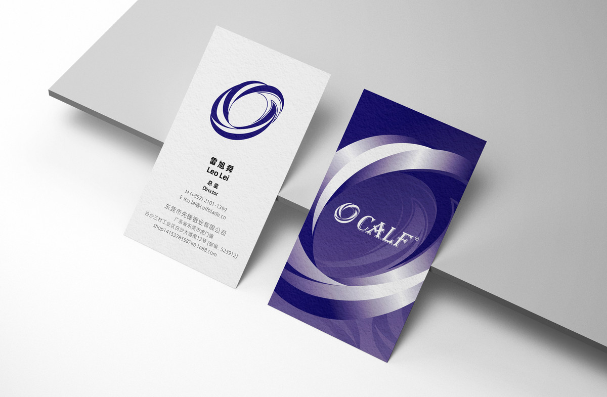
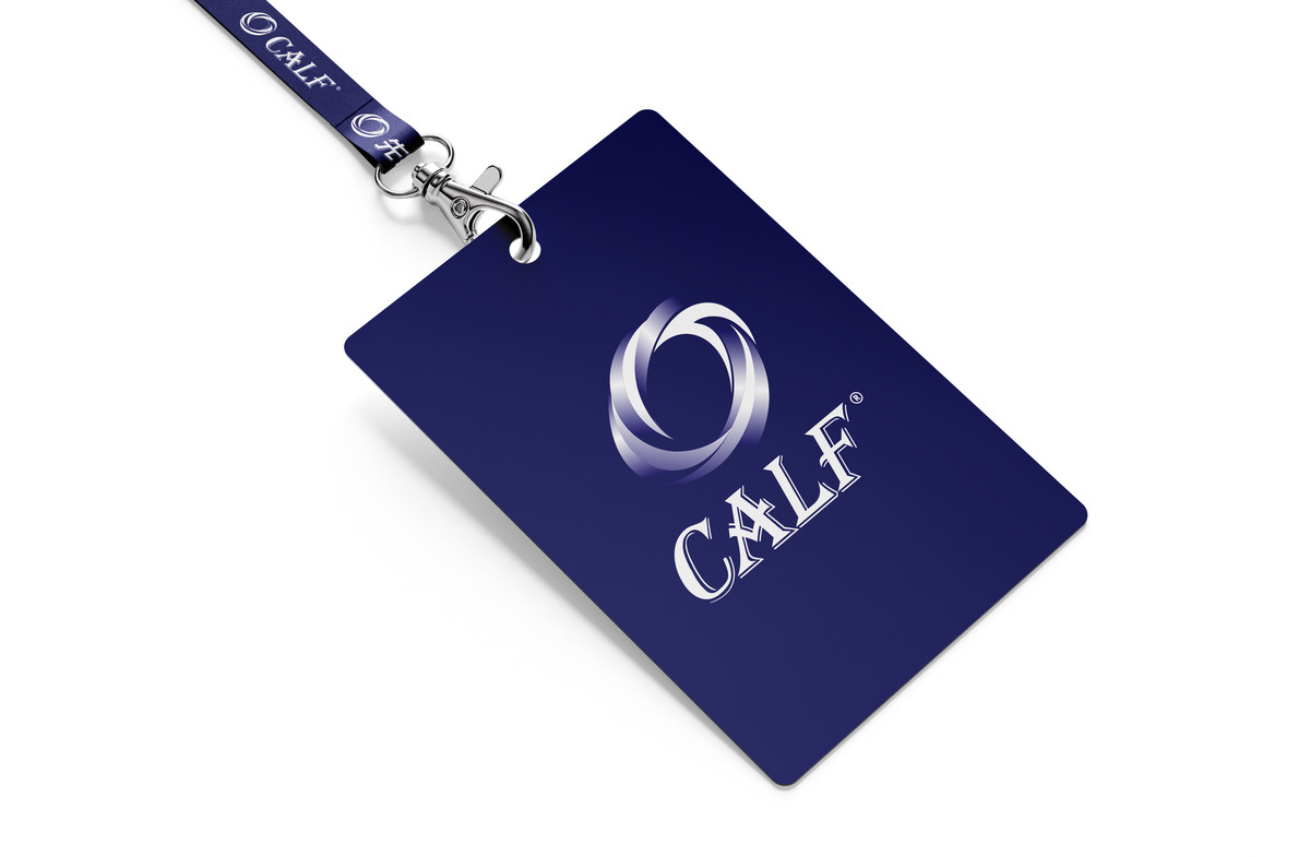
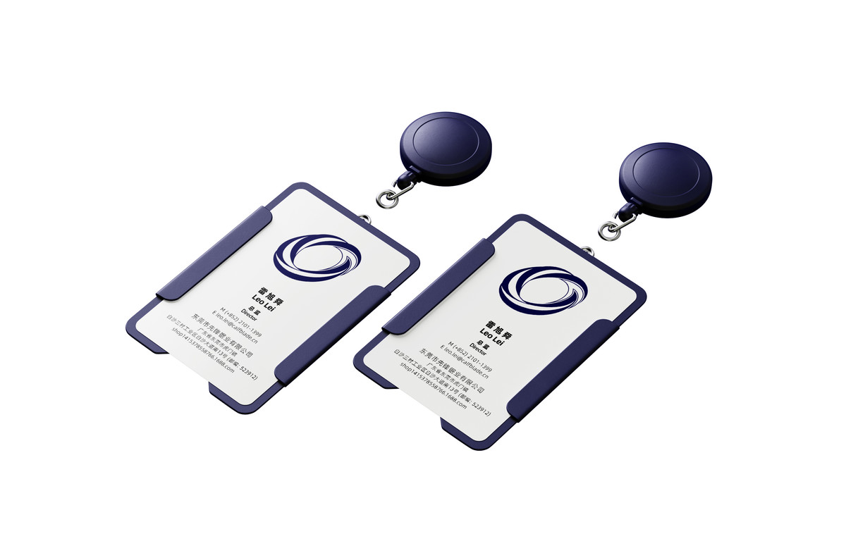
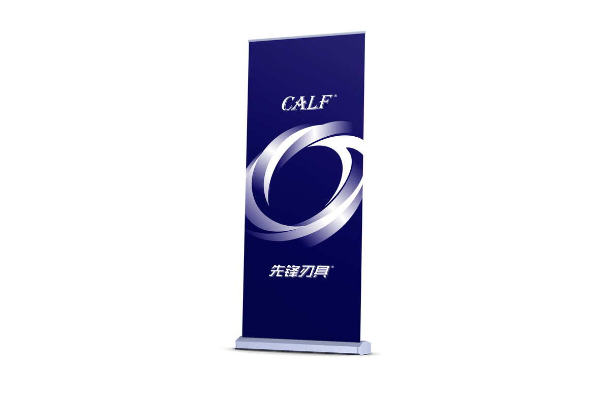
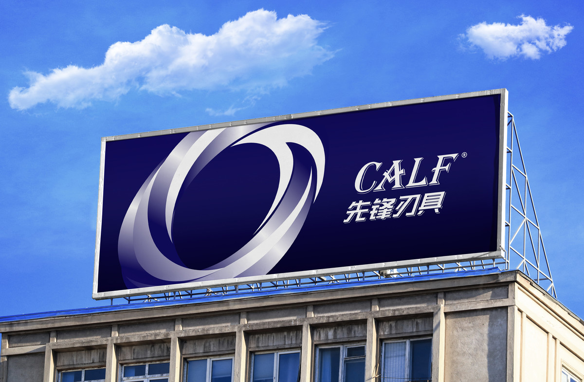
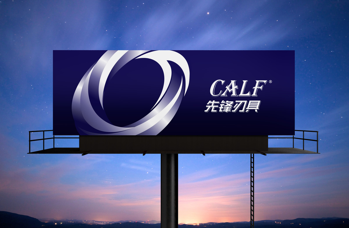
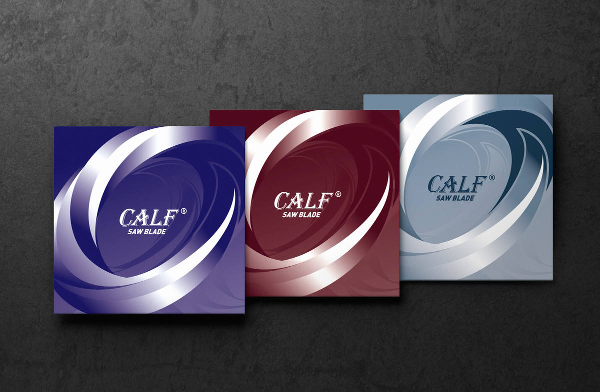
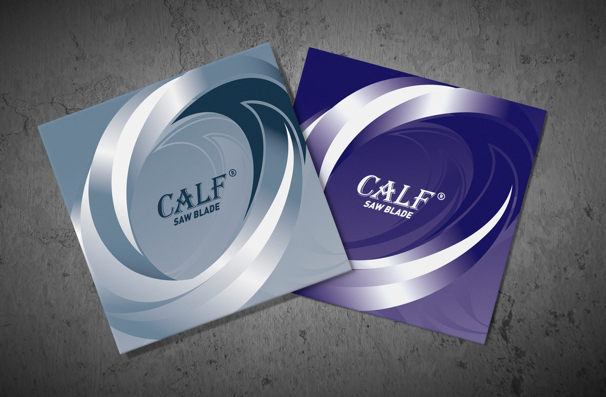
色彩與品牌識別
主色調選用深藍色,代表專業、信任與穩定,並以漸變處理增強科技感與未來感,呼應高端製造業的品牌屬性。金屬質感的細節則進一步強化精密工藝與技術實力。
Color & Brand Identity
Deep blue serves as the primary color, representing professionalism, trust, and stability. A gradient effect enhances the technological and futuristic feel, aligning with the brand's positioning in high-end manufacturing. Metallic finishes reinforce precision craftsmanship and technical expertise.
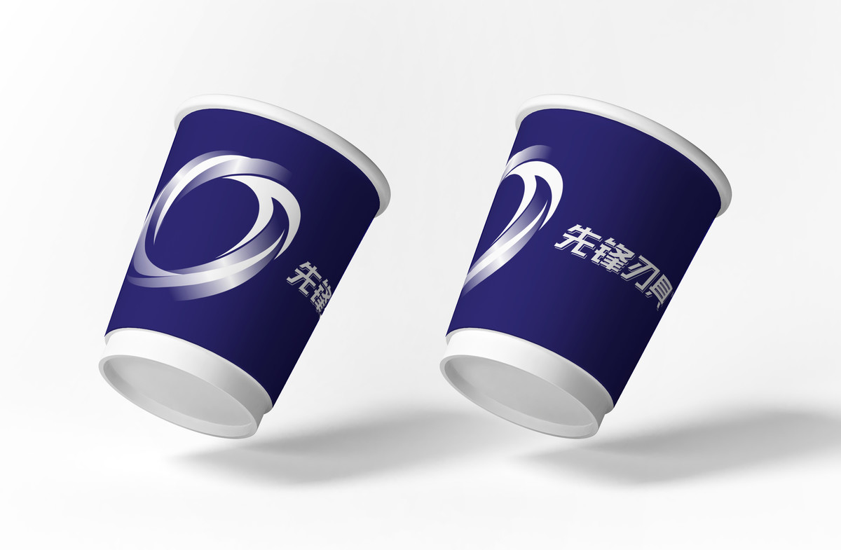
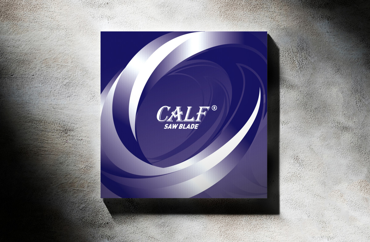
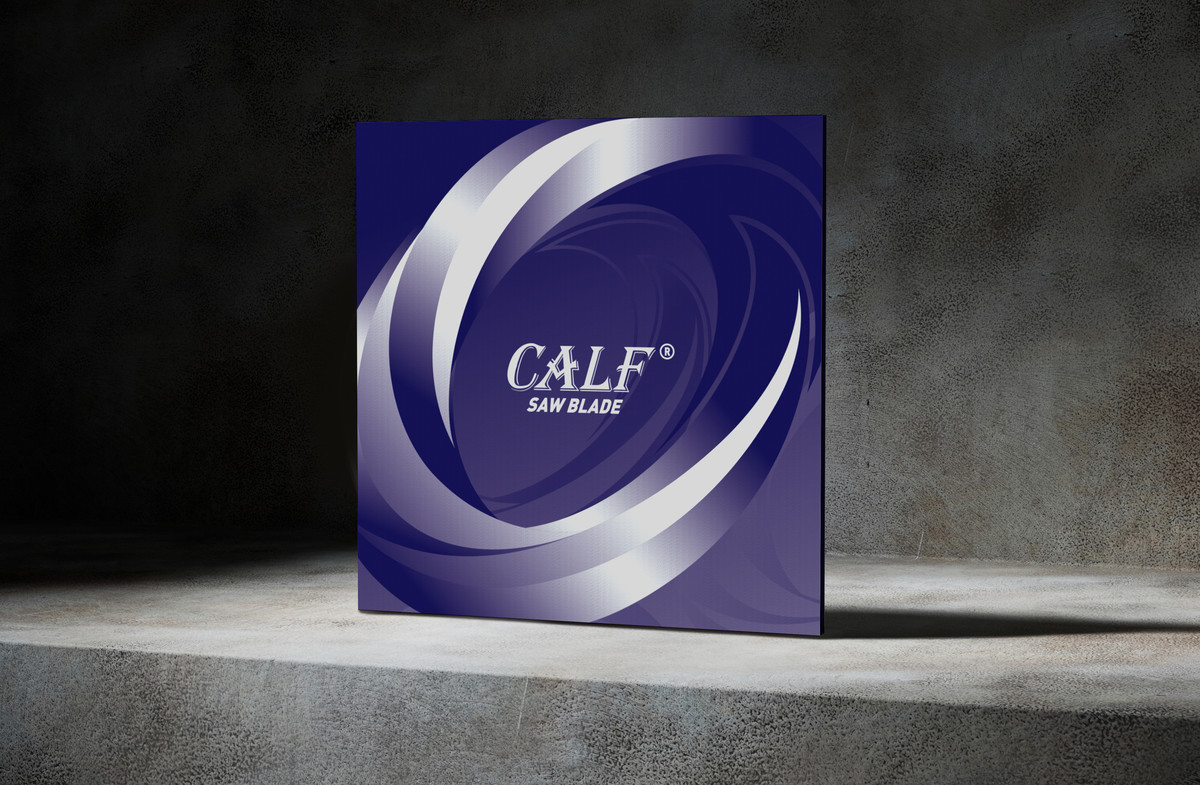
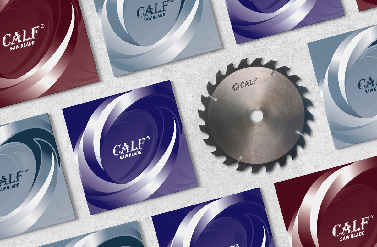
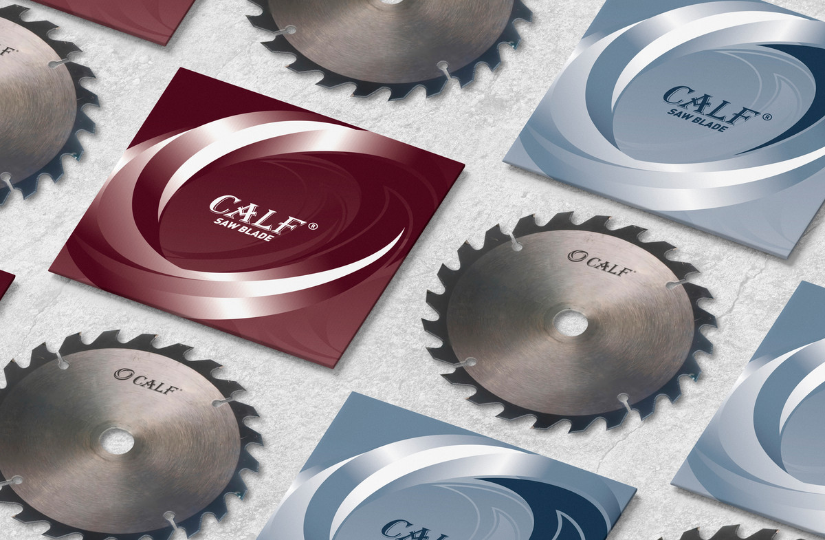
科技感與產品包裝設計
除企業標識外,我們亦為Calf品牌設計了一系列產品包裝。傳統製造業往往被視為保守,但高端鋸片的生產涉及精密材料與先進技術,因此包裝設計特意強化科技感,通過簡約的線條、金屬光澤與動態視覺元素,突顯品牌的技術創新力,提升市場信賴感。
Technology & Product Packaging Design
Beyond the brand identity, we also designed a series of saw blade packaging for the Calf brand. While traditional manufacturing is often perceived as conservative, high-performance saw blades rely on cutting-edge materials and engineering. To reflect this, the packaging design incorporates a strong technological aesthetic, utilizing clean lines, metallic textures, and dynamic visuals to emphasize innovation and reinforce market confidence.
品牌升級,邁向未來
這次品牌標識升級不僅賦予先鋒鋸業更鮮明的企業形象,也進一步強化其市場競爭優勢。新標識不僅是一個視覺符號,更凝聚了品牌 20 年的發展歷程與未來願景,為邁向下一個十年奠定堅實基礎。
A Stronger Identity for the Future
This brand revamp not only strengthens Pioneer Saw Industry's corporate image but also enhances its market competitiveness. The new identity is more than just a visual mark—it embodies the brand's 20-year legacy and future aspirations, laying a solid foundation for the next decade of growth.