

競速印記 Racing Insignia
競速印記 Racing Insignia
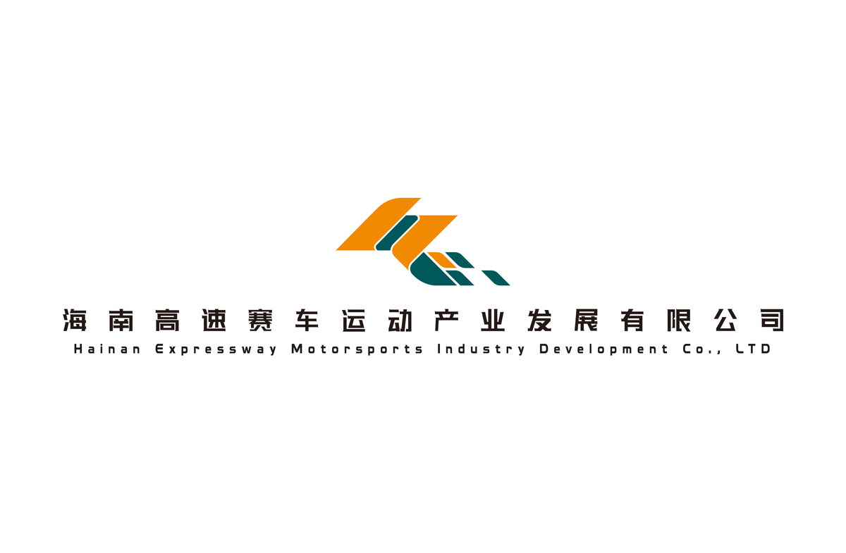
海南高速賽車運動產業發展有限公司 / 海南國際卡丁車場 品牌標識設計
Brand Identity Design for Hainan High-Speed Racing Industry Development Co., Ltd. / Hainan International Karting Circuit
CLIENT : 海南高速賽車運動產業發展有限公司 Hainan High-Speed Racing Industry Development Co., Ltd.
PROJECT SERVICE : Brand Identity Design
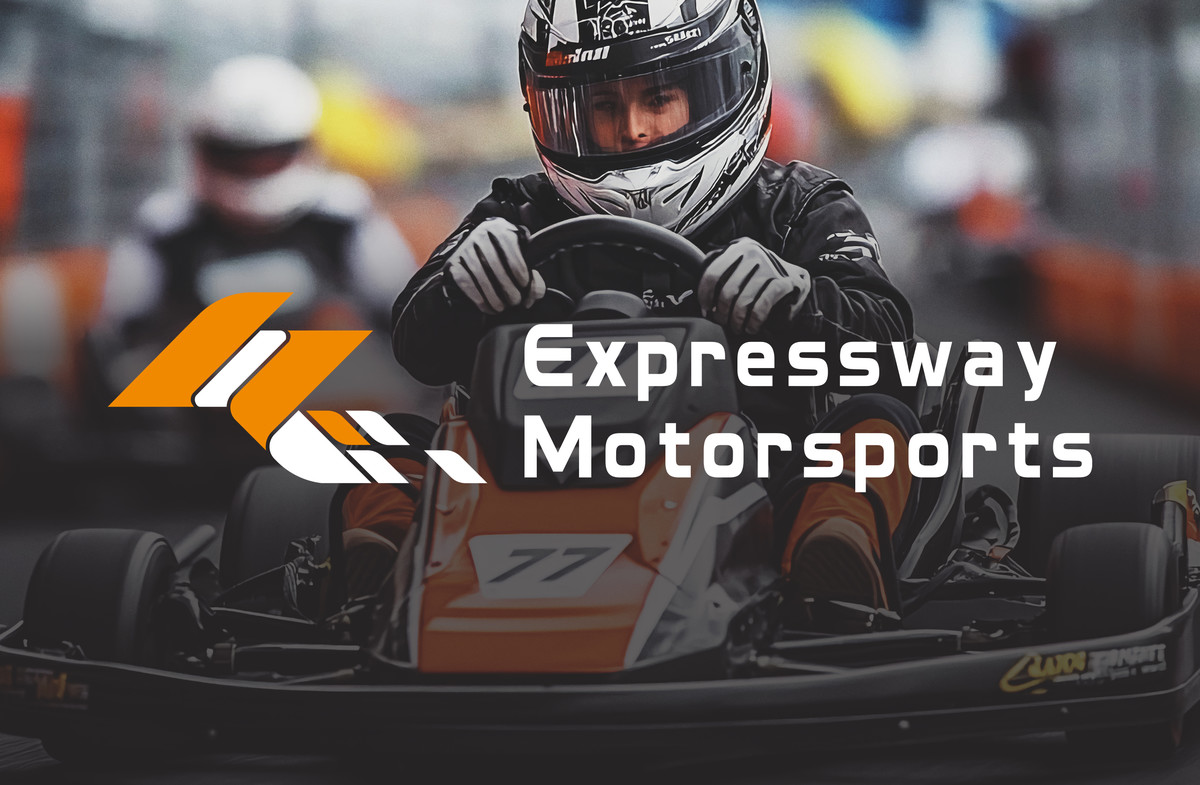
受海南高速公路有限公司(HEC)委託,為其新成立的海南高速賽車運動產業發展有限公司設計企業品牌標識。該子公司專注發展賽車事業及推廣賽車文化,因此品牌標識需要清晰傳遞企業精神及行業屬性。
We were commissioned by Hainan Expressway Co., Ltd. (HEC) to design the corporate brand identity for its newly established Hainan Expressway Motorsports Industry Development Co., Ltd. This subsidiary focuses on racing business development and motorsport culture promotion. Therefore, the brand identity needs to effectively communicate the company's spirit and industry attributes.
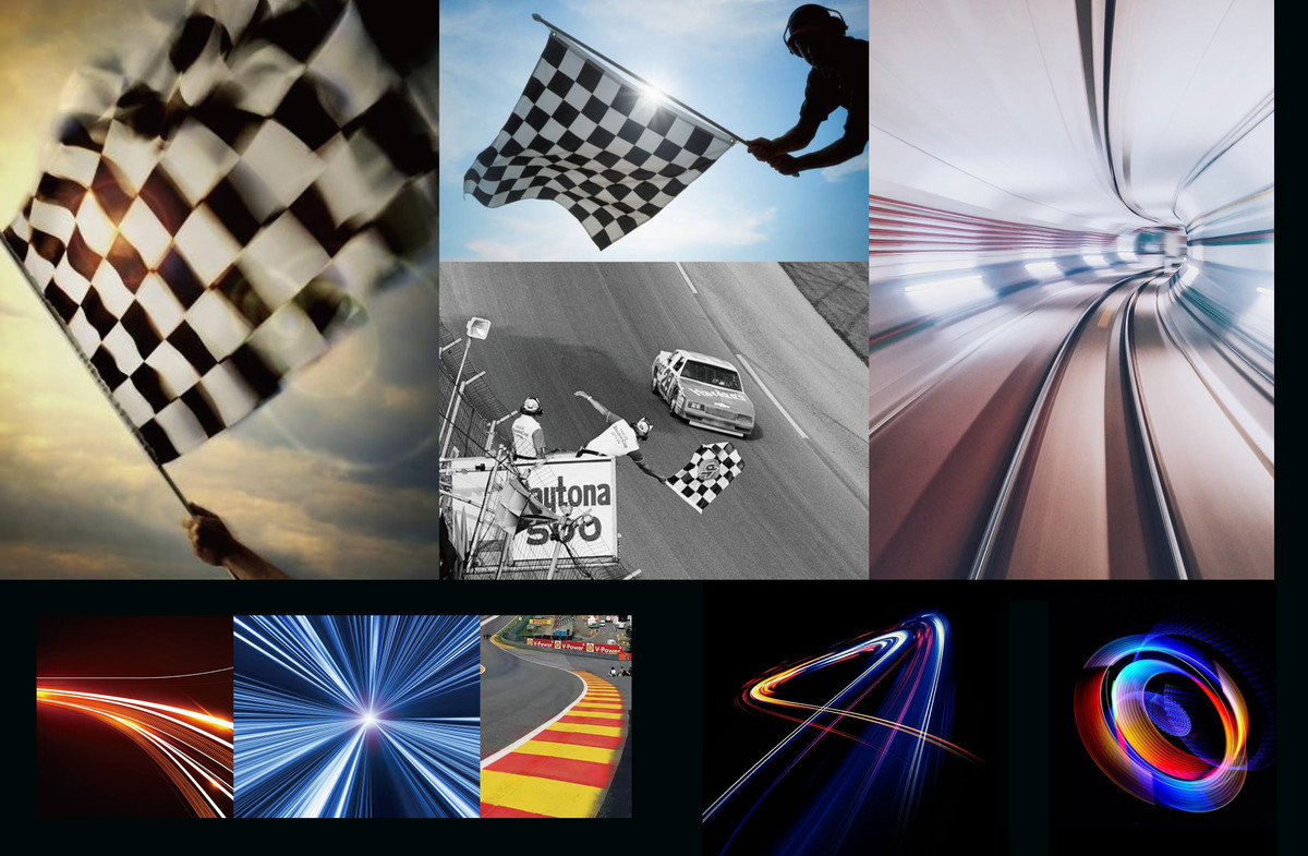
從賽車運動的核心特質出發,提煉出以下關鍵元素:
- 速度:速度是賽車運動的靈魂,亦是品牌形象不可或缺的要素。
- 賽道:蜿蜒的線條已成為賽車文化的重要象徵,直觀且富有動感。
- 格子旗:終點衝線時揮舞的格子旗代表勝利,寓意正面且充滿動力,極具品牌象徵意義。
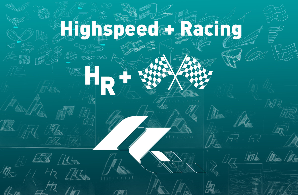
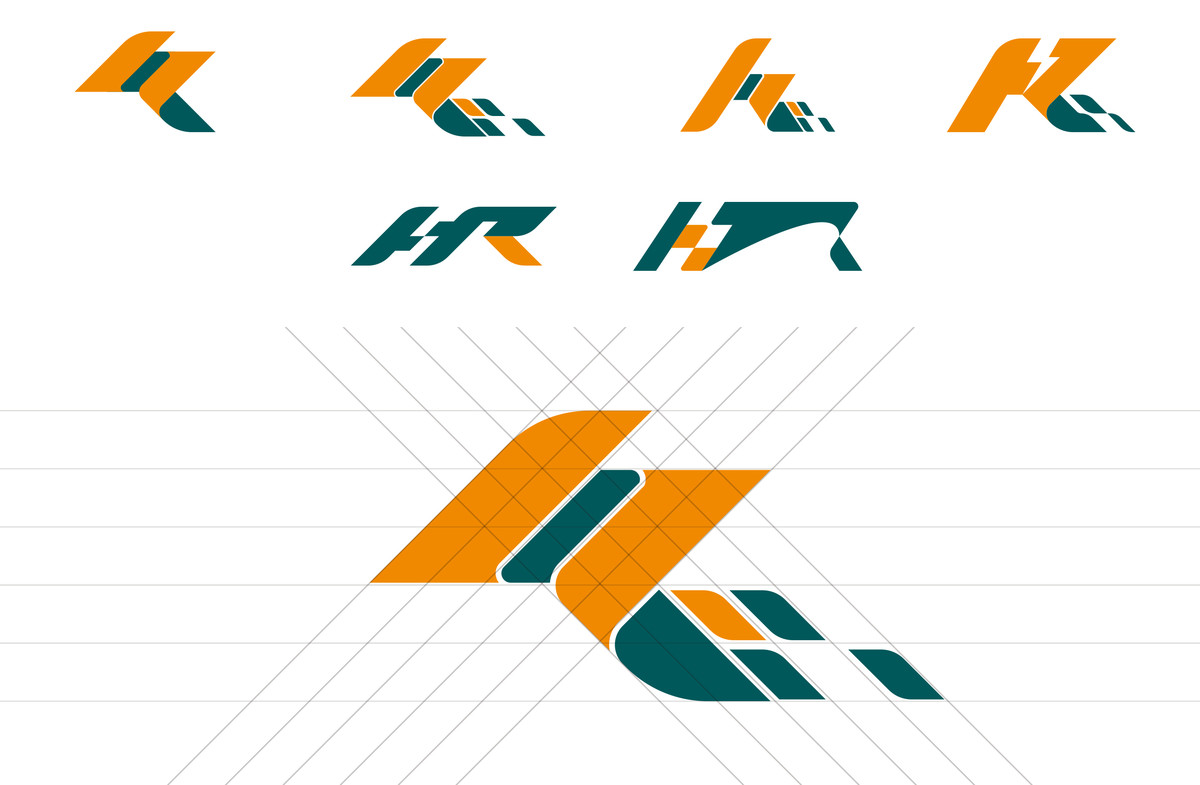
設計以「H」與「R」為核心結構,其中「H」代表High Speed(高速)及Highway(公路),而「R」則象徵Racing(賽車)。兩者透過流暢的連結組合,構成獨特的品牌符號。設計亦融入格子旗在終點衝線時的扭動動勢,進一步增強標誌的速度感與動態表現,使其兼具識別度與行業屬性。
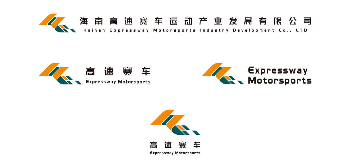
作為企業的最小識別單元,標誌除了需要承載品牌精神,更需在資訊爆炸的時代確保快速辨識,讓人留下清晰印象。因此,我們在設計過程中,平衡品牌調性與視覺呈現,打造簡潔而富衝擊力的形態,使其適用於不同應用場景,同時保持鮮明的品牌形象。
The design concept extracts key elements from the essence of motorsports:
- Speed: The soul of racing and an essential brand characteristic.
- Racetrack: The winding track lines are an intuitive and symbolic representation of motorsports.
- Checkered Flag: The moment of victory at the finish line, carrying a positive and dynamic brand meaning.
The logo is structured around the initials "H" and "R" where "H" represents High Speed and Highway, and "R" symbolizes Racing. The two letters are seamlessly connected, incorporating the dynamic twisting motion of a waving checkered flag at the finish line. This enhances the sense of speed and movement while ensuring strong brand recognition and industry relevance.
As a core brand symbol, the logo must not only embody the company's identity but also be instantly recognizable in today's information-saturated world. Our design strikes a balance between brand identity and visual clarity, creating a form that is simple yet impactful, ensuring high adaptability across various applications.
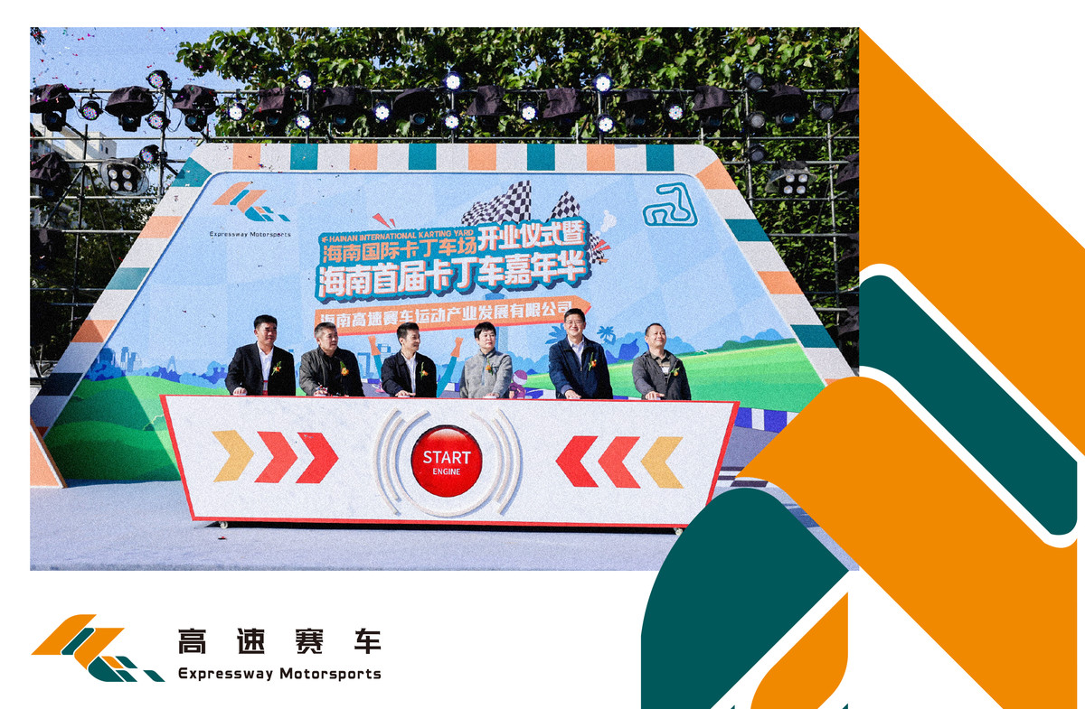
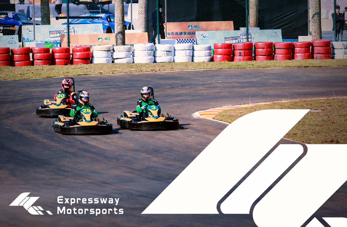

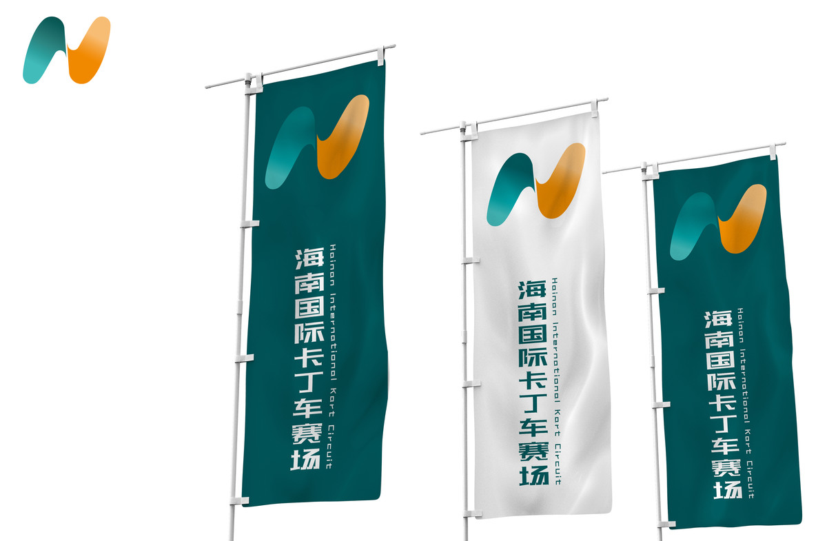
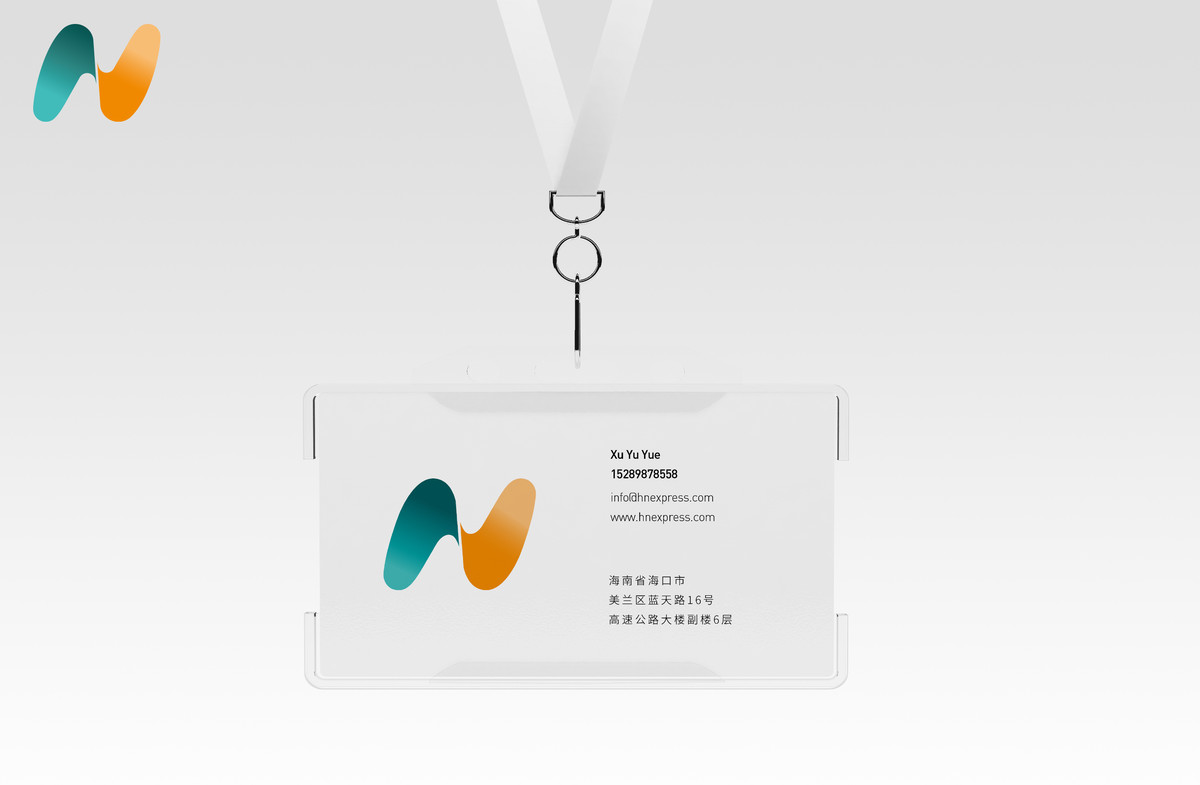
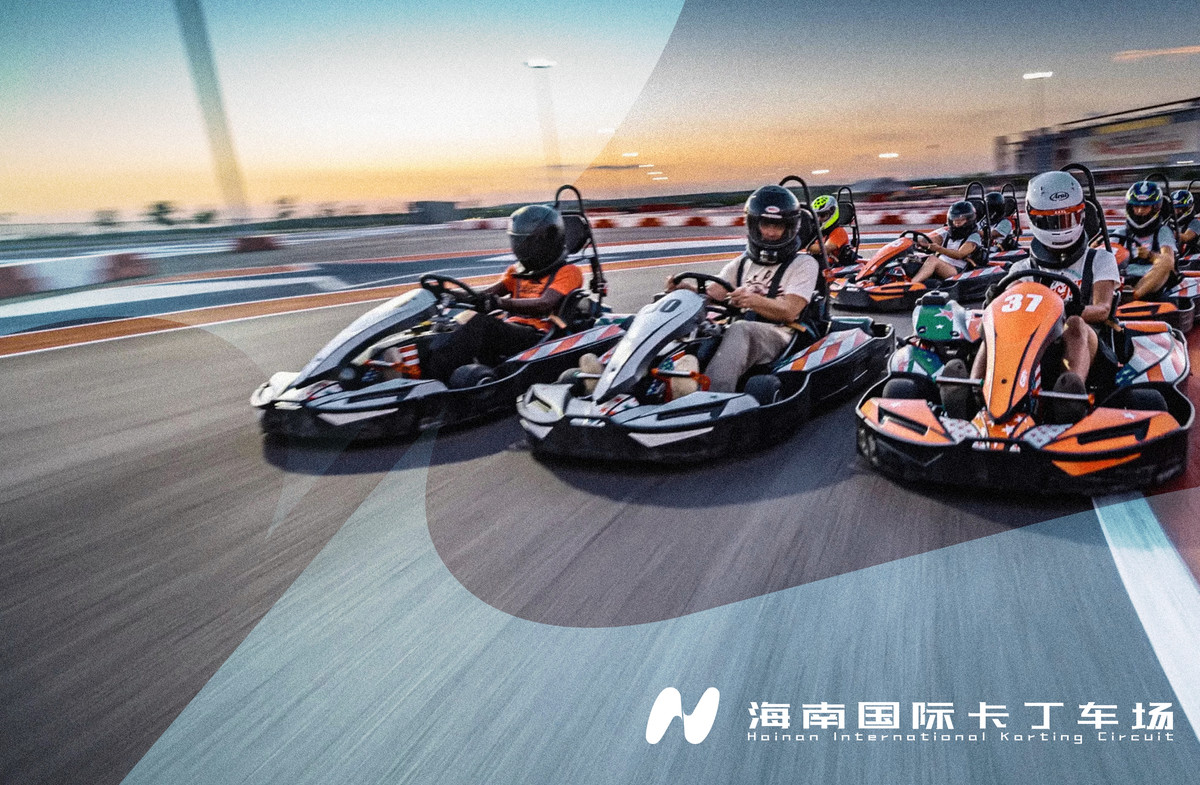
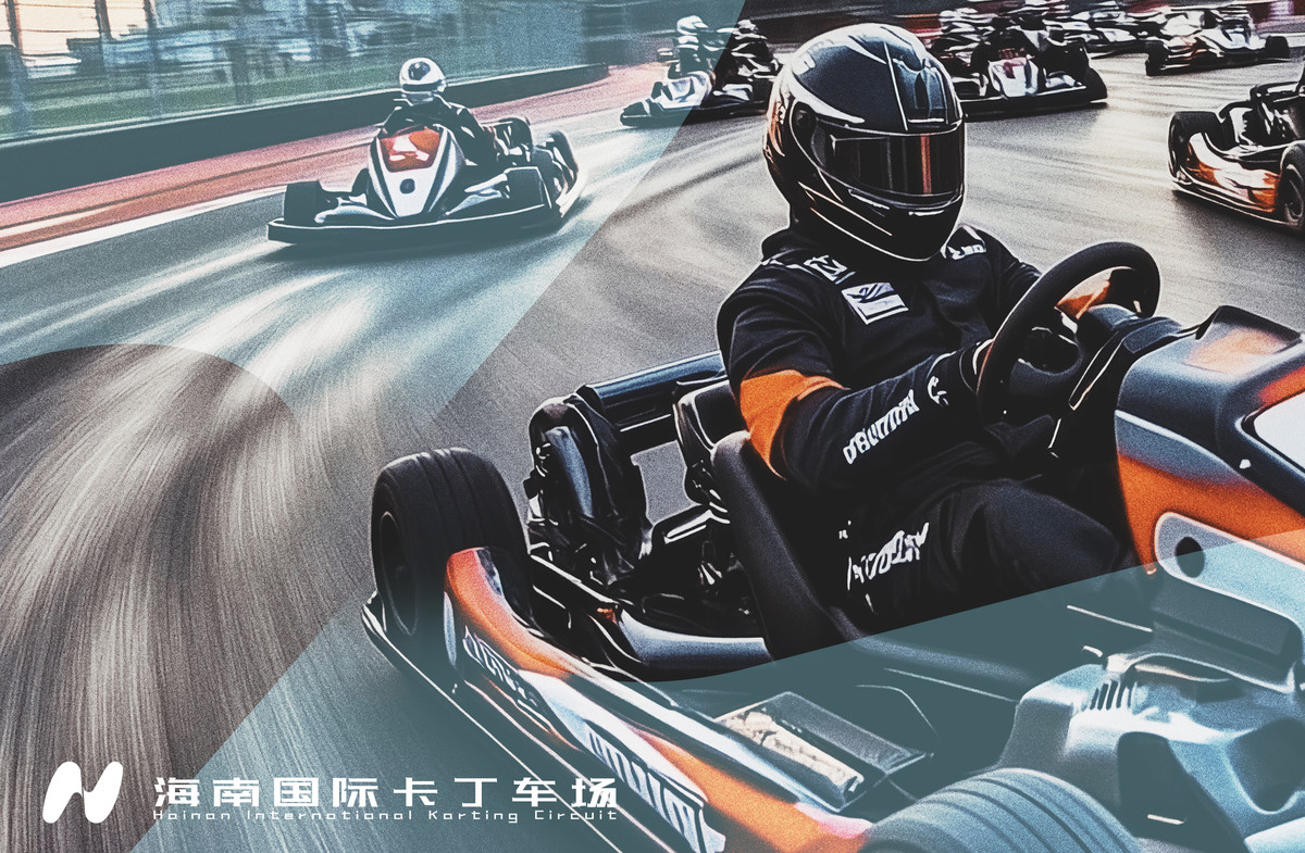
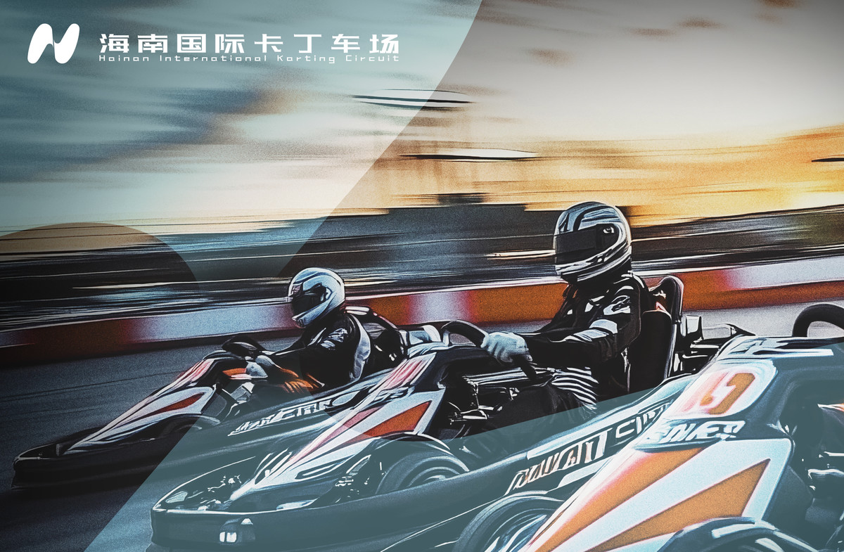
海南高速賽車運動產業發展有限公司成立後,其首個實體項目——海南國際卡丁車場亦同步啟動,我們同時為其設計品牌標識。雖然卡丁車場與母公司屬獨立品牌,但基於一脈相承的設計理念,我們為其打造出既具自身特色,又與母品牌保持關聯的視覺形象。
Alongside the establishment of Hainan Expressway Motorsports Industry Development Co., Ltd., its first physical project—Hainan International Karting Circuit—was also launched. We developed an independent yet visually connected brand identity for the karting circuit under a cohesive design system.
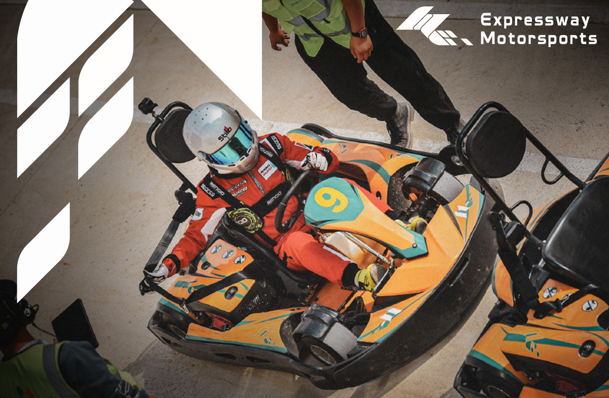
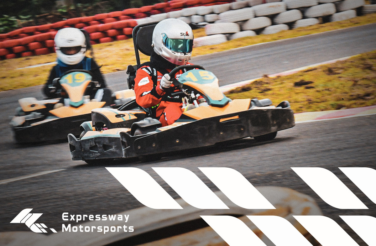
與母公司相比,卡丁車場更強調臨場感及互動體驗,因此在設計方向上亦有不同的著眼點。
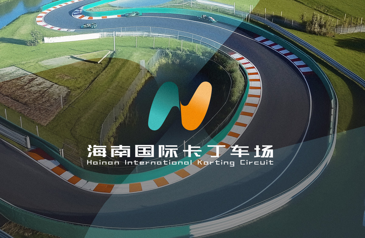
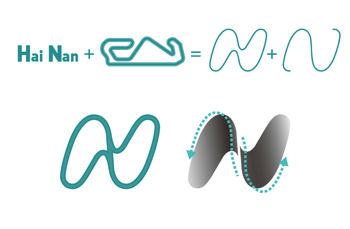
最能代表賽車場的視覺符號,莫過於 蜿蜒的賽道。標誌設計以海南縮寫 「H」 與 「N」 為核心,將兩者融合為流暢的賽道造型,形成 無限循環的動態線條,不僅呈現速度感,更象徵賽事的無限挑戰精神。交錯的曲線亦如同格子旗迎風擺動的姿態,進一步突顯賽車運動的動態張力。
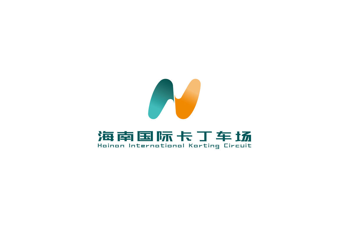
在視覺表現上,標誌採用更簡約純粹的設計語言,並透過漸變色彩营造強烈的活力感,以突顯卡丁車運動的 娛樂性、大眾化及專業性,讓其成為極具吸引力的專業賽車娛樂場所。
Unlike the parent company, the karting circuit places a greater emphasis on on-site experience and interaction, leading to a different design focus.
The winding racetrack serves as the most iconic representation of a racing venue. The logo is constructed from the initials "H" and "N" (representing "Hainan"), merging into a continuous track-like shape that conveys speed and an endless pursuit of challenges. The interwoven curves also resemble the fluid motion of a waving checkered flag, reinforcing the dynamic energy of motorsports.
Visually, the logo adopts a minimalist approach, while the gradient color scheme adds vibrancy, highlighting the karting circuit as an engaging, professional, and accessible racing entertainment venue.
與母公司品牌的關聯性
Brand Connection with the Parent Company
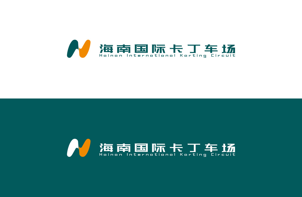
客戶希望新標誌在具備獨立性的同時,亦能與母公司HEC保持一定的品牌連結。因此,我們在設計時,需平衡品牌區隔與識別統一性。 為確保標誌設計能獨立運作,我們在圖形結構上完全以各自品牌理念出發,未作直接關聯。但在配色策略上,則特意保留母公司標誌的橙色,以建立品牌識別的一致性。同時,綠色部分則根據不同子品牌的屬性自由發揮,確保品牌在統一調性下仍能展現各自的特點。 最終,我們成功打造了既能獨立運作、又能通過色彩識別母品牌關聯性的設計方案,符合客戶的品牌發展需求,並建立清晰且具層次的品牌視覺體系。
While maintaining independent brand identities, the new logos also needed to establish a visual link with the parent company HEC. To achieve this, we carefully balanced brand differentiation and visual consistency. The logo structures were developed independently without direct references to HEC, ensuring originality. However, we retained HEC's signature orange color in both logos to maintain a sense of brand continuity, while allowing flexibility in the green color scheme for differentiation. Ultimately, this approach successfully connects the brands visually while preserving each entity's unique identity, fulfilling the client's requirements for a cohesive yet independent brand system.
Continue Reading 延伸閱讀:
. 海南國際卡丁車場正式開業 致力打造卡丁車賽事活動基地
. 体验速度与激情!海南国际卡丁车场在海口开业
. 海南国际卡丁车场